The Created vs Resolved report is widely used by Jira users through the built-in Atlassian Created vs. Resolved Chart gadget. Many marketplace apps also offer custom issue analysis reports to show comparison between created and resolved issues within a certain period.
However, Performance Objectives: Charts for Jira takes it a step further by offering the ability to compare more than two date fields. Thus, our app stands out with its extensive range of customization options, providing enhanced flexibility, valuable insights and better reporting experience.
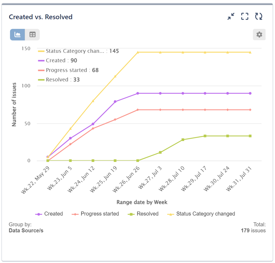
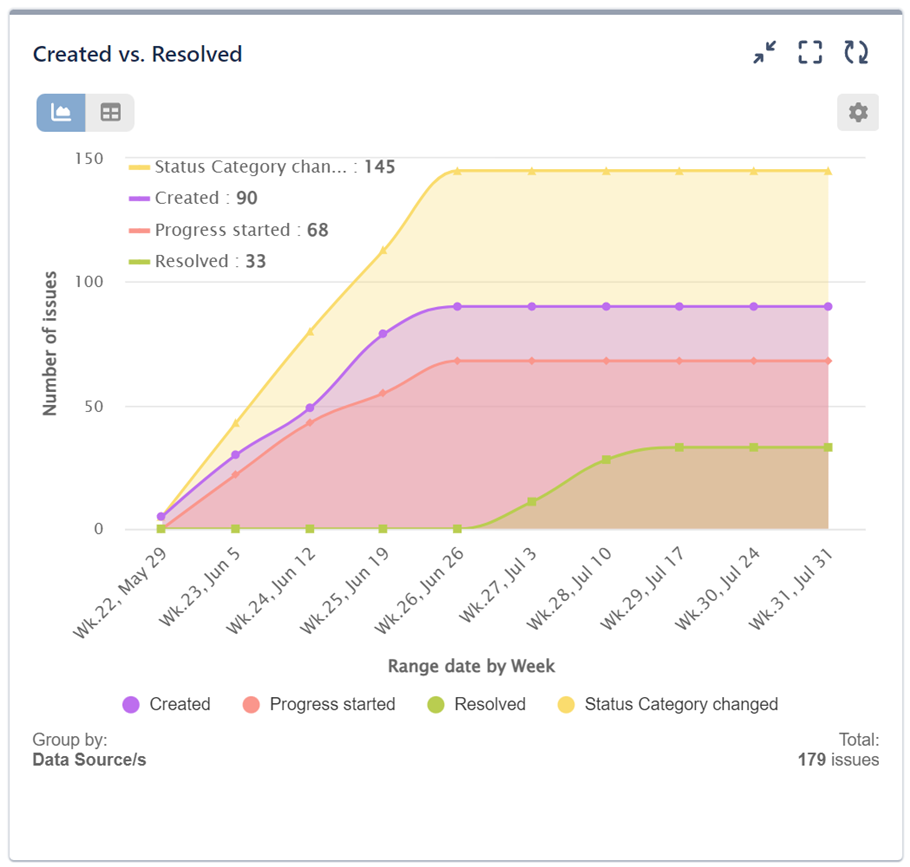
In this section, we’ll explore two different visualizations for Jira issue data. First, we’ll use the Performance Trend gadget to analyze correlations between date events stored in your Jira issues. Build Created vs Resolved issues analysis report and expand it with any other date events that may be of interest to compare. Choose between line and area chart for your data visualization.
Created vs Resolved vs any Date Field report with Performance Trend Gadget
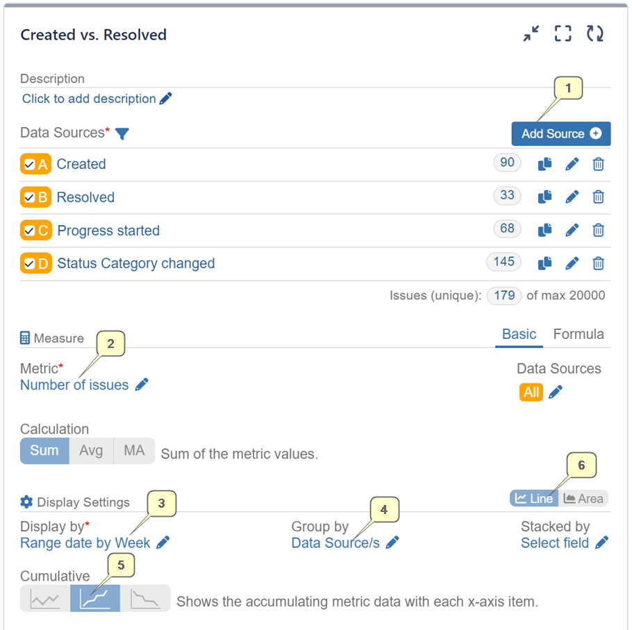
Please find below the configuration steps for setting up Created vs Resolved vs Any Date Field Report with the Performance Trend dashboard gadget:
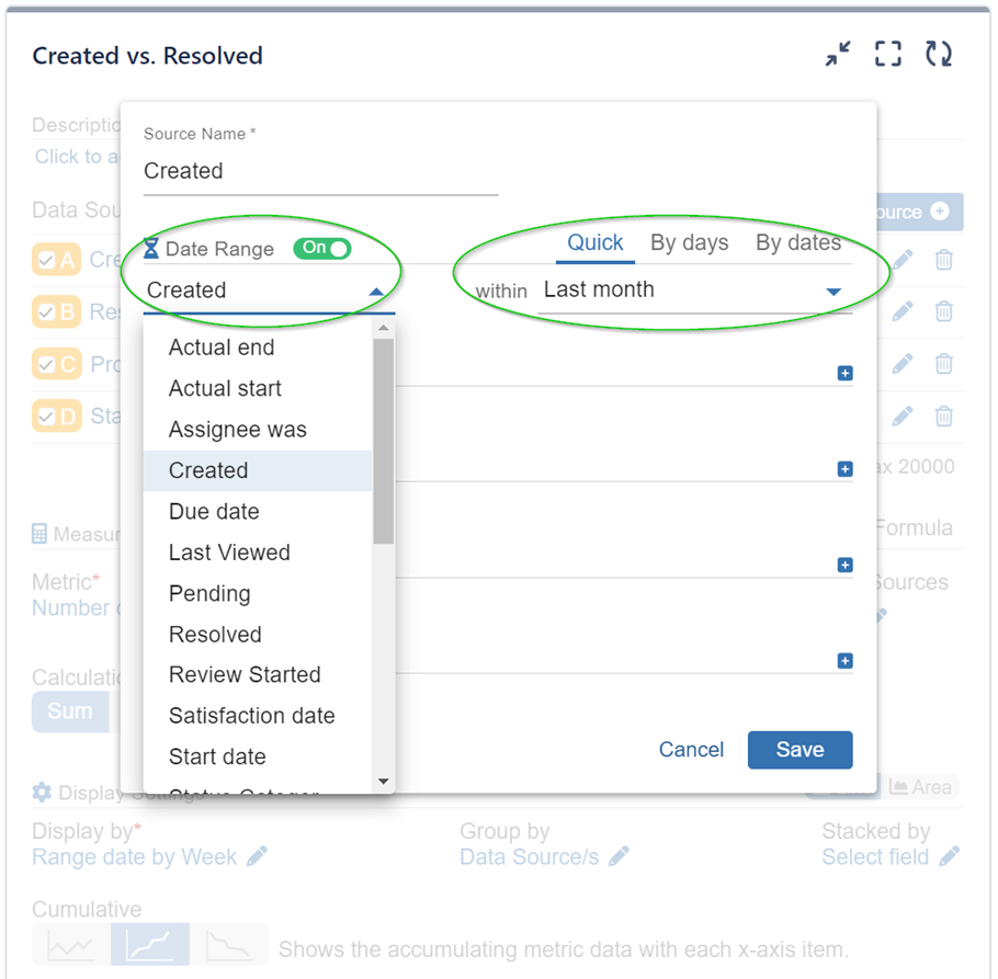
Step 1: Add a Data Source and select the date range based on the ‘Created’ date field.
Step 2: Add another Data Source, this time based on the ‘Resolved’ date field, covering the same period. Repeat this process for any other date fields you want to analyze, like ‘Progress Started’ or ‘Status Category Change,’ as specified in the provided sample configuration.
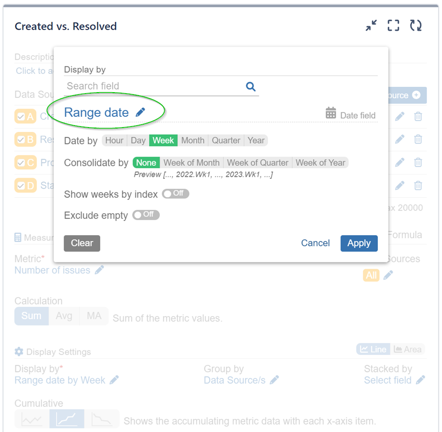
Step 3: Choose the ‘Range Date‘ field for ‘Display by.’ This unique field synchronizes all values from the defined date fields in the data sources onto the same x-axis timeline. In this sample case, we use Jira issue date fields: ‘Created,’ ‘Resolved,’ ‘Progress Started,’ and ‘Status Category Change.’
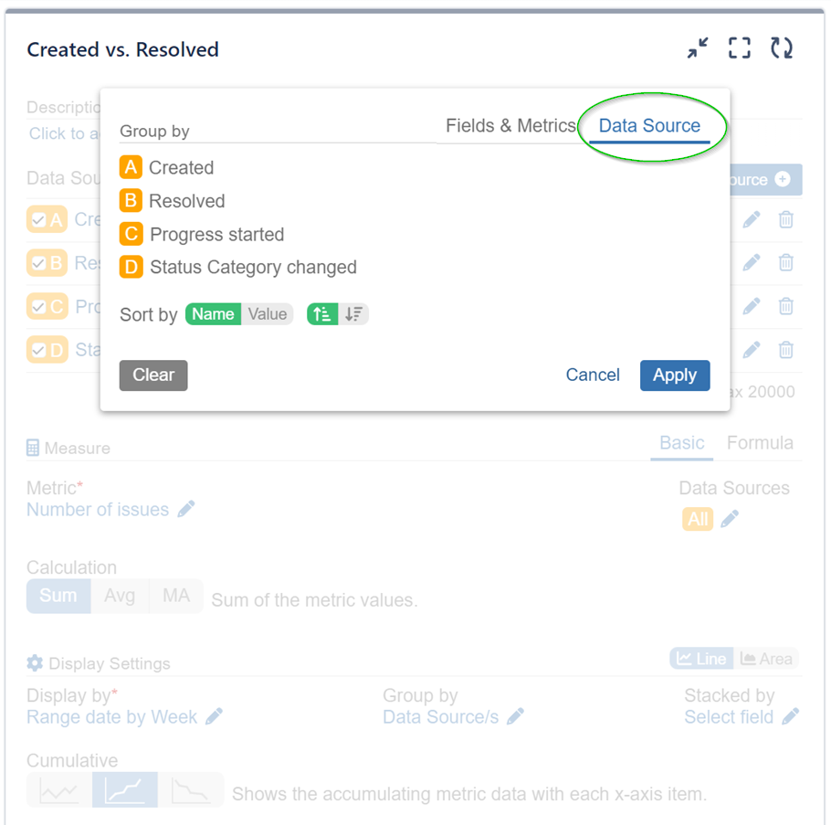
Step 4: For ‘Group by’ set the Data Source option to display distinctive trends for each data source based on its corresponding date field used for the Date Range.
Step 5: Select the ‘Cumulative mode’, which accumulates the data with each x-axis item. In this sample case, the data will be aggregated by week.
Step 6: (Optional) Choose between Line or Area chart
We have prepared a configuration video that demonstrates how to add additional date fields from the data sources to achieve the visualization mentioned earlier.
Created vs Resolved with Performance Objectives Gadget
Next, we’ll showcase the Performance Objectives gadget. This tool offers numerous customization and advanced reporting options, enabling you to compare different date events in your data. The results will be presented in a straightforward bar chart format for easy understanding.
We have prepared a helpful configuration video that guides you through the setup process for Performance Objectives gadgets, making it even easier to get started with your data analysis in Jira:
The Created vs Resolved issue analysis report can be used in numerous ways and here are just a few of them:
- Feature Requests: Compare the number of new feature requests created with the implemented or resolved features to track progress and prioritize enhancements.
- Bug Tracking: Analyze the number of bugs created versus bugs resolved within a specific timeframe to assess the effectiveness of bug fixes.
- Customer Support: Monitor customer support tickets raised and their resolution rate to ensure timely responses and efficient issue resolution.
You can also include any other Date Field of interest into the comparison to further deepen your analysis. For a comprehensive list of different field types supported by the app, please refer to our Configuration Overview and look for:
Explore other essential reports and KPI examples you can build on your Jira dashboard with Performance Objectives: Charts for Jira app.
Start your 30 days free trial of Performance Objectives: Charts for Jira from Atlassian Marketplace.