Table of Contents
Kanban is all about transparency and workflow efficiency. For teams using Kanban in Jira, configuring the right reports and gaining valuable insights can make a significant difference. In this article, we’ll explore six configurations generated with the Performance Objectives app for Jira, plus one Jira native report. These reports are designed to enhance your team’s visibility into performance, streamline processes, and ensure effective management and movement of tasks across your Kanban board. Whether you’re a seasoned Kanban practitioner or new to Jira, leveraging these reports will help you achieve your project goals with greater precision and clarity.
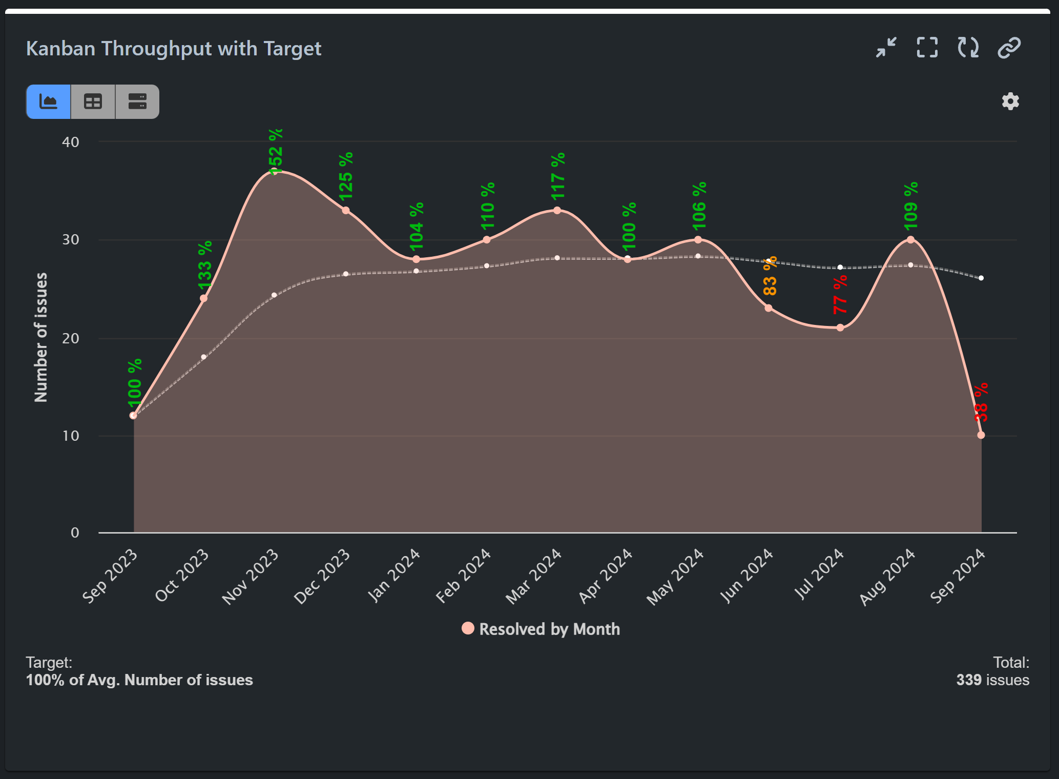
Kanban Throughput Report: Measuring the Pace of Completed Work Over Time
Kanban throughput refers to the amount of work (issues completed/resolved) delivered by the team over a specific time period. It is an essential Agile metric that provides insight into how efficiently a team is working and helps predict future performance. Throughput can be calculated on a daily, weekly, or custom basis, depending on the team’s needs. For example, if a team delivers 5, 7, 2, and 6 tasks over four weeks, the average throughput would be (5 + 7 + 2 + 6) / 4 = 5 tasks per week. By monitoring throughput, teams can assess trends, identify bottlenecks, and make future work capacity estimates.
In the sample report below, we showcase resolved issues by month and compare the results against a moving average target of 100%, based on the performance of previous months. The Performance Trend gadget in area mode is used for this visualization.
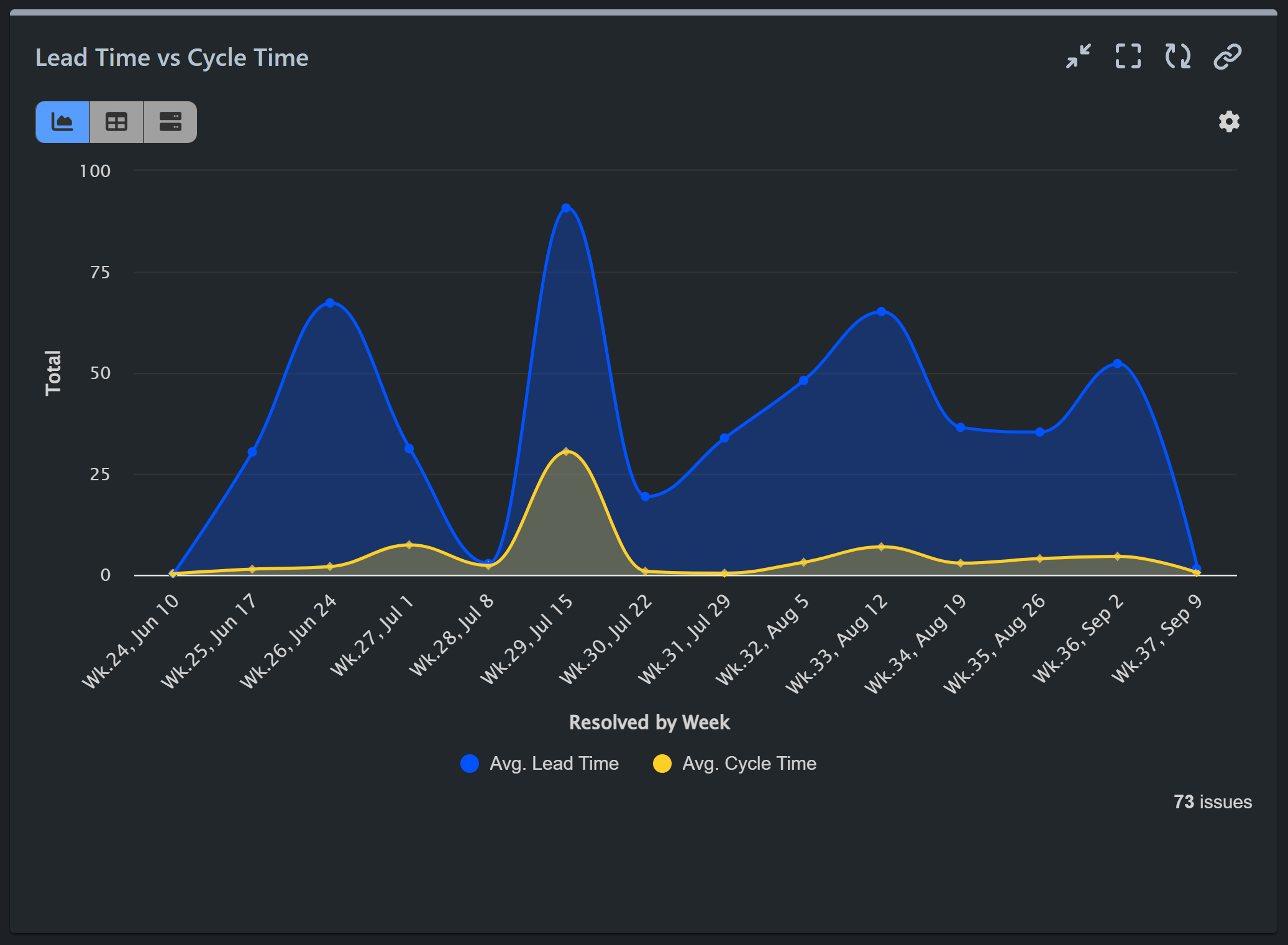
Cycle Time vs. Lead Time: Visualizing Both Metrics on a Single Chart
Cycle time and lead time are essential Kanban metrics because they provide insight into how efficiently work moves through. Cycle time measures how long it takes to complete tasks once work has started (from status “In progress”), while lead time tracks the total time from task creation to completion. Both metrics help teams identify bottlenecks, optimize workflows, and predict delivery times. With the Multi Metric Trend gadget you can track and monitor both cycle time and lead time on a single chart, allowing for easy comparison and a more comprehensive view of your team’s performance.
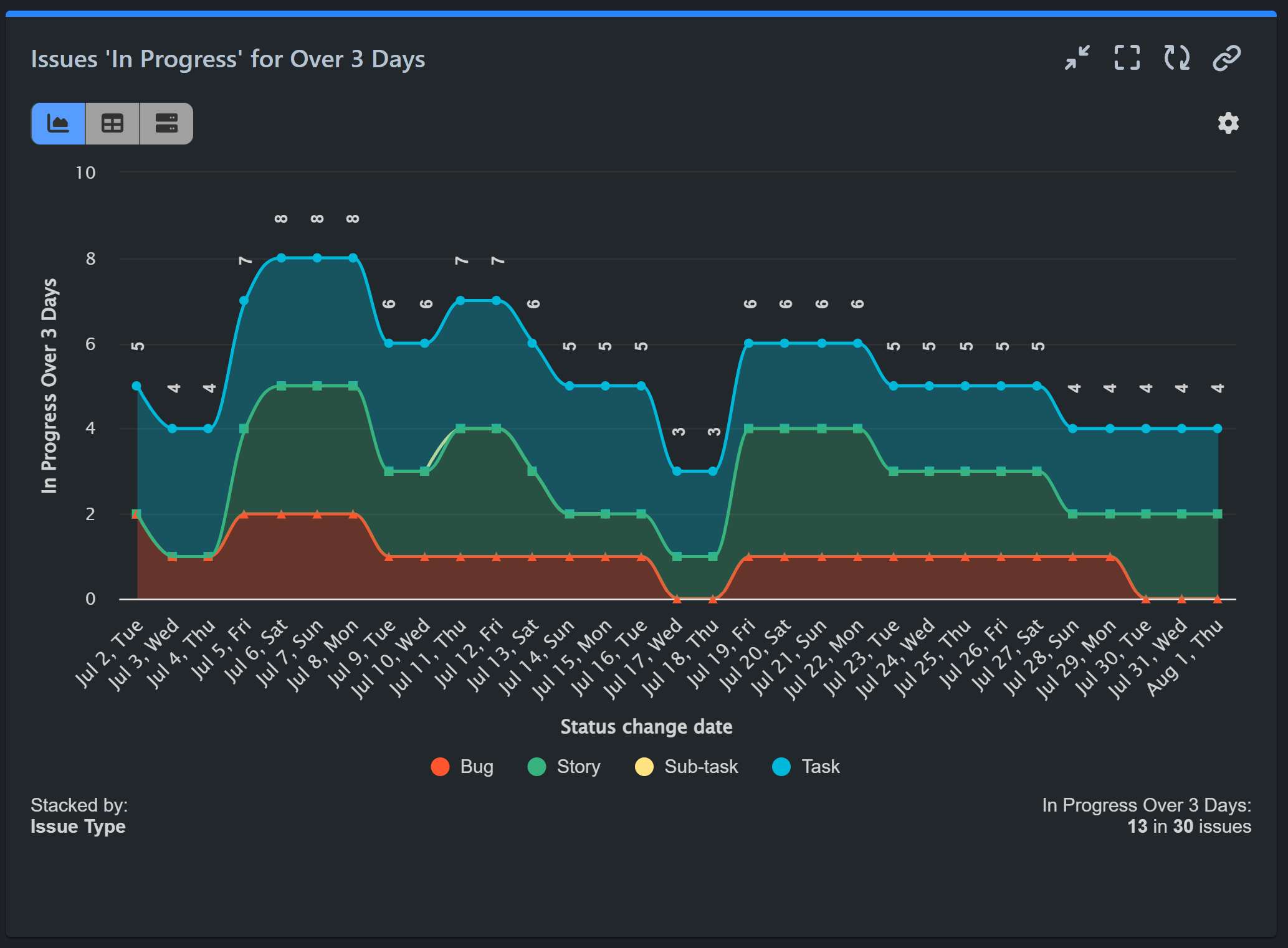
Monitor Aging Work In Progress (WIP)
The Aging Work in Progress (WIP) report tracks how long tasks currently in progress have remained in this status. It provides a visual representation of the age of active work items, helping teams identify potential bottlenecks and delays. By monitoring the age of WIP, teams can focus on completing long-standing tasks, ensuring a smoother workflow and preventing issues from staying in progress for too long, which can negatively impact efficiency. With the Performance Objectives app for Jira, you can also set a target to represent the maximum preferable time for WIP issues.
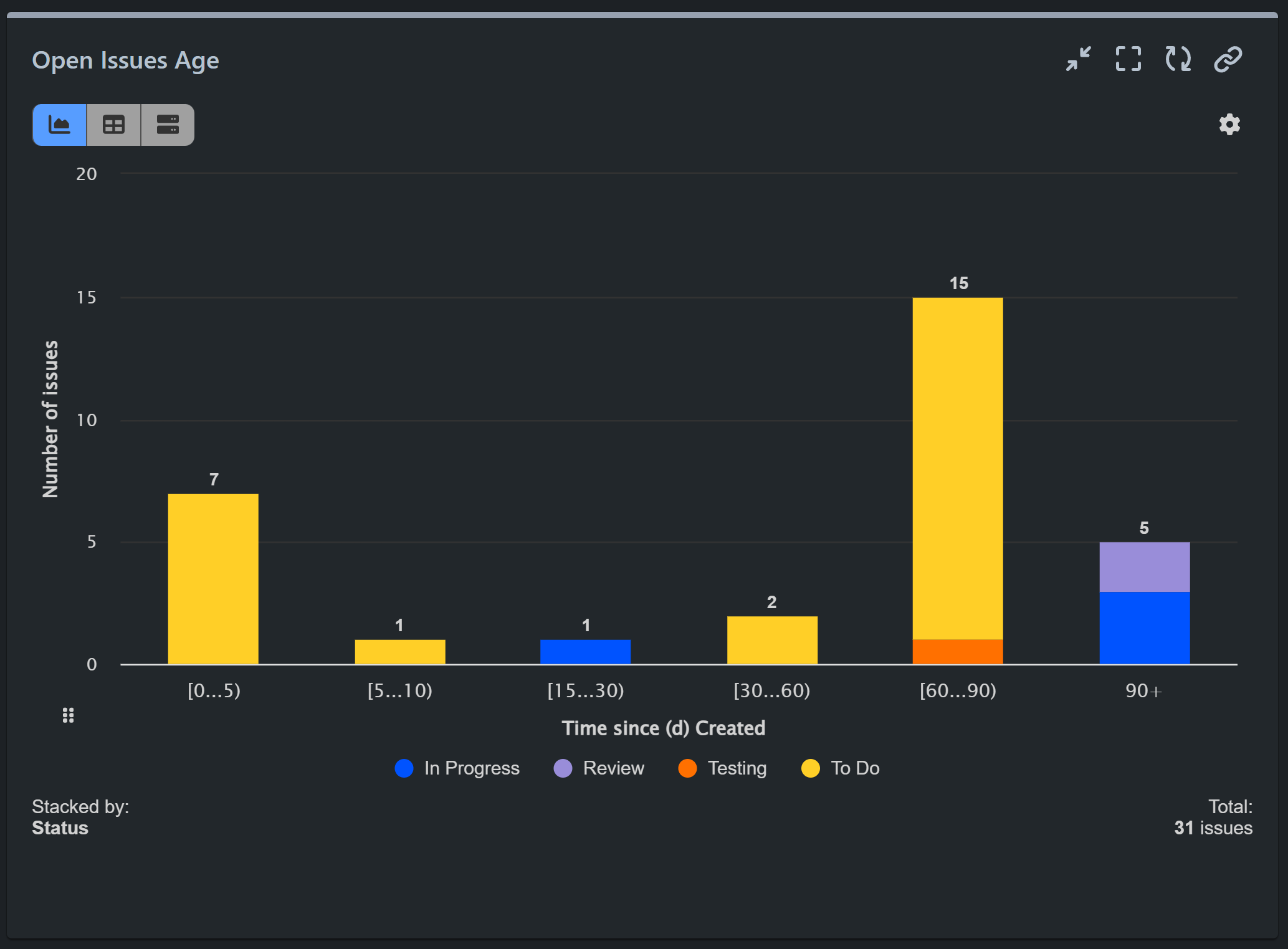
Alternatively, using the Performance Objectives app’s metric distribution feature, you can generate the Open Issues Age report. This report segments issues in open statuses like “To do”, “In Progress”, “Review”, and “Testing” into custom time slots, as demonstrated below. It helps prioritize issues based on their age, ensuring that older issues are addressed promptly and not overlooked.
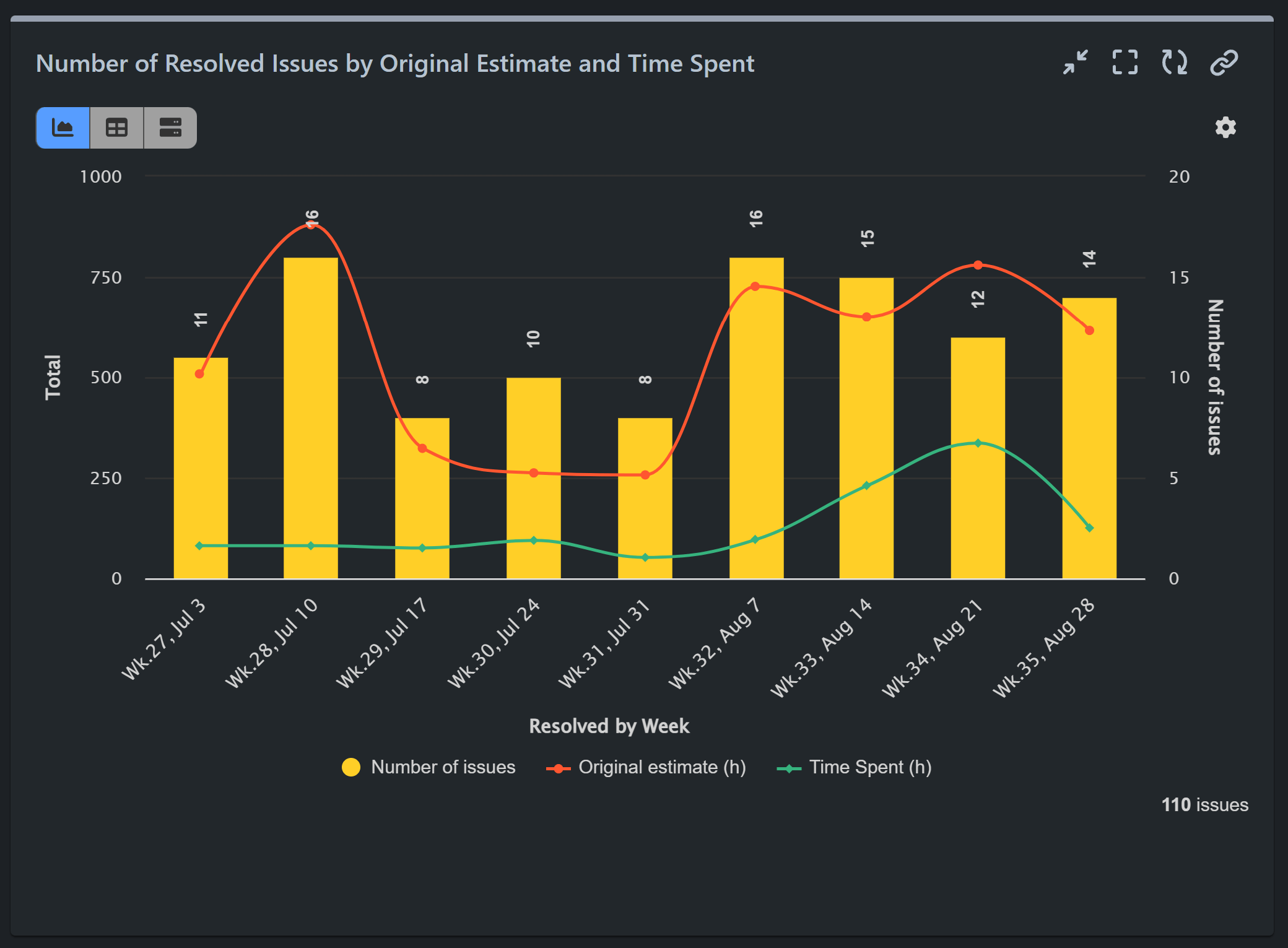
Resolved Issues by Estimate and Time Spent: Evaluate Estimation Accuracy
This report generated with the app’s Multi Metric Combined Chart gadget helps track how accurately estimates align with actual time spent, revealing whether your kanban team’s time predictions are realistic or need adjustment. It also provides valuable feedback to teams on their performance, helping them refine their estimation skills and improve their overall effectiveness.
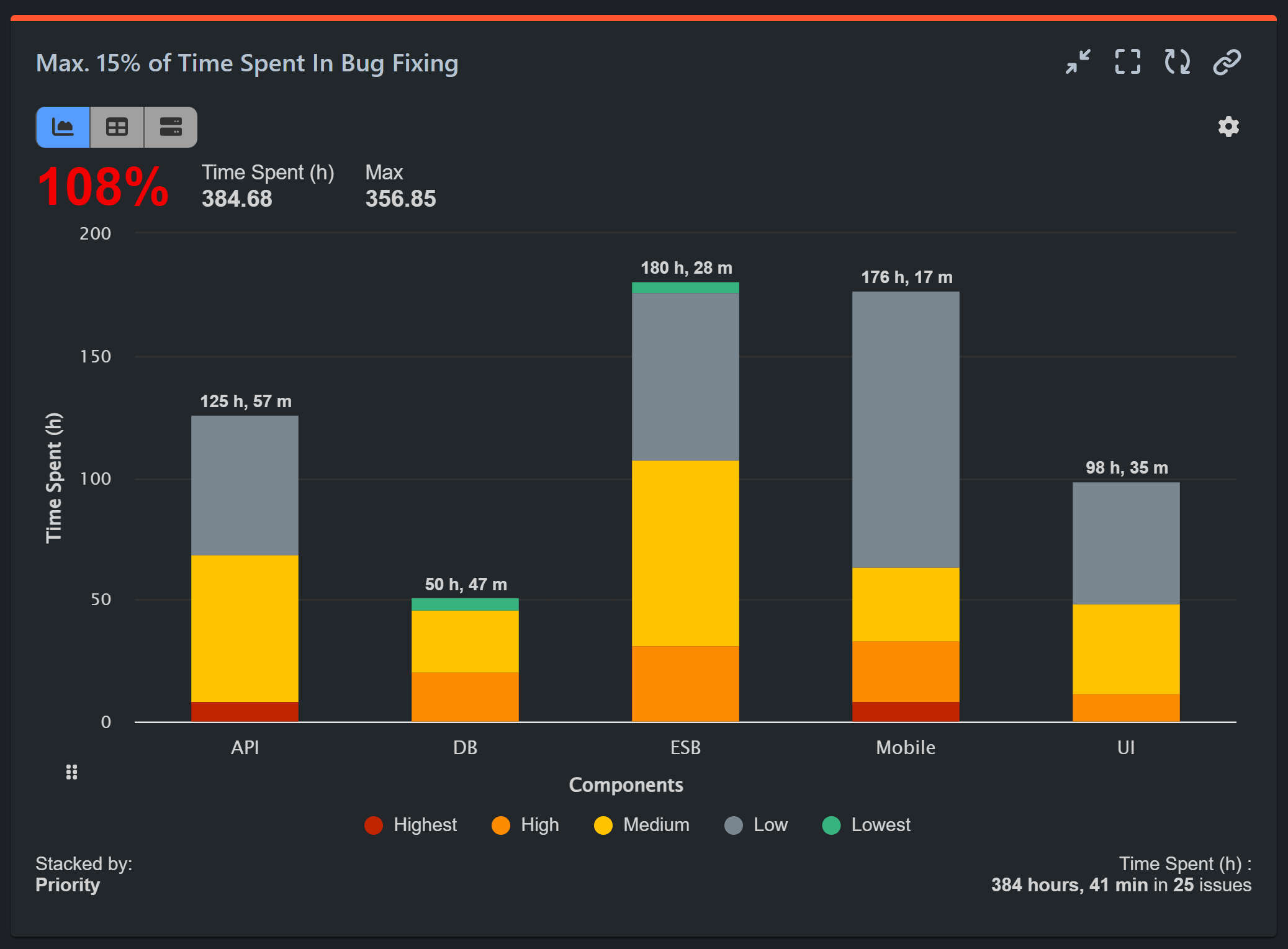
Max Time Spent in Rework
This report tracks how much of your team’s total time is dedicated to bug fixing and code maintenance, with a target of keeping this below 15%. This allows you to see whether too much time is being spent on rework, which can detract from developing new features and delivering value.
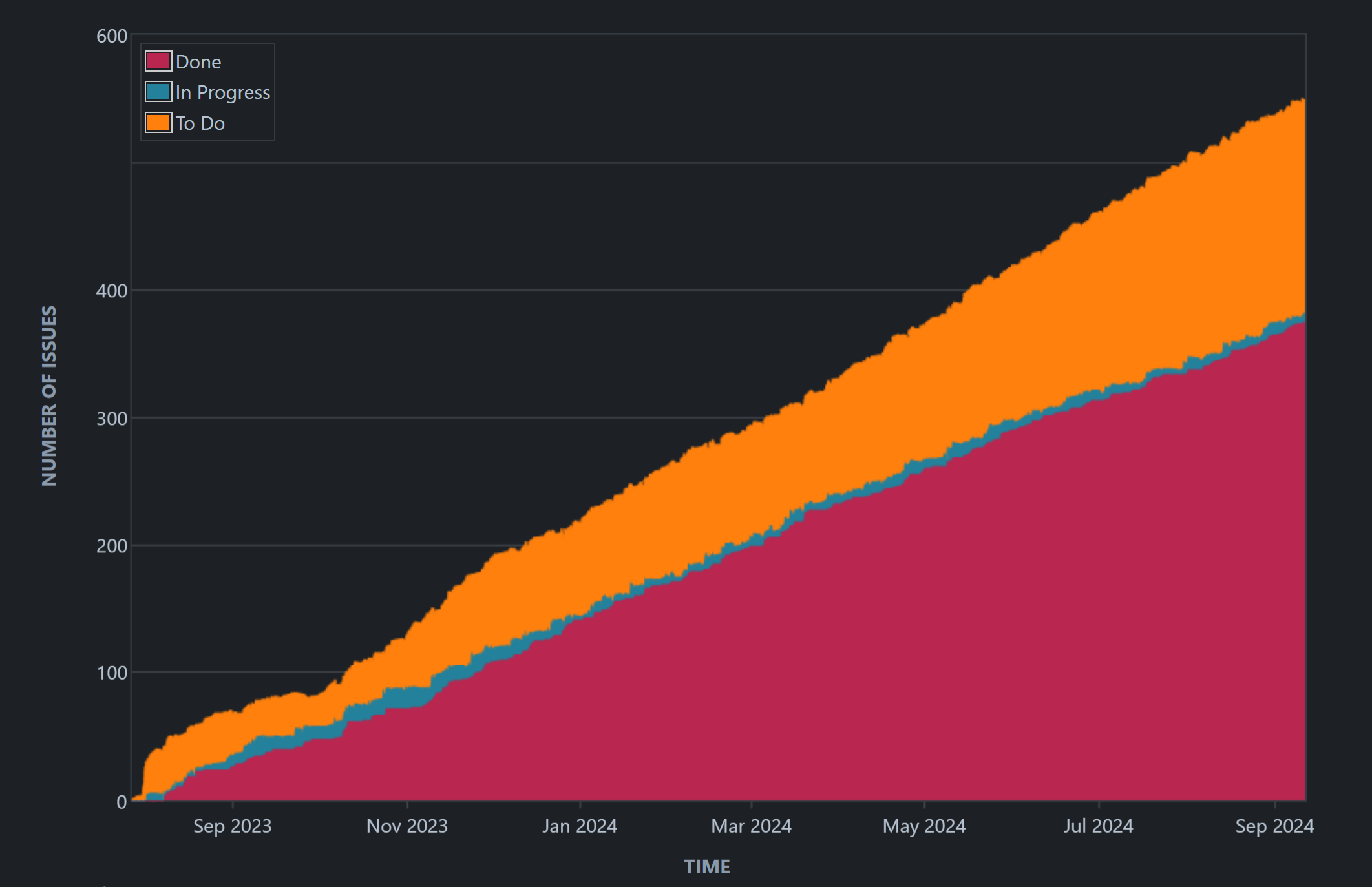
Cumulative Flow Diagram (CFD): The Fundamental Kanban Report
And last, but not least, is the Cumulative Flow Diagram (CFD). This area chart is a vital visualization tool that tracks workflow efforts and overall project progress out of your Kanban board. The CFD displays the accumulation of all issues as they move through your workflow stages, including To Do, WIP, Done, and any custom statuses you’ve added. Additionally, as a built-in Jira feature, it can be configured and monitored without the need for third-party apps or additional costs.
While we’ve covered essential Kanban reports in this article, there are many more Kanban-related reports you can set up with our app. Explore the full range of reporting options to further enhance your workflow and project management. For additional report examples for your Jira dashboard, explore our KPI library.
Start your 30 days free trial of Performance Objectives: Charts for Jira from Atlassian Marketplace.