Table of Contents
Explore Cross-Metric Analysis with Multi Metric Combined Gadget
The Performance Objectives app introduces a suite of 10 Jira dashboard gadgets, among which stands the Multi Metric Combined Gadget. That standalone tool empowers users with the ability to conduct comprehensive cross-metric analysis of Jira data. By seamlessly integrating up to 10 metrics on a single chart, the gadget offers invaluable insights into project performance, enabling teams to identify correlations, trends, and areas for improvement with precision and clarity.
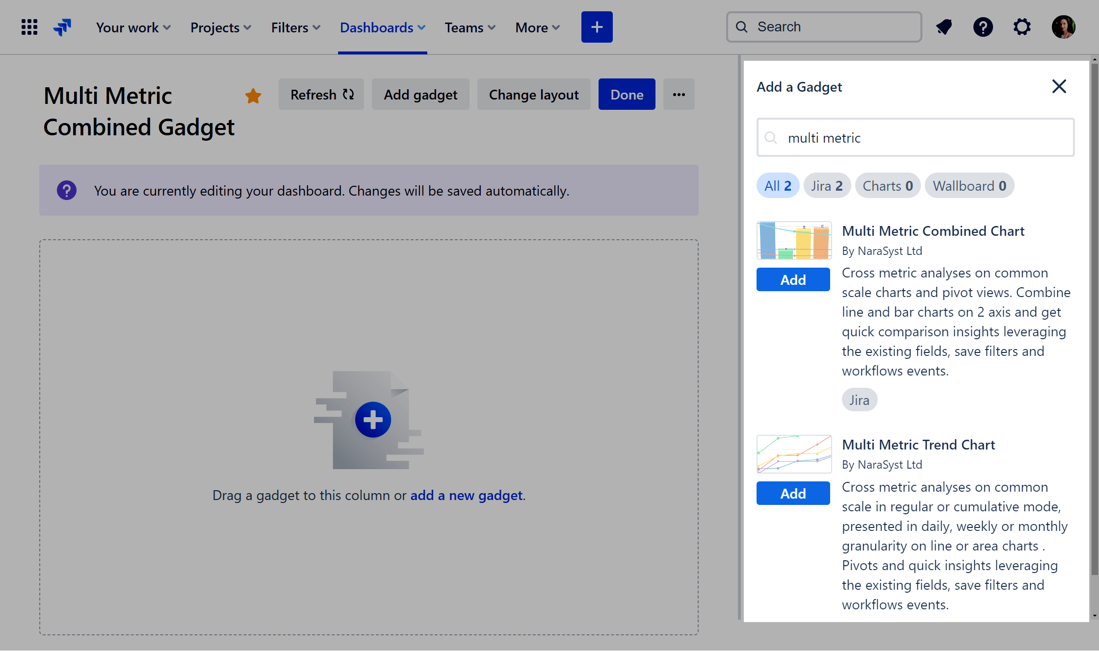
Start your journey by adding the Multi Metric Combined gadget to your Jira dashboard. Performance Objectives for Jira app also offers a Multi Metric Trend Gadget, you can learn about its features and best use in this article.
Key Features of the Multi Metric Combined Jira Dashboard Gadget
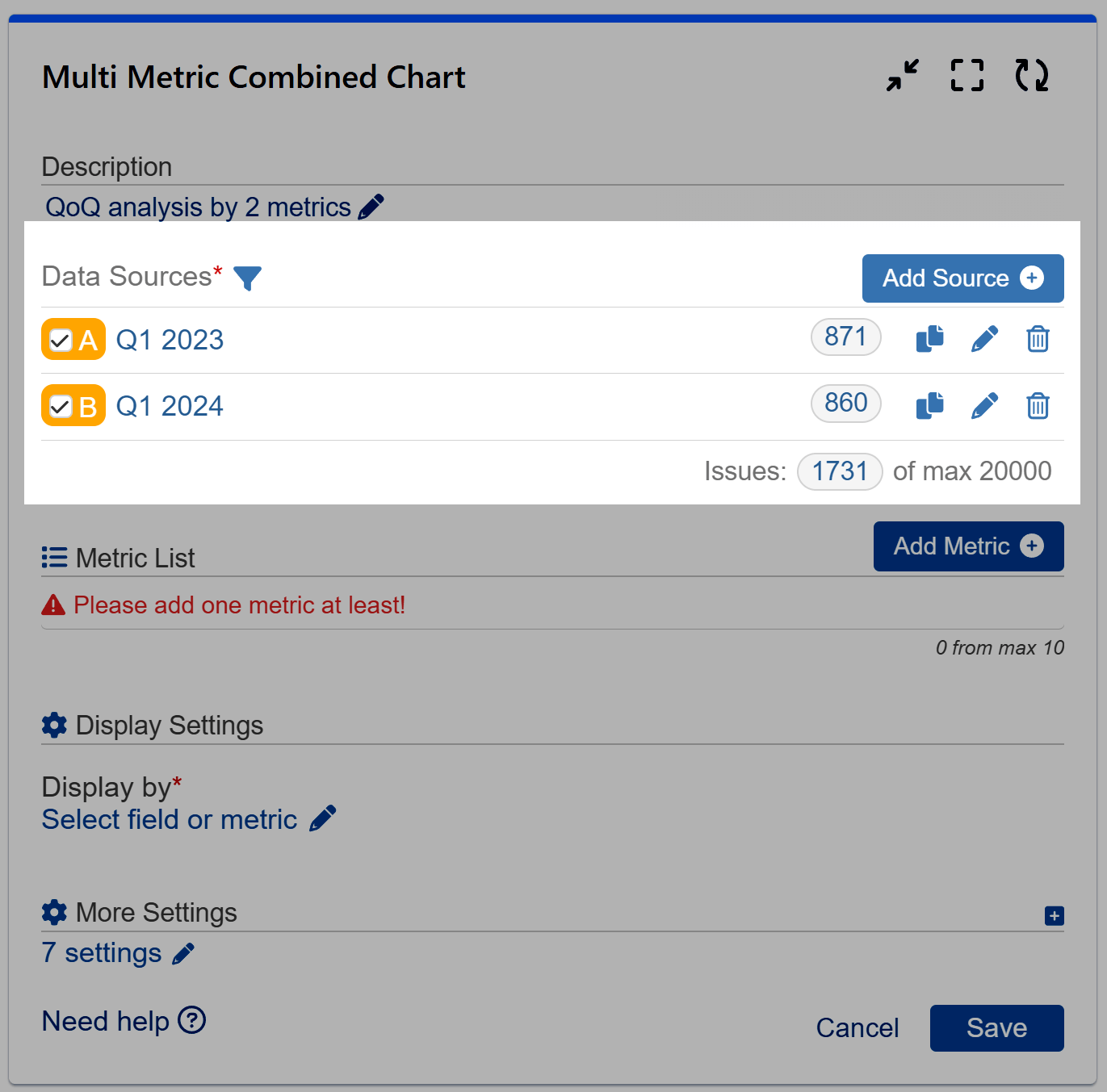
Multiple Data Sources and Data Segmentation
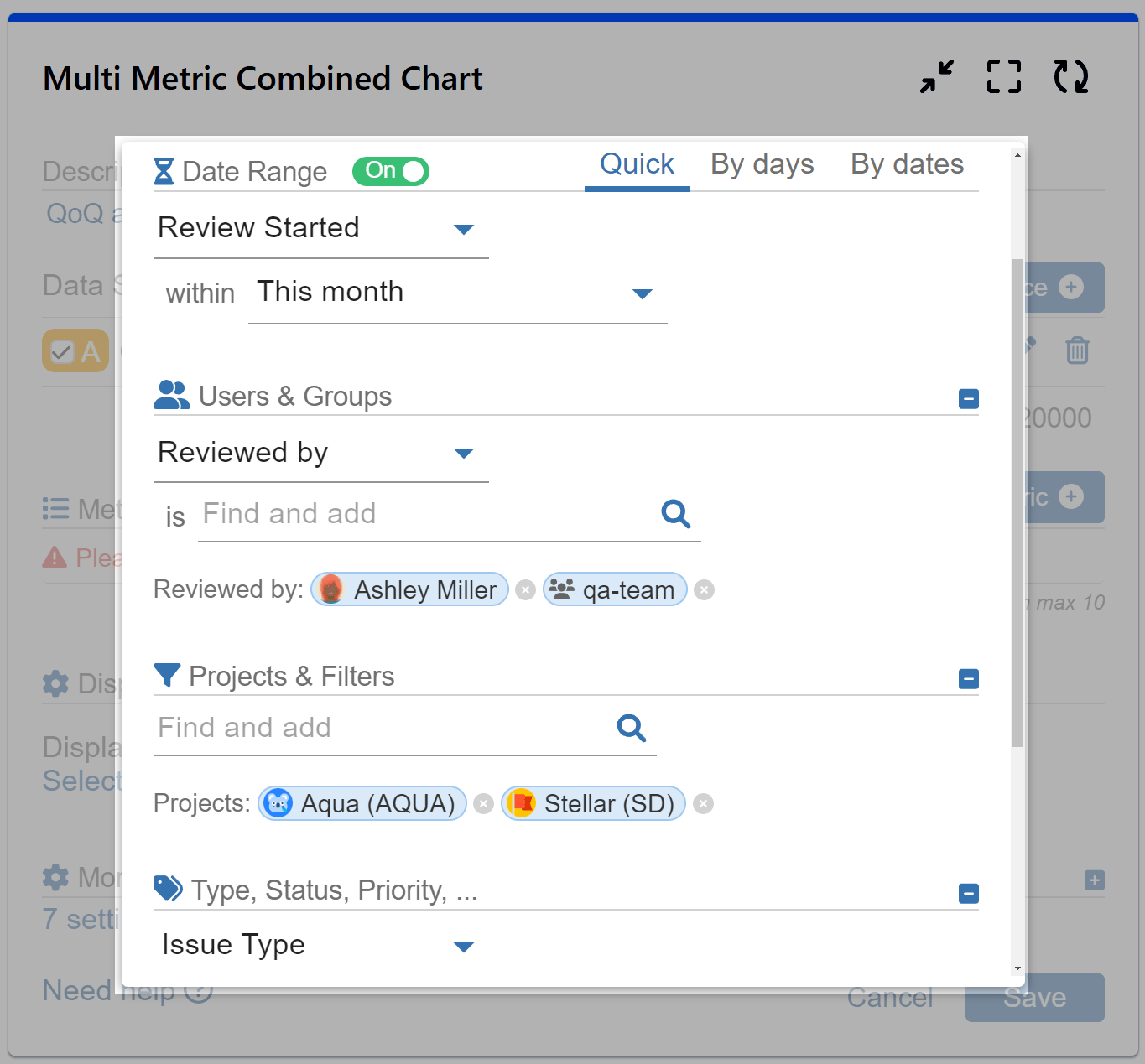
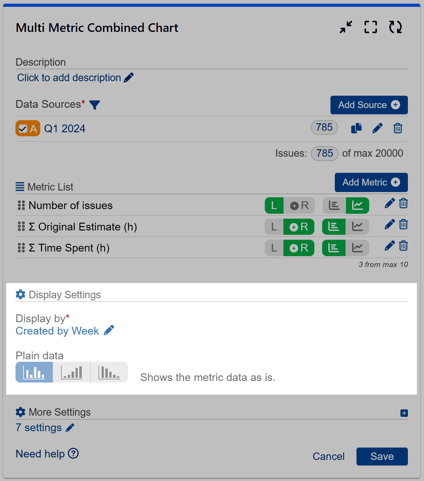
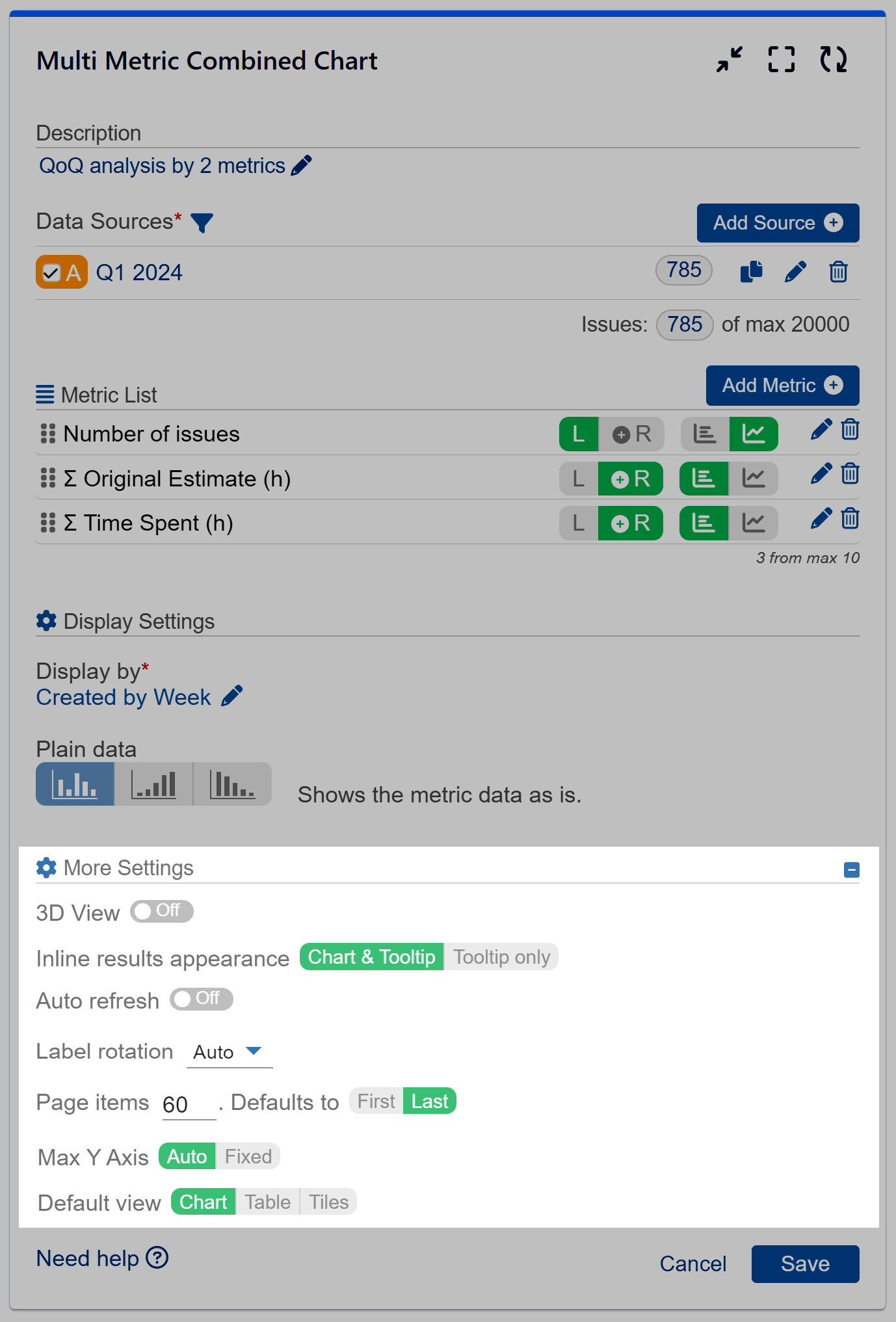
Users can filter data and incorporate as many data sources as necessary. Each data source may be a separate Jira filter, allowing for comprehensive analysis and reporting, as well as multi-filter comparison.
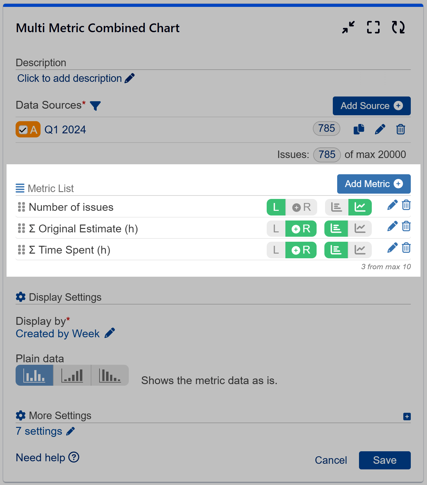
Measure Settings
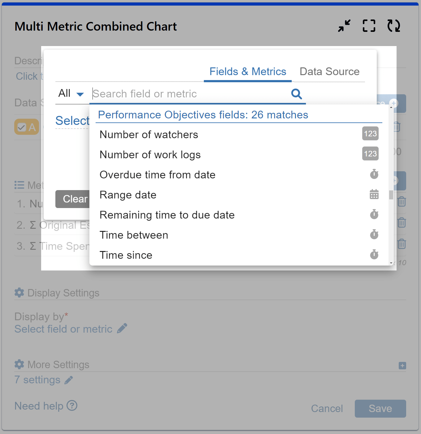
This feature distinguishes the Multi Metric Combined gadget from the rest of the app’s package by enabling users to add up to 10 metrics. Users have the flexibility to choose from a variety of metrics, including Jira system, Jira Service Management, Jira Custom, and Performance Objectives Dynamic metrics.
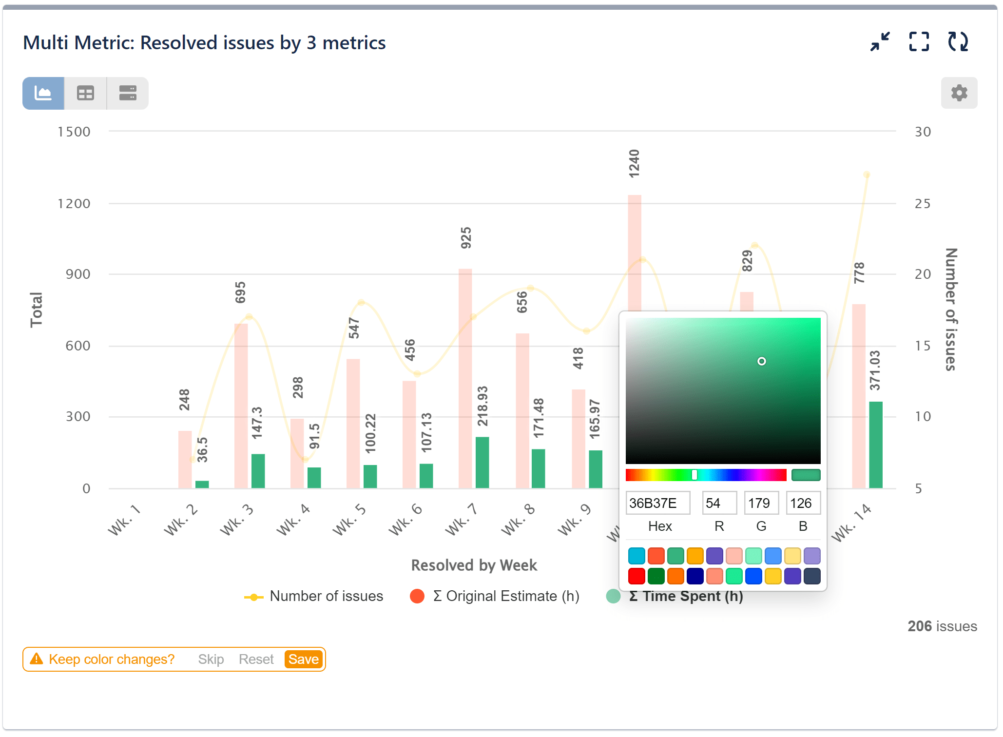
The gadget’s primary feature is its ability to visualize data from various ranges together, such as time and numerical metrics, on the same chart. Each metric is represented with a separate range on the y-axis. Choose to place the y-axis ranges on either the left or right side of the chart. When choosing the left side, all metrics on the left will share the same y-axis scale, allowing for easy comparison. Conversely, placing metrics on the right side means each metric will come with its separate scale on the y-axis.
A comprehensive list of ready-to-use metrics can be found in our Configuration Overview.
Keep in mind that you can easily reorder the added metrics using simple drag and drop.
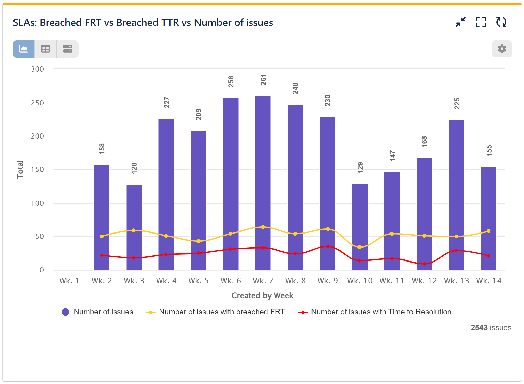
Additionally, users can create their own conditional metrics, which enhance flexibility in data analysis. On the sample Multi Metric chart on the right, we have created the conditional SLA metrics ‘Number of issues with breached FRT (First Response Time)’ and ‘Number of issues with Time to Resolution Breached’.
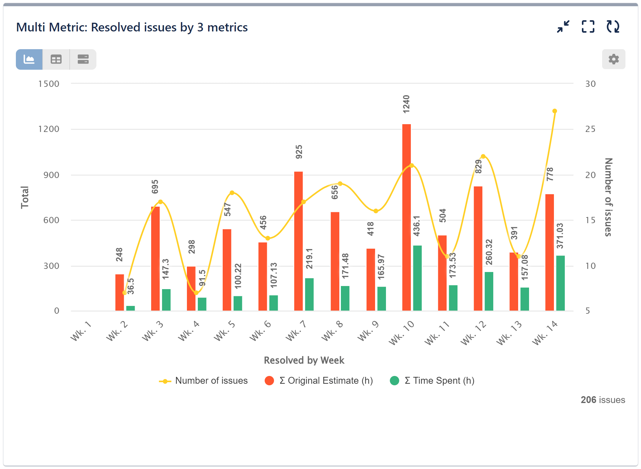
For each metric added, users can choose to align its positioning on the y-axis to the left or right. As a best practice, it is advisable to align metrics of the same type to the same side of the chart, for example, place all time metrics on the left. Additionally, to ensure good readability, prioritize placing a larger number of metrics of the same type on the left y-axis. Each metric can be configured as a bar or trendline, all within a single chart, as shown on the sample chart combining two time metrics on the left.
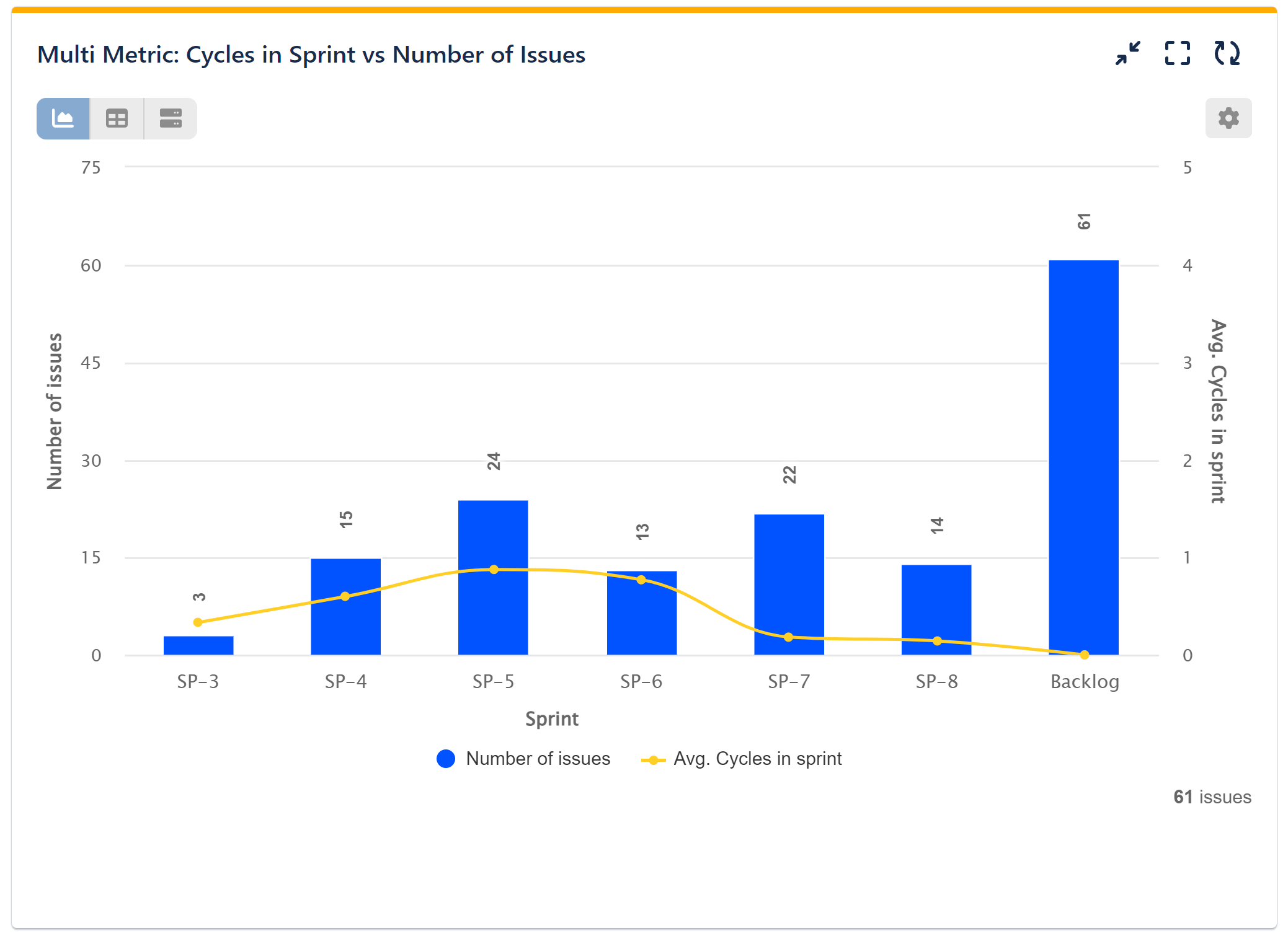
The gadget offers both Sum and Average calculation functionalities, empowering users to perform comprehensive data analysis and derive meaningful insights. In the sample Multi Metric chart on the right, we have applied the Average calculation to the ‘Cycles in sprint’ metric.
Display Settings
With Multi Metric Combined, Jira users have the flexibility to display data by all types of fields including text, user, date, number, and time. Data Sources can also be utilized as display items on the x-axis. This gadget does not support stacking and grouping. Users can choose from Plain, Cumulative, and Declining display modes, accommodating diverse visualization preferences and analytical needs.
Customization and More Settings
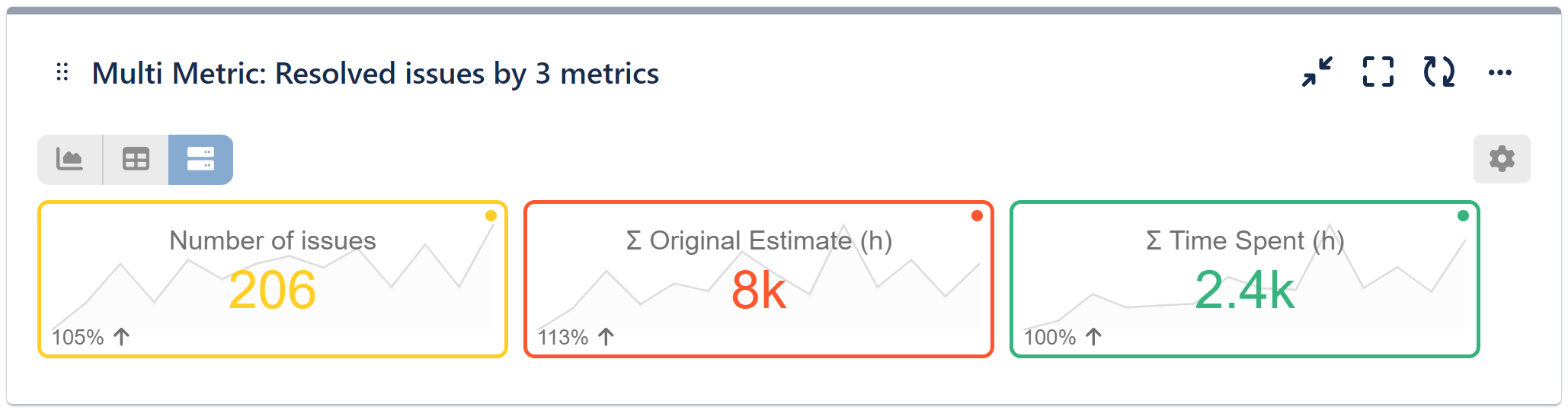
Numerous customization options are an unbreakable part of all our app’s gadgets, and the Multi Metric Combined is no exception. The gadget provides the ability to switch with one click between Chart, Tiles, or Pivot Table view, select custom colors directly from the chart, and choose Inline results appearance, among others. These features enable users to tailor the gadget to their specific requirements and enhance usability.
In Tiles View, the Multi Metric Combined gadget provides comprehensive and appealing visualizations for each metric, featuring a trendline, total, and percentage change index when a date field is selected for ‘Display by’.
Explore more about our app gadgets and features, or delve into our KPI examples.
Start your 30 days free trial of Performance Objectives: Charts for Jira from Atlassian Marketplace.