Diverse Jira Dashboards with Seamless Integration of Charts, Tables, and Tiles With our app, Jira users can elevate their user…
Diverse Jira Dashboards with Seamless Integration of Charts, Tables, and Tiles With our app, Jira users can elevate their user…
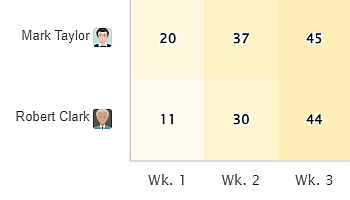
The Heat Map is one of the 10 standalone gadgets available within our app, Performance Objectives for Jira. Discover the…
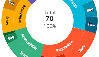
Create impressive interactive reports with Sunburst chart visualization on your Jira Dashboard using the ‘Circular Chart’ gadget available within the…
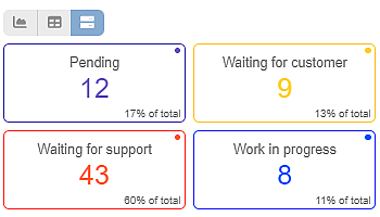
Performance Objectives for the Jira app comes with a variety of 10 dashboard gadgets to suit the reporting needs of…
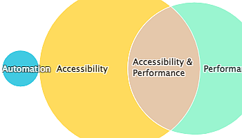
The Venn diagram is one of the 12 chart types supported by the Performance Objectives app for Jira. It’s a…
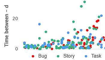
Powerful Data Insights: Harness the Potential of Scatter Charts The Scatter chart, also known as a scatter plot, is a…
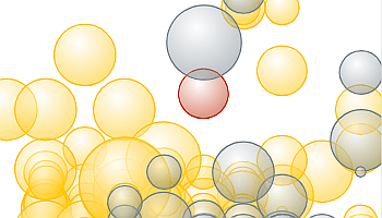
The Bubble chart is among the 12 available chart types within our app, enabling you to visualize tasks using up…
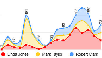
Use Performance Objectives gadgets to create Stacked Area or Stacked Bar charts. Compare data sets within one chart, analyze relationships, and assess relative proportions across categories or dimensions.
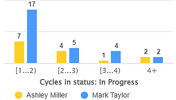
Use ‘Group by’ in Performance Objectives app to break down data by a second dimension, that can be any Jira field, metric, or custom segment.
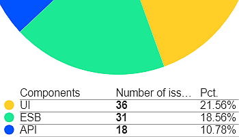
Simplify Data Interpretation with Pie Charts in Performance Objectives App Pie charts enjoy widespread popularity due to their simplicity. They…