Table of Contents
Why Choose Cumulative Mode?
Performance Objectives: Charts for Jira supports the cumulative configuration option that allows for the accumulation or aggregation of data over time. The cumulative mode becomes available when a date type field is selected for the ‘Display by’ setting. This feature is particularly beneficial to Jira users because it provides a valuable perspective on the overall progress, trends, and performance metrics associated with their objectives. By utilizing this mode, users can easily identify significant milestones or achievements. Furthermore, the cumulative mode effectively smooths out fluctuations and eliminates noise in the data, providing a more consistent and stable representation of the overall trend.
This powerful feature is fully integrated into various dashboard gadgets within the Performance Objectives: Charts for Jira app, including:
- ‘Performance Trend’ dashboard gadget
- ‘Performance Objectives’ dashboard gadget
- ‘Multi Metric Combined Chart’ gadget
- ‘Multi Metric Trend Chart’ gadget
- ‘Change History’ dashboard gadget
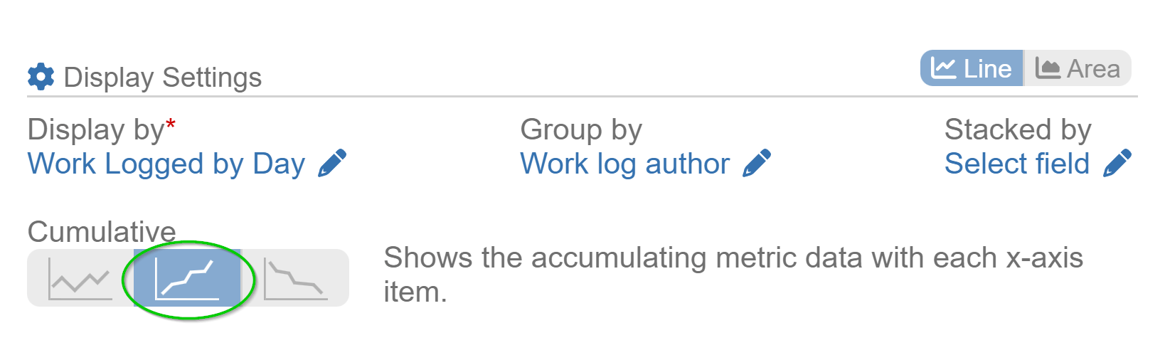
To access the configuration option, navigate to the ‘Display Settings‘ section. Let’s take a closer look at how it appears in the ‘Performance Trend’ gadget.
Unlocking the Potential of Cumulative Mode: Examples from Performance Objectives App Gadgets
In this section, we will explore two specific gadgets offered by the Performance Objectives: Charts for Jira app, highlighting how you can harness the power of cumulative mode when monitoring work log hours of your team members. These examples demonstrate the practical application and benefits of utilizing cumulative mode within your Jira reports. Let’s explore them below:
Cumulative Trend in ‘Performance Trend’ Gadget
By leveraging cumulative mode within this gadget, you can transform standard line charts into cumulative trend charts. This allows you to gain a clearer understanding of how various metric data accumulates over a specified period.
In the first image below, you can observe the distribution of work log hours by each day of a month, grouped by work log author, in plain mode. In contrast, the second image below displays the same data but with cumulative mode turned on. It provides a clearer and more comprehensive representation of the cumulative work log hours over time for each author, enabling easy comparison.
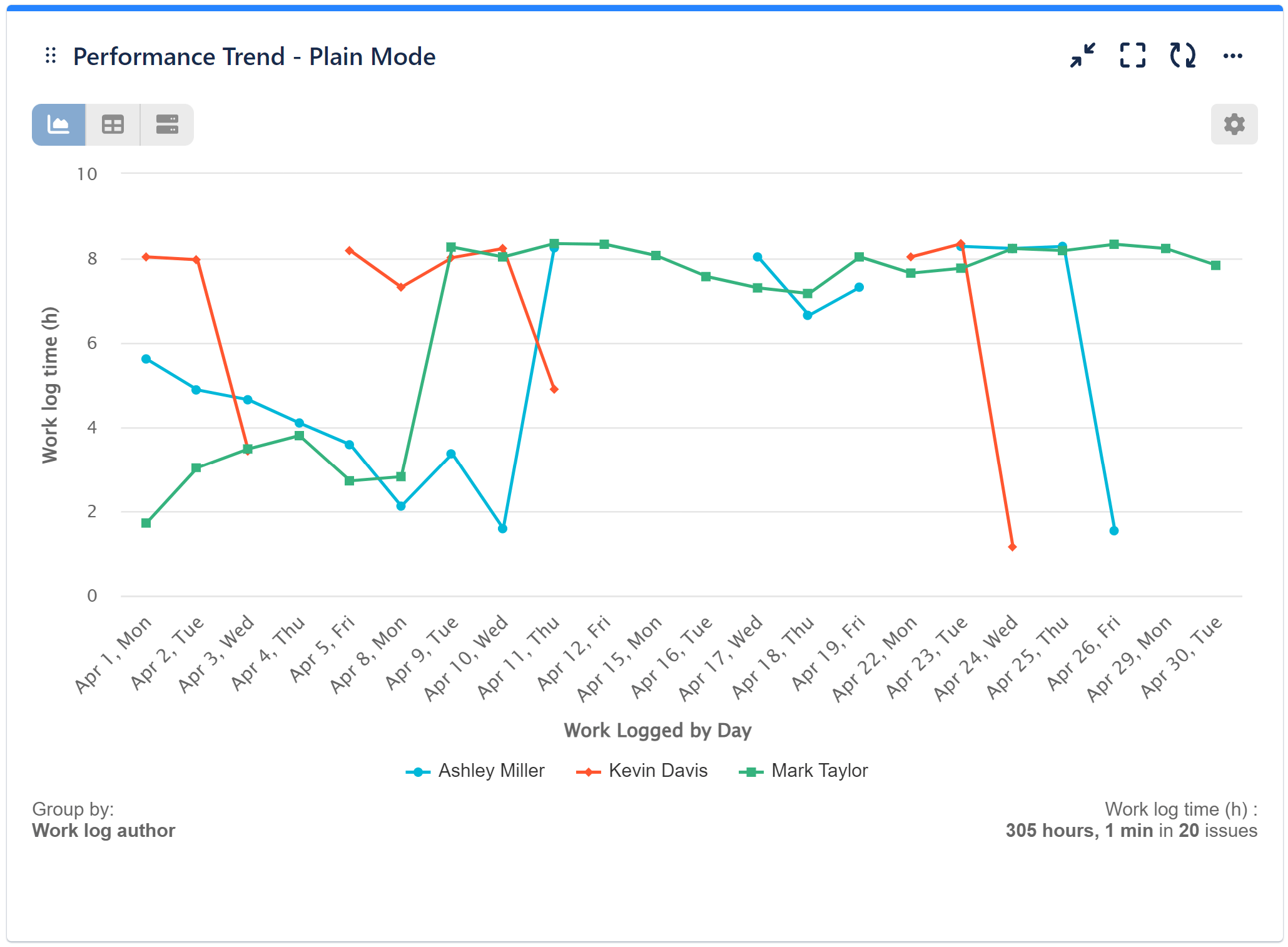
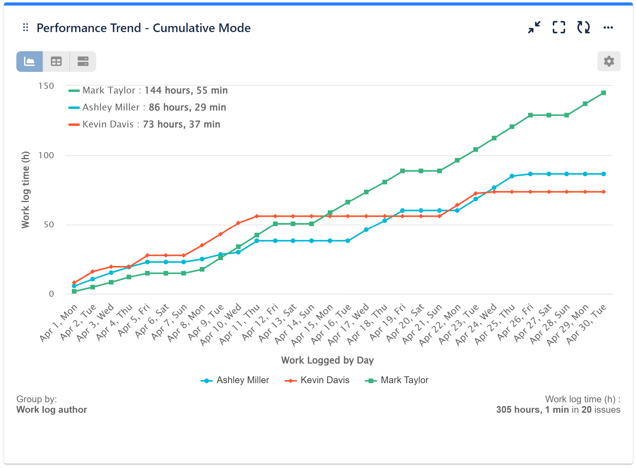
In addition to monitoring the overall progress of work completed by your team within a specific timeframe, it is important to analyze the distribution of workload among individual team members and identify any potential imbalances. Moreover, it simplifies the identification of potential bottlenecks in work log time. If an author’s line significantly widens vertically, it suggests a bottleneck where the accumulation of work log hours is slower compared to other authors.
In this specific instance, we can observe that Kavin Davis experienced a gap in the upward trend of accumulated work logged hours between April 10 and 20th. This gap can be attributed to his vacation during that period. Proactively identifying such discrepancies aids in addressing workload imbalances and promptly resolving performance issues.
Video Recording Utilizing the ‘Performance Trend’ Gadget
Please refer to the video below for guidance on how to switch to cumulative mode.
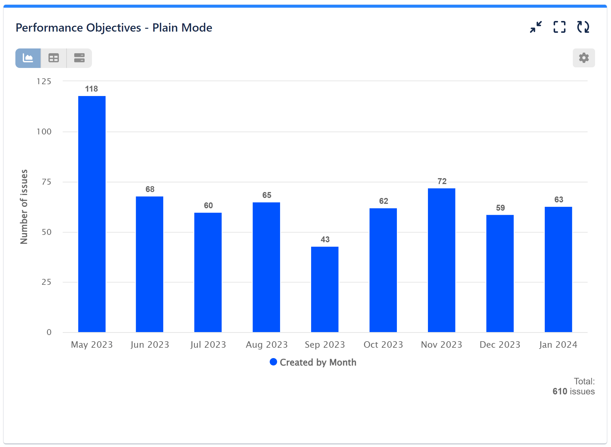
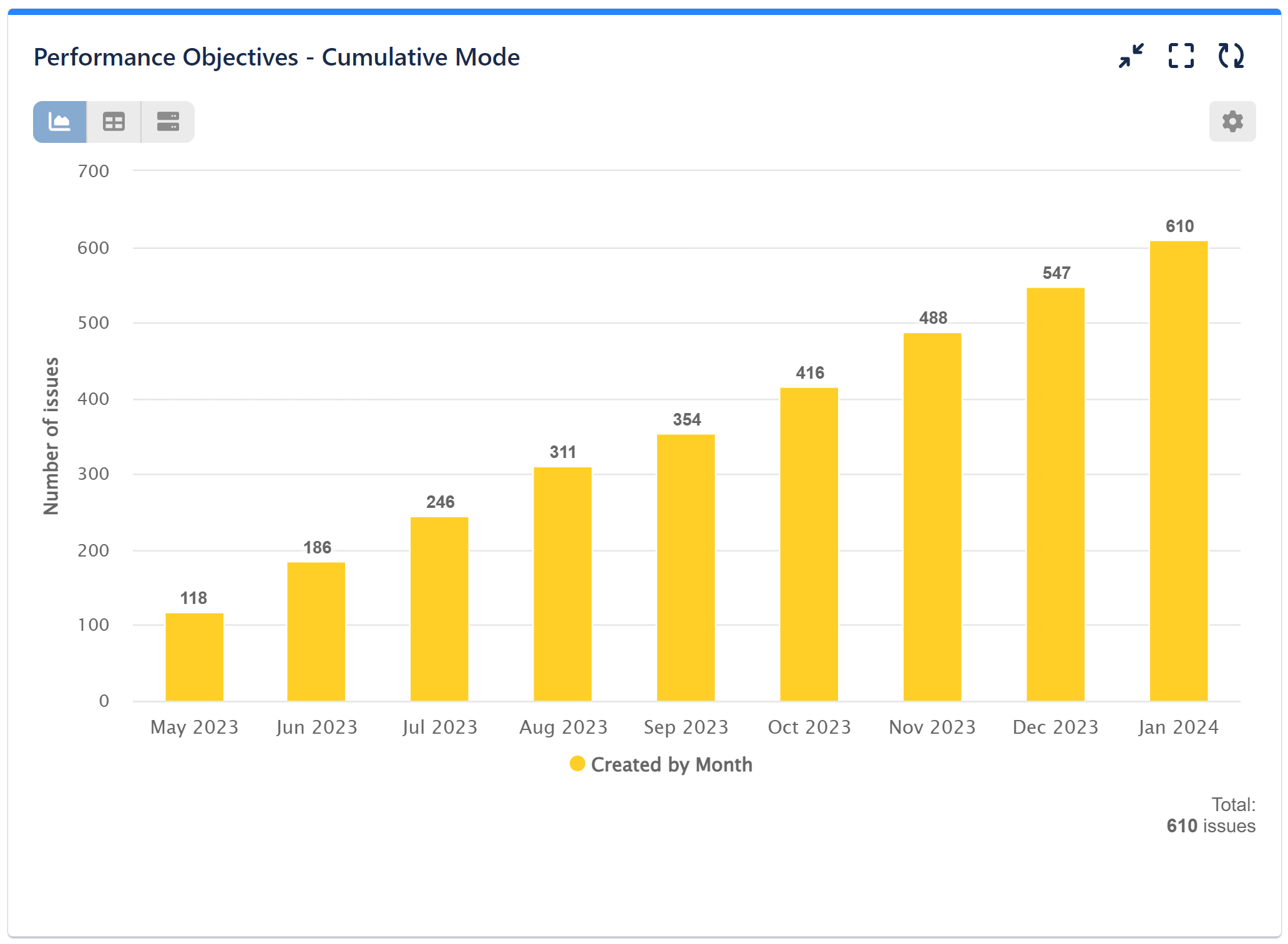
Cumulative Mode in ‘Performance Objectives’ Gadget
Performance Objectives gadget offers the flexibility to perform the same analysis using cumulative mode on a bar chart.
The first image shows monthly numbers in isolation, while the second one reveals the total accumulation of issues over time, offering a clearer view of patterns and trends within the specified timeframe.
To explore further information about Performance Objectives: Charts for Jira and discover the full capabilities of its gadgets, please refer to our comprehensive User Guide.
Start your 30 days free trial of Performance Objectives: Charts for Jira from Atlassian Marketplace.