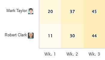
The Heat Map is one of the 10 standalone gadgets available within our app, Performance Objectives for Jira. Discover the…
The Heat Map is one of the 10 standalone gadgets available within our app, Performance Objectives for Jira. Discover the…
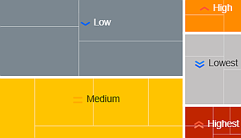
Performance Objectives for the Jira app comes with a variety of 10 dashboard gadgets to suit the reporting needs of…
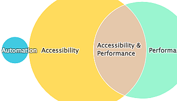
The Venn diagram is one of the 12 chart types supported by the Performance Objectives app for Jira. It’s a…
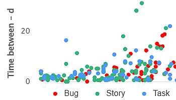
Powerful Data Insights: Harness the Potential of Scatter Charts The Scatter chart, also known as a scatter plot, is a…
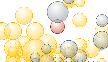
The Bubble chart is among the 12 available chart types within our app, enabling you to visualize tasks using up…
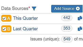
Use Multiple Data Sources for Enhanced Data Segmentation Performance Objectives: Charts for Jira app offers powerful capabilities to segment your…
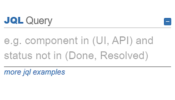
JQL Data segmentation option in Performance Objectives for Jira app provides you the ability to segment relevant data and customize…
Performance Objectives: Charts for Jira provides an array of built-in chart customization options. What distinguishes it is its ability to…
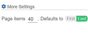
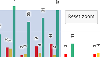
Performance Objectives: Charts for Jira introduces a robust feature allowing chart pagination, granting Jira users the capability to explore detailed…
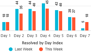
Enhance Period over period analysis – Visualize Jira data using “by date index” in Performance Objectives & Trend gadgets.