Take a closer look at each of the available gadgets in the Performance Objectives: Charts for Jira app and explore the best ways to use them.
Take a closer look at each of the available gadgets in the Performance Objectives: Charts for Jira app and explore the best ways to use them.
Performance Objectives: Charts for Jira app provides a wide range of chart types through its gadgets, allowing you to effectively…
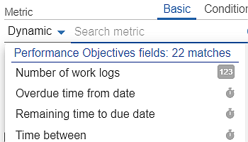
Configuration overview of the app’s robust features and a comprehensive list of Standard and Custom metrics and fields supported by the app, enabling powerful Jira reporting.
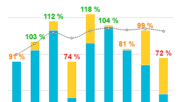
Performance Objectives is the flagship gadgets of the app, allowing you to leverage its powerful capabilities to create impressive and insightful bar charts.
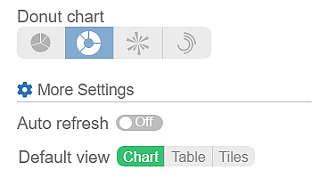
Diverse Jira Dashboards with Seamless Integration of Charts, Tables, and Tiles With our app, Jira users can elevate their user…
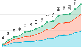
Performance Trend Gadget: Spotting Patterns on Your Jira Dashboard Introducing one of the 10 standalone Jira dashboard gadgets offered within…
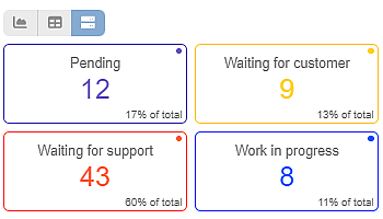
The Heat Map is one of the 10 standalone gadgets available within our app, Performance Objectives for Jira. Discover the…
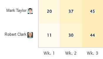
Using the Performance Objectives app, you can leverage a variety of sprint-related metrics and fields to build comprehensive sprint reports…
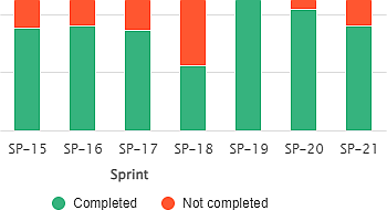
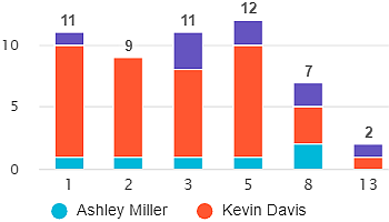
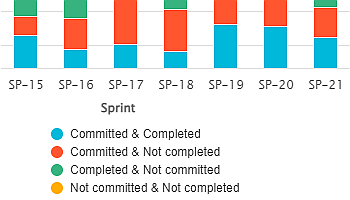
The Sprint Completion State Report, created using the Performance Objectives gadget, provides a detailed analysis of your team’s sprint performance…
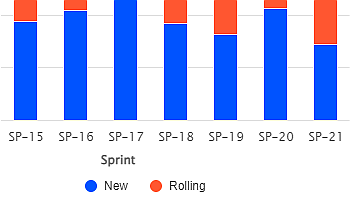
In agile project management, stories and their estimates sometimes don’t get completed within their original sprint and instead roll over…