Table of Contents
Diverse Jira Dashboards with Seamless Integration of Charts, Tables, and Tiles
With our app, Jira users can elevate their user experience, crafting insightful and visually appealing dashboards and reports by seamlessly integrating charts, tables, and now – tiles!
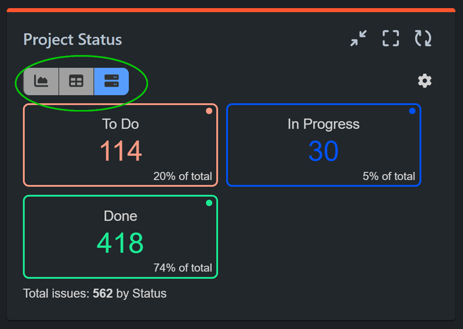
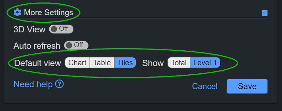
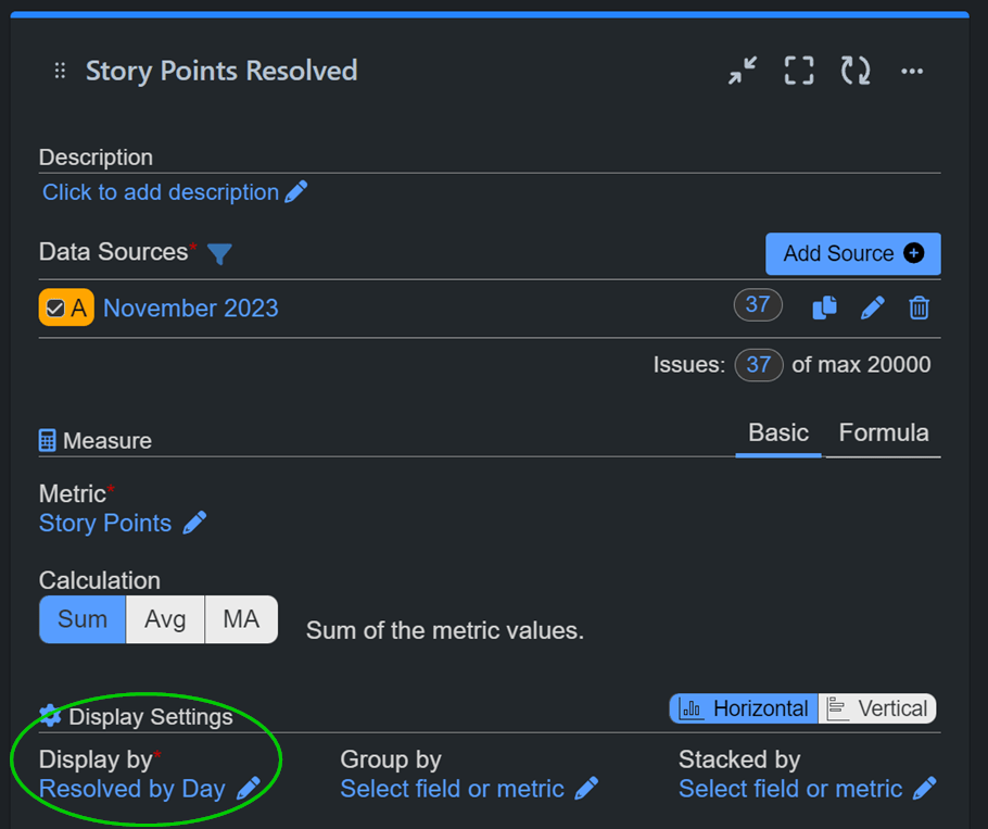
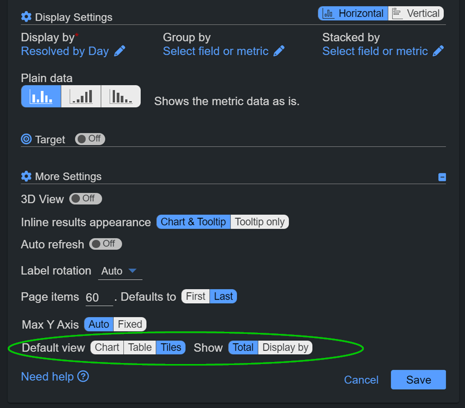
Seamlessly switching between these viewing options is just a click away directly from the chart. Additionally, users can set the default view to Tiles in the ‘More Settings’ section of the gadgets, ensuring that every time they load their Jira dashboard, it is presented in their preferred style.
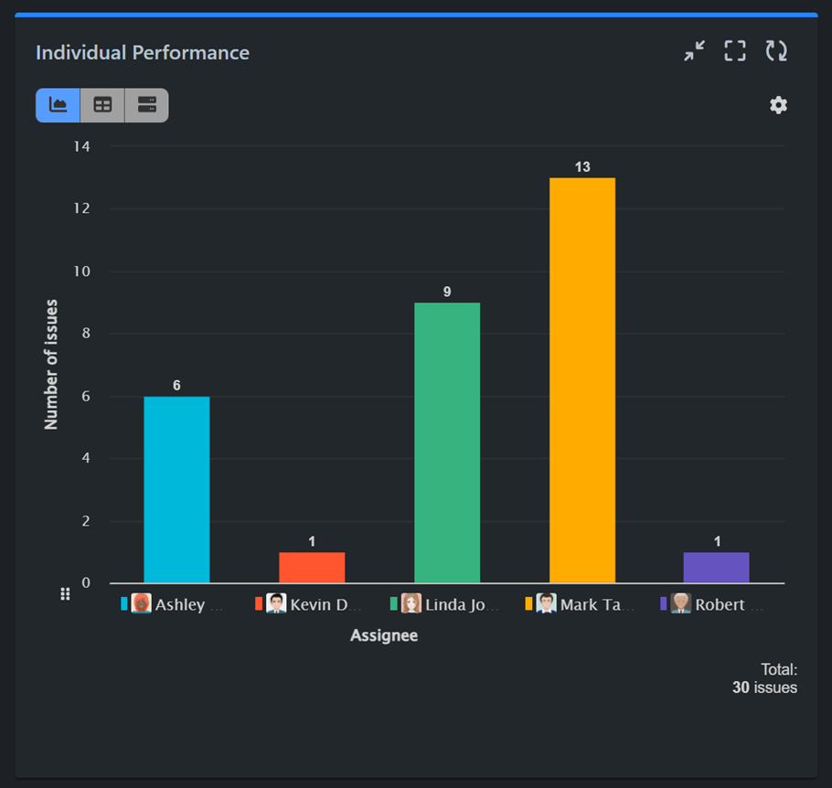
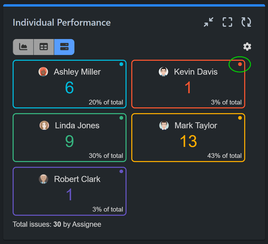
Enhance Project Insight with Tiles View: Perfect for 1D Charts
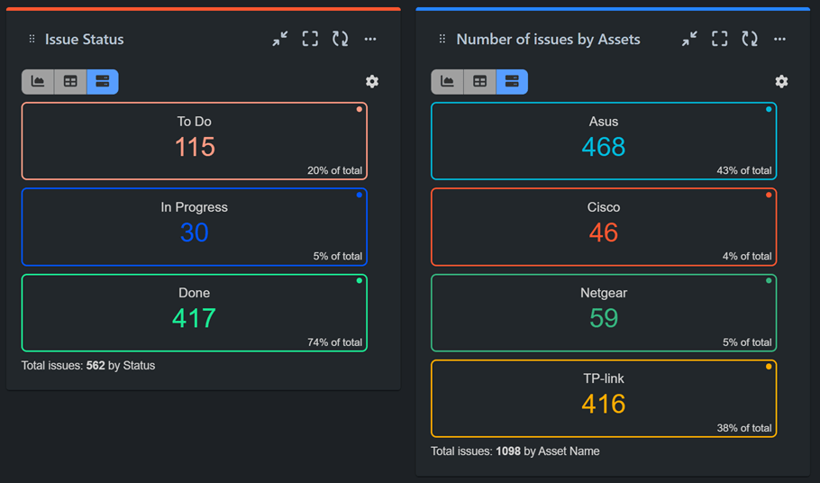
The Tiles View is particularly well-suited for 1D charts or configurations exclusively set up with a display by field. In such instances, each x-axis item is presented as a distinct tile, accompanied by a % of total indicator. Users can alternatively choose to view only the total in a single tile. This type of tile reporting proves invaluable for project progress checks and configurations where insights into the distribution of issues by status, priority, components, labels, assets, assignee, reporter, or other text fields are essential.
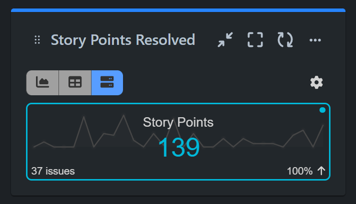
The Performance Objectives and Performance Trend gadgets can display a percentage change index and a sparkline when a date field is selected for ‘display by’ and Tile view is chosen, showing a total.
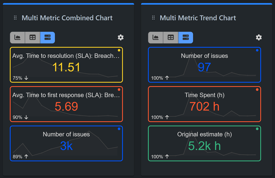
Tiles View Integration with Multi Metric Combined and Multi Metric Trend Gadgets
The second most effective application of the Tiles View is in conjunction with our Multi Metric Combined and Trend gadgets. Tiles view simplifies the interpretation of complex data by dedicating each tile to a distinct metric added to the configuration, ensuring that Jira users gain at-a-glance insights into various performance indicators.
In those two gadgets you can also enjoy sparklines. The visually appealing sparklines on each tile streamline trend analysis, allowing users to identify patterns and fluctuations with ease, thereby enhancing their ability to make informed decisions.
In addition, when a date-type field is set for ‘display by’, Tiles View goes beyond by presenting a Percentage of Change (% change) indicator on each tile. This feature provides users with instant insights into fluctuations, enabling a deeper understanding of data dynamics.
The Power of Tiles in Jira KPI Reports
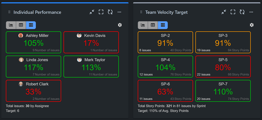
A noteworthy synergy exists between the Tiles View and our Targets feature, supported by Performance Objectives, Performance Trend and Change History gadgets of the app. Configuring a Jira KPI report with the target feature turned on allows users to see the percentage achievement completed toward the target. The color-coded tiles provide instant feedback—red for underachievement, green for meeting or exceeding goals, and amber if the configured threshold criteria are met.
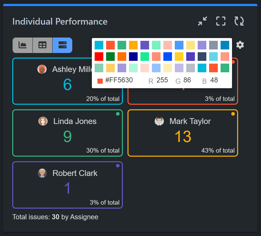
Tailoring Your Experience: Custom Tile Colors
Last but not least, customization lies at the core of our app. Users have the flexibility to choose custom colors for their tiles directly from the tile itself. Importantly, this customization extends to the corresponding items in the chart view, ensuring a cohesive and personalized dashboard experience.
Tiles View feature not only enhances usability and readability on Jira dashboards but also offers a variety of options for tailoring your data representation according to your unique preferences and needs.
If you want to learn how to create the most insightful and visually appealing dashboard in Jira, explore the 12 chart types supported by the app and their best uses, or delve into pivot tables and their benefits. Take a look at our KPI examples section, featuring sample Jira KPI reports.
Start your 30 days free trial of Performance Objectives: Charts for Jira from Atlassian Marketplace.