Table of Contents
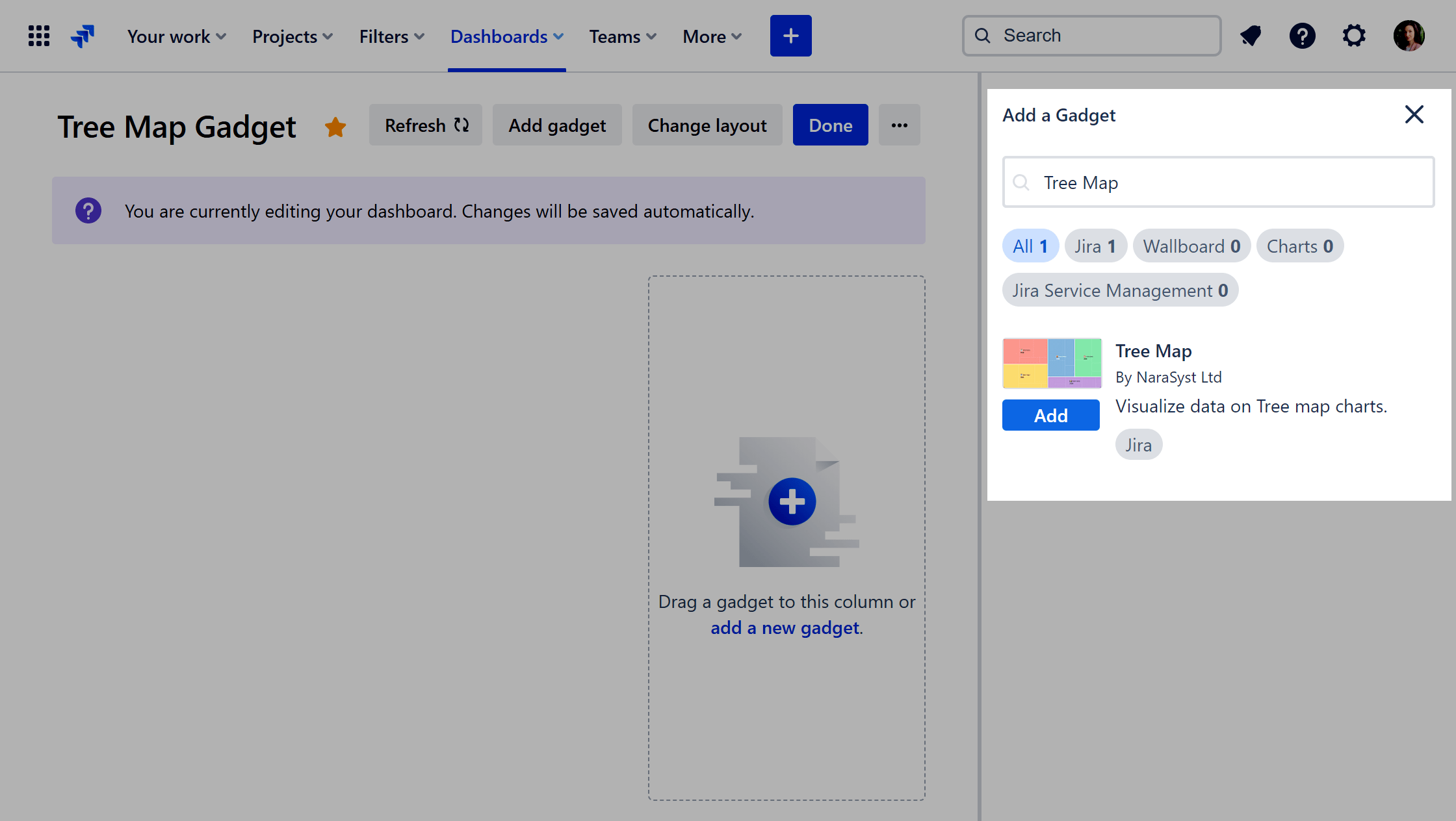
Performance Objectives for the Jira app comes with a variety of 10 dashboard gadgets to suit the reporting needs of every Jira user. In this article, we will introduce you to the Tree Map gadget, explain how to best utilize it and discuss its supported features.
Hierarchical Analysis in Jira with Tree Map
Discover the power of the Tree Map chart for dynamic visualization of ratios based on specific fields or metrics. With the ability to drill down and analyze three levels deep, the Tree Map offers unparalleled insight into hierarchical data, allowing you to effortlessly visualize part-to-whole relationships.
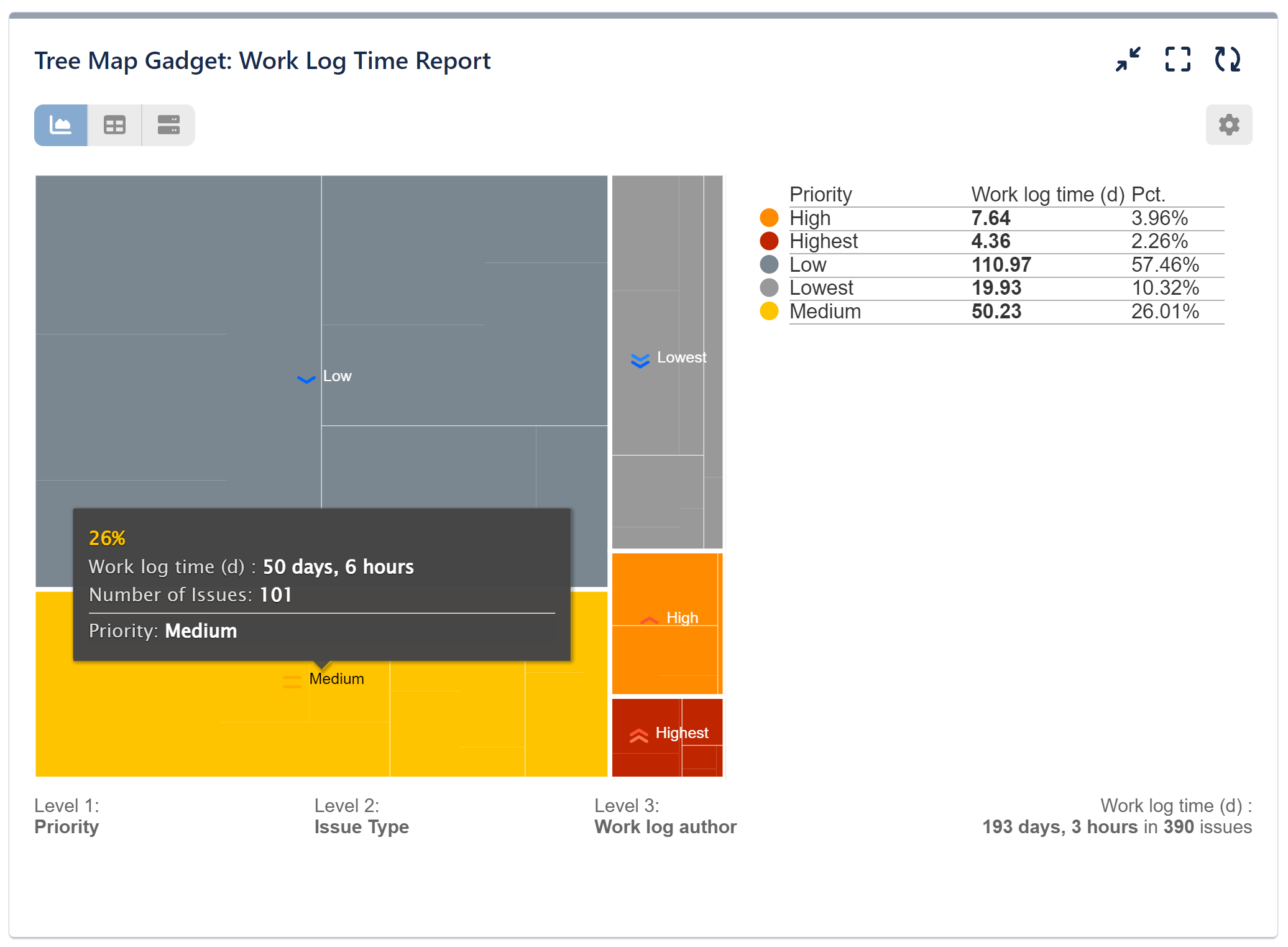
With its hierarchical structure and nested rectangles, the Tree Map chart offers an intuitive visualization method. In our sample report, we have displayed work logs per issue with various priorities. Each rectangle is dynamic, meaning that clicking on it reveals the second level of information — in our case, issue types. Delving deeper into the third level of the map unveils the author of each work log. Below are the configuration steps for this report.
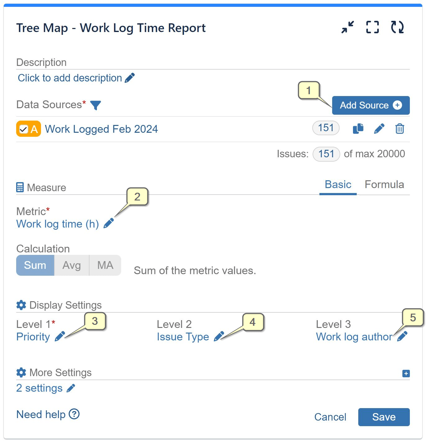
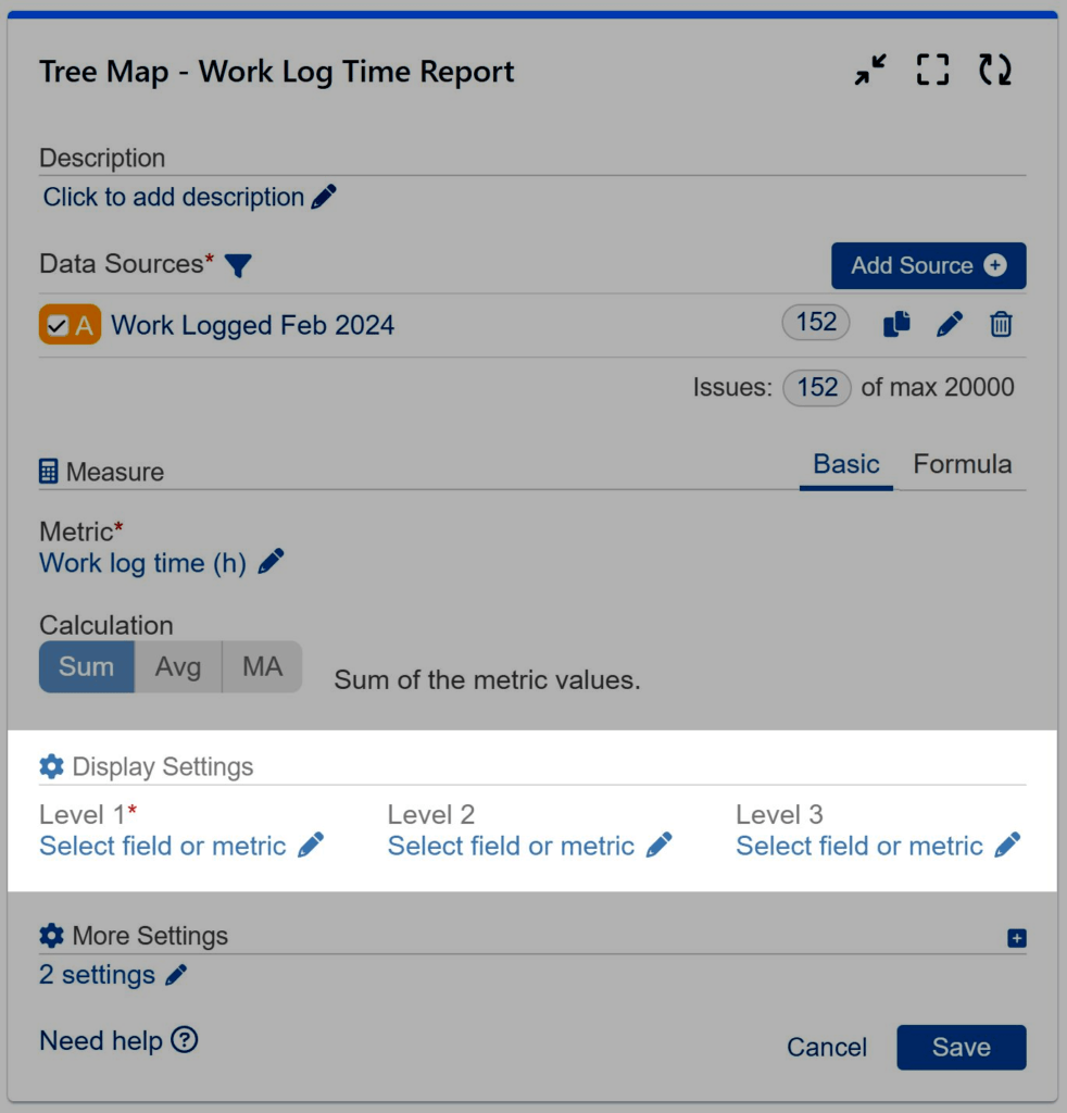
Step 1: Add data source. Filter out the issues that need to be analyzed. To explore Data Source options, please check the Configuration Overview article.
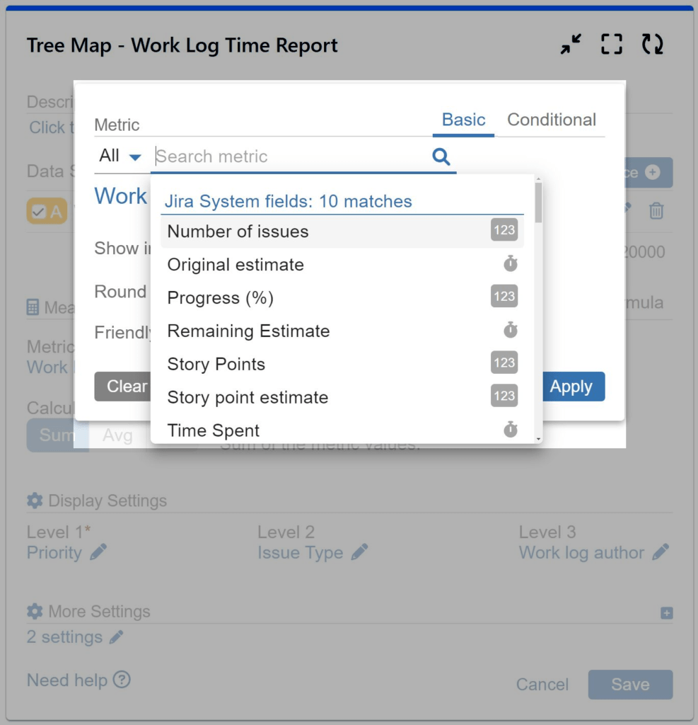
Step 2: Select metric ‘Work Log Time (h)’ from the available metric options.
Step 3: Select field ‘Priority’ for ‘Level 1’ from the available field options.
Step 4: Select field ‘Issue Type’ for ‘Level 2’ from the available field options.
Step 5: Select field ‘Work Log Author’ for ‘Level 3’ from the available field options.
Explore the Tree Map Gadget’s Powerful Features
Data Source Settings
Multiple Data Sources
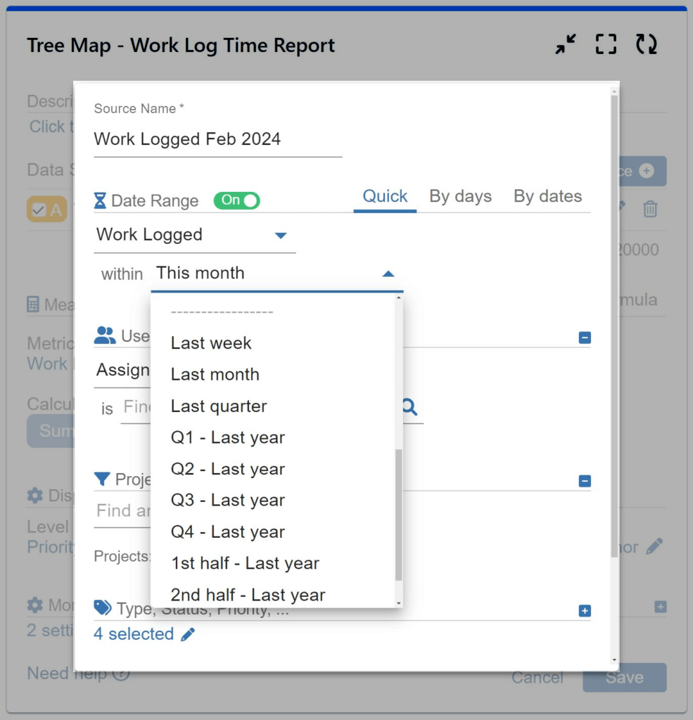
Custom Date Ranges
JQL Data Segmentation
This gadget allows you to seamlessly integrate multiple data sources to facilitate comprehensive analysis. In the Quick date range, benefit from a diverse selection of pre-defined periods such as this/last week, this/last month, quarters, the first or second half of this or last year, and more. For more granular control over date ranges, leverage the “By days” or “By dates” options. With these selections, you can specify exact start and end dates.
Measure Settings
Dynamic Metrics
‘Time in status’
‘Cycles in status’
‘Time in assignee’
‘Cycles in assignee’
‘Time between dates’
‘Number of Issues over time in Status’
Choose the most appropriate metric to meet your reporting requirements. Select from a wide range of metrics, including Jira System, Jira Service Management (SLA), Custom, or Performance Objectives’ app dynamic metrics, for your y-axis.
Display Settings
3 Levels of Display
The Tree Map gadget offers versatile display options, categorized as level 1, level 2, and level 3. These options enable users to drill down into data hierarchies with ease, facilitating deeper analysis and understanding.
Customization Settings
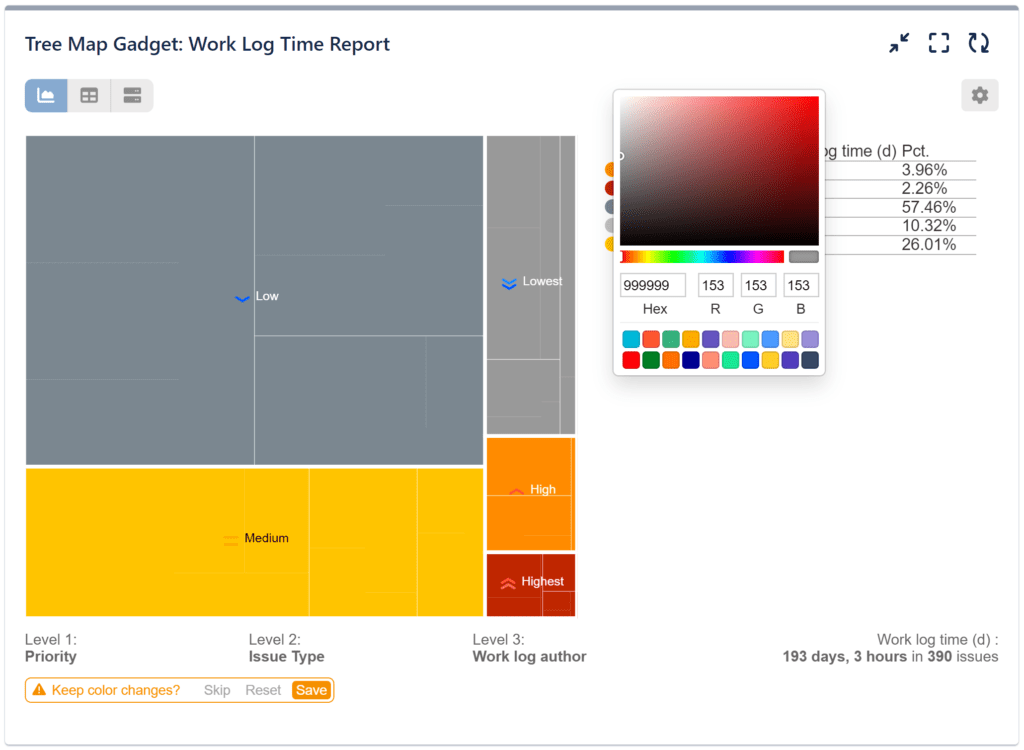
Pick Colors and Easily Customize
Tailor the default colors to seamlessly align with your dataset, enhancing the visual impact of your reports and ensuring clarity in data interpretation.


Start your 30 days free trial of Performance Objectives: Charts for Jira from Atlassian Marketplace.