Table of Contents
Tables and charts are both valuable tools for presenting data effectively. Each has its own advantages and functions. When deciding whether to use a table or a chart to visualize your Jira data, you must consider factors like your target audience, the specific data you want to review, and the desired impact of the visualization.
The Performance Objectives: Charts for Jira app offers 10 highly customizable charting gadgets to meet the needs of different Jira users. However, the app also recognizes the value of data tables. Introducing the new feature called Default Table View, this article explores why and when the table view is the ideal option for your reports.
Discover how the Performance Objectives app supports this functionality and simplifies its application.
When to Use a Table: A Quick Guide
The key question is, “How do you prefer to view your data: raw or processed?”
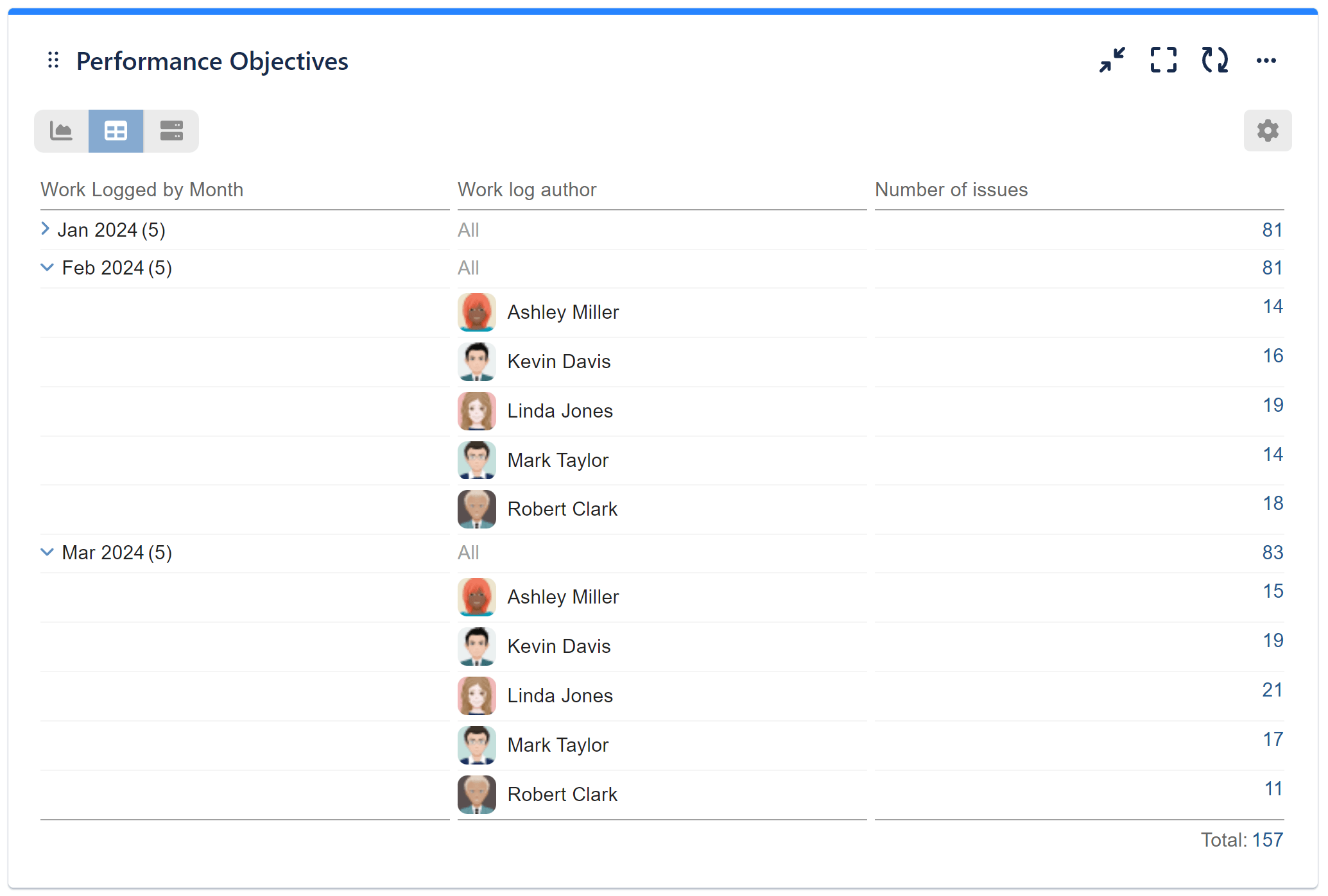
There are situations where data cannot be effectively presented through a chart alone. For instance, if you have various performance metrics tracking your team’s efficiency and output, such as original estimate, time spent, remaining estimate, and number of issues by issue type, visualizing them clearly can be challenging. In such cases, tables are valuable as they present the raw data directly, while charts summarize and enhance the data for visual impact.
Take a look at the images below to see the difference between a chart and table view for the same configuration:
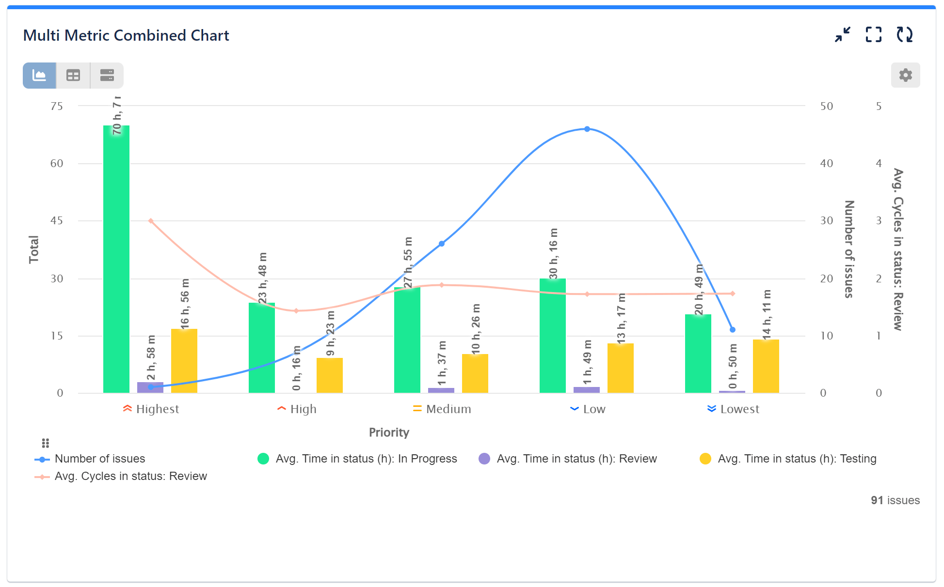
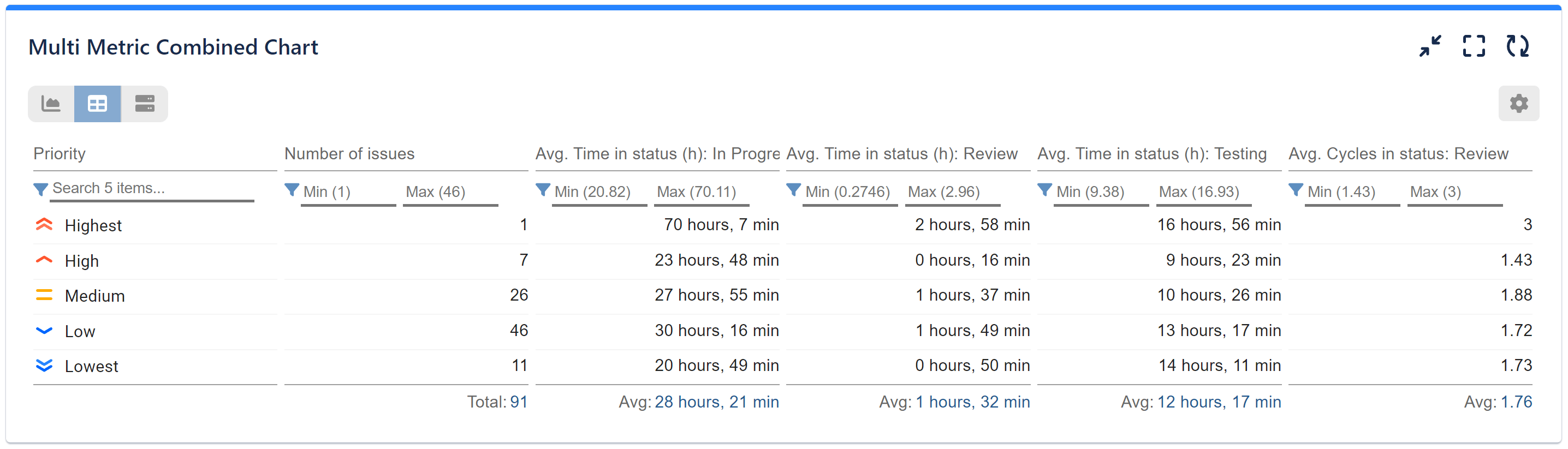
Tables are the best choice when precise values are needed. They allow for detailed analysis, offering a clear and direct representation that enables close examination of specific results. Tables are easy to understand, making them accessible to a wide range of users.
Tables are also especially useful when presenting a large amount of detailed information. They excel at maintaining precision, allowing users to explore specific numerical values rather than relying on approximations or visual representations. In complex financial or time spent analysis that involve pivot data and multiple data streams, tables are indispensable.
Default Table View with Performance Objectives
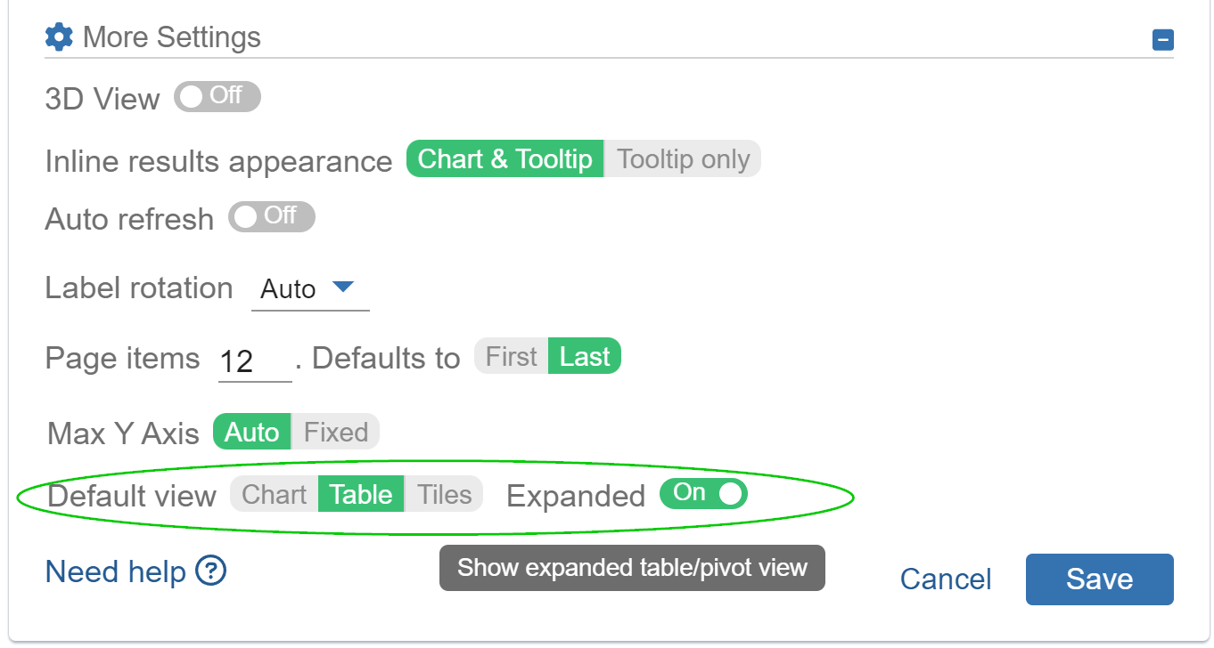
With Performance Objectives app, you can easily generate default table view reports without the hassle of switching between chart and table view option every time you want to check on your report. Here’s how you can achieve this:
- Access the Configuration screen and navigate to “More Settings”.
- Select Default view – Table.
- Optionally, click on “Expanded” to maximize the width of the table display.
- Apply the chosen settings and enjoy the convenience of your table view on your Jira dashboard
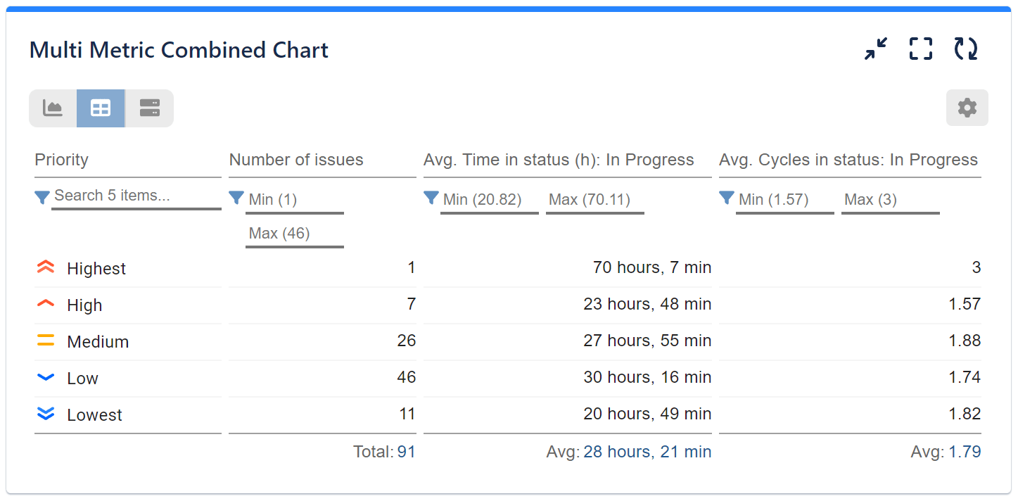
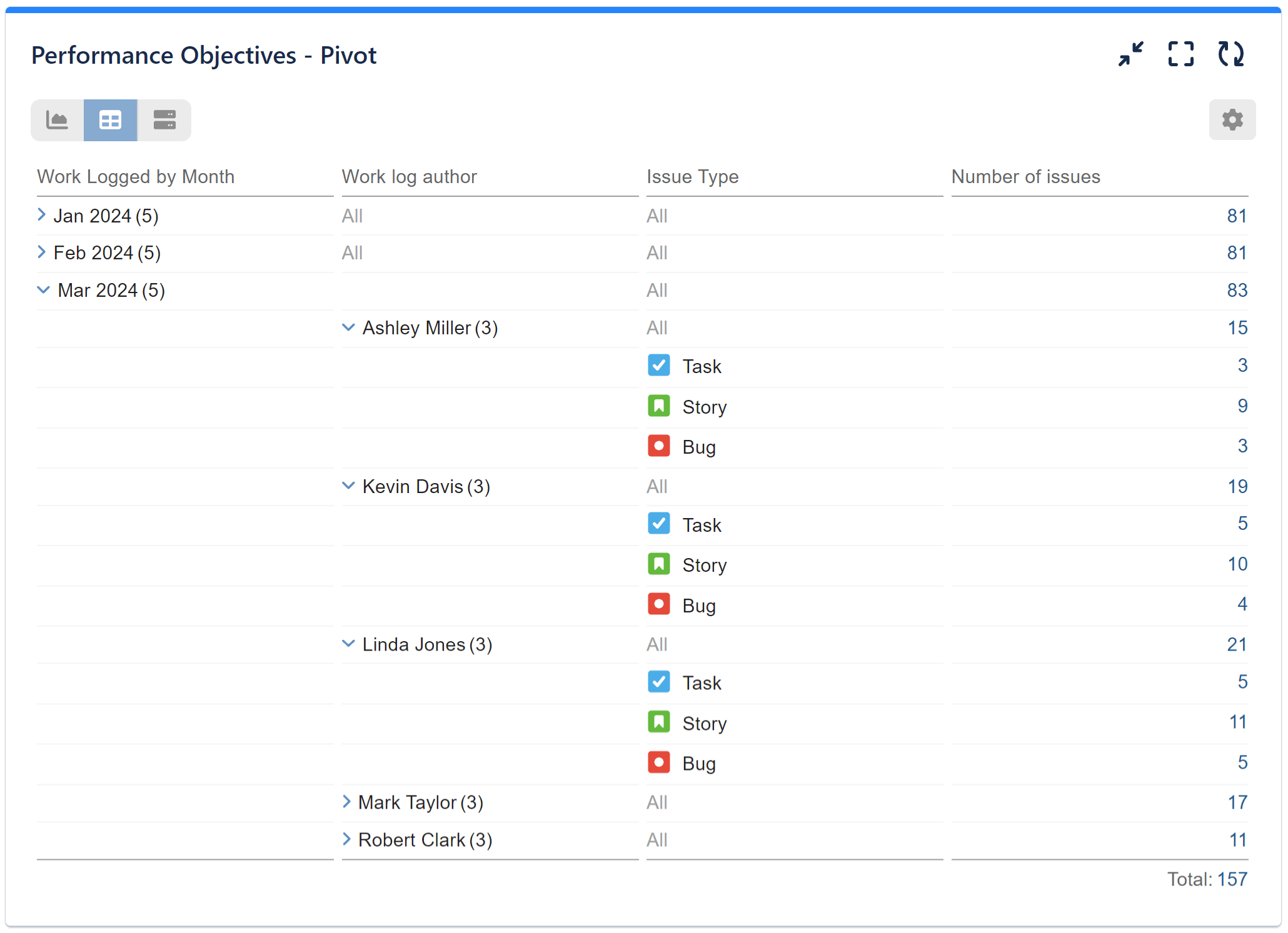
Pivot Table with Performance Objectives
Distinct from standard tables, pivot tables allow for the presentation of dimensions across both rows and columns. A pivot table consolidates and summarizes individual data points from a larger table based on one or more distinct categories.
Key features of pivot tables, available for all Performance Objectives dashboard gadgets, include:
- Multi-level grouping
- Multi-column sorting
- Filtering (when not in grouped state)
- Exporting in CSV format (compatible with Excel)
The images below demonstrate standard, two-dimensional, and three-dimensional pivot tables created using the Performance Objectives gadgets:
To learn more about all the app features, please refer to our User Guide.
Start your 30 days free trial of Performance Objectives: Charts for Jira from Atlassian Marketplace.