Powerful Data Insights: Harness the Potential of Scatter Charts
The Scatter chart, also known as a scatter plot, is a powerful tool for visualizing relationships and dependencies between two data variables. It excels at displaying a large number of issues individually, making it effortless to spot outliers and delve deeper into their significance.
The Performance Objectives app offers an exceptionally versatile Scatter plot, which you can easily configure on any Jira standard dashboard using the ‘Scatter & Bubble charts’ gadget. With this chart, you can explore issue distribution based on any Jira metric, allowing you to identify anomalies and correlation patterns with other standard or custom metrics and fields. This capability provides valuable insights into your data, aiding in data-driven decision-making and performance optimization.
The ‘Scatter & Bubble charts’ gadget serves as a powerful tool for effectively visualizing a wide array of reports. Some examples of reports that can be vividly depicted with Scatter chart include:
- Cycle time vs Lead time, grouped by Issue priority;
- Time between ‘Created’ and ‘Resolved’ vs Time in Assignee “Unassigned”, grouped by SLA ‘Time to resolution’ Breach;
- Time in status ‘Open’ vs Time in status ‘To do’;
- Time to resolution ‘Breached’ vs Time to first response ‘Breached’, grouped by ‘Assignee’, etc.
Optimizing Operations: Unveiling Insights with the ‘Cycle Time’ Scatter Plot Report
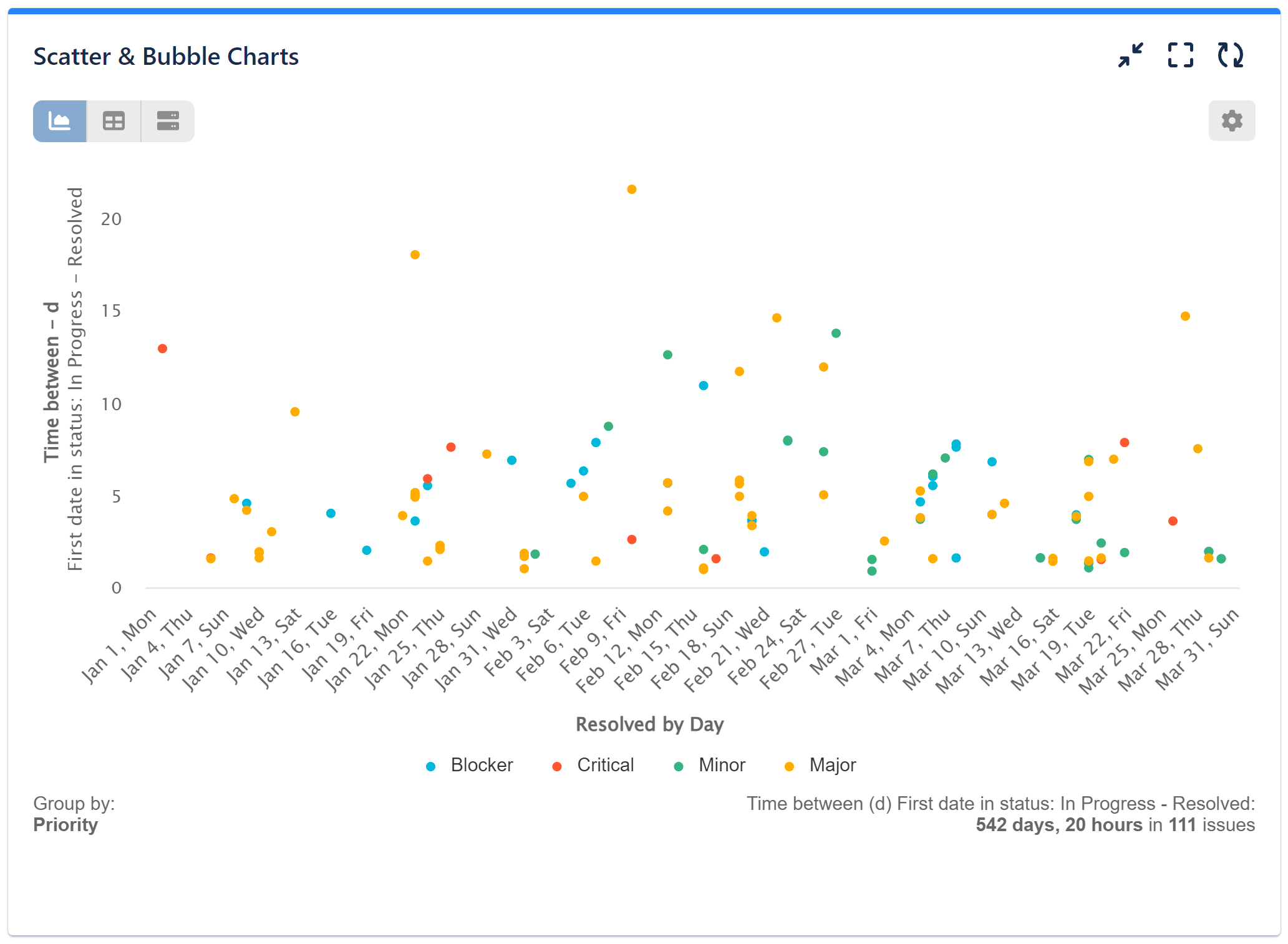
Please find below configuration video for ‘Cycle Time’ scatter plot utilizing ‘Time between’ metric. Metric data is displayed by ‘Resolved by Day’ and grouped by ‘Issue priority’.
Here are the configuration steps along with a preview of the configuration screen:
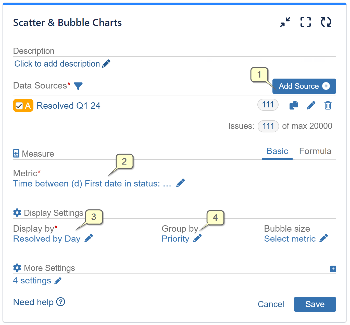
Step 1: Add data source to filter out the issues you want to analyze.
Step 2: Select metric ‘Time between’ from the available metric options and select the date fields that you are interested in.
Step 3: Select field ‘Resolved’ for ‘Display by’ from the available field and metric options. Choose date granularity for the metric data. In the sample case it is ‘by Day’
Step 4: Select field ‘Priority’ for ‘Group by’ from the available field and metric options.
Consider these additional or optional steps for configuring your chart to further customize it:
Open ‘More settings’ section and set custom page items value. Save the configuration.
Other chart customizations available for the saved configuration:
- Select custom colors for your data sets;
- Hide certain groups from the chart by clicking them;
- Zoom any chart area to view certain issue clusters – drag the mouse on the chart and define the area to zoom. The chart will expand and show only the selected area. You can zoom multiple times to view in detail any chart area. Click the ‘Reset zoom’ button to return the chart to its initial view. Zoomed-in area view:
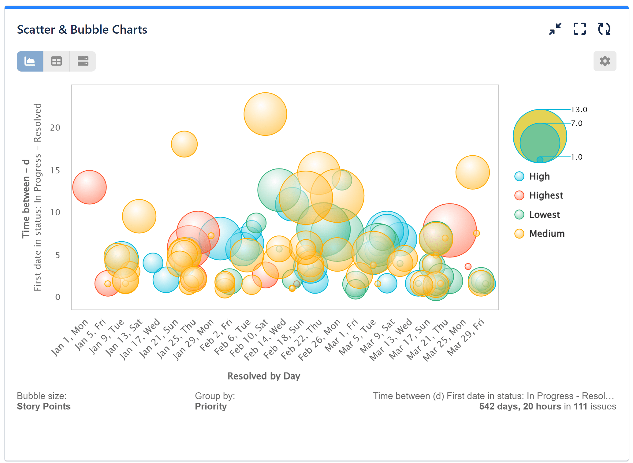
Upgrade Your Scatter Plot to a Bubble Chart with One Click
If you incorporate a metric to the ‘Bubble size’ option into your configuration, you’ll transform your chart into a dynamic Bubble chart. Here’s an example of a bubble chart created using the same configuration as described above, with the addition of the ‘Story points’ metric set as the ‘Bubble size.’
Explore the Bubble chart in the related article.
For a comprehensive overview of all available chart types within the Performance Objectives app, refer to the Charts Overview article.
Start your 30 days free trial of Performance Objectives: Charts for Jira from Atlassian Marketplace.