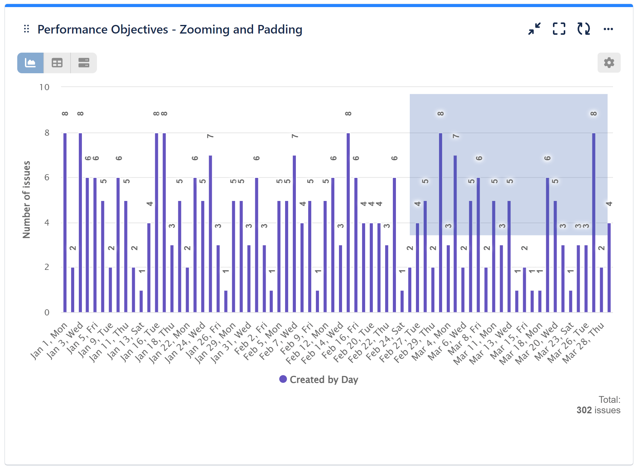
Performance Objectives: Charts for Jira provides an array of built-in chart customization options. What distinguishes it is its ability to present Jira data in a clear and thorough manner, enabling better data analysis. Utilize the zooming and padding feature to navigate extensive charts with numerous x-axis items. Simply drag your mouse across the chart to specify the area for a more detailed examination.
Elevate Data Visualization with Zooming
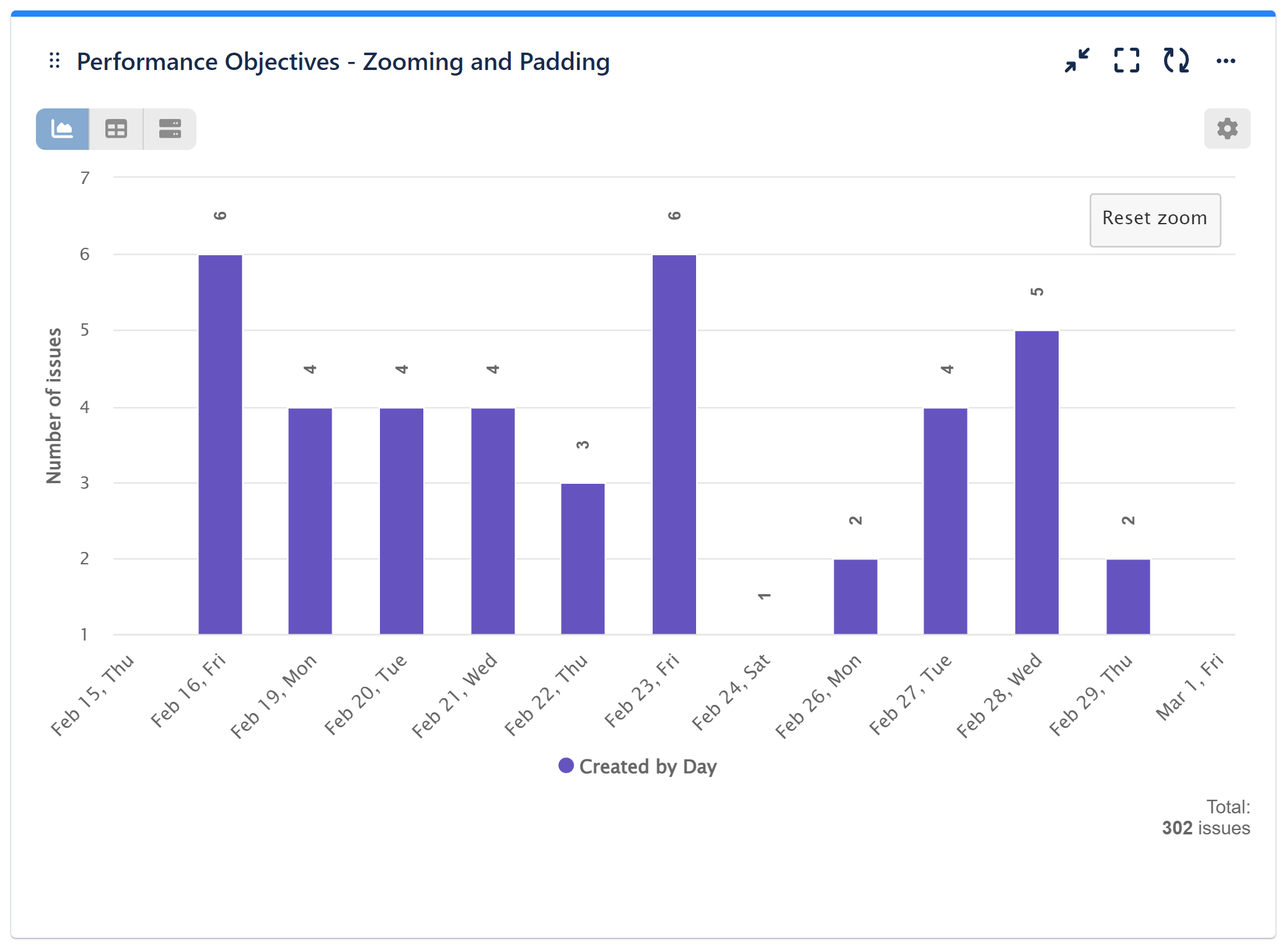
Once selected, the chart will seamlessly expand to display only the chosen range, enabling you to zoom in multiple times for an in-depth examination of your data.
To reset the chart to its initial view, just click the ‘Reset’ button as show on the image below:
Effortlessly Navigate Through Chart Results with Padding
What’s more is that you can further enhance your analysis by utilizing the chart padding function and scrolling through the results in any direction. To activate this feature, press and hold the ‘Shift’ key and use your mouse to navigate the chart as needed.
Please watch the screen recording with the user interaction steps:
If you’re interested in delving deeper into chart result customizations, be sure to explore our Pagination article. For a comprehensive understanding of our app’s full potential, consult our User Guide to discover other powerful features.
Start your 30 days free trial of Performance Objectives: Charts for Jira from Atlassian Marketplace.