Table of Contents
Explore Cross-Metric Trend Analysis with Multi Metric Trend Gadget
The Multi Metric Trend Chart is one of the 10 standalone gadgets available in our app, the Performance Objectives for Jira. This powerful gadget enables cross-metric analysis of up to 10 metrics, allowing users to customize their positioning on the y-axis. This functionality generates advanced multiple / dual-axis charts for your Jira data, facilitating comprehensive analysis. The distinction of this gadget from the Multi Metric Combined Chart gadget is its limitation to date fields exclusively for the x-axis and its support for line or area visualization for the list of metrics.
In this article, we will explore the key features of the gadget.
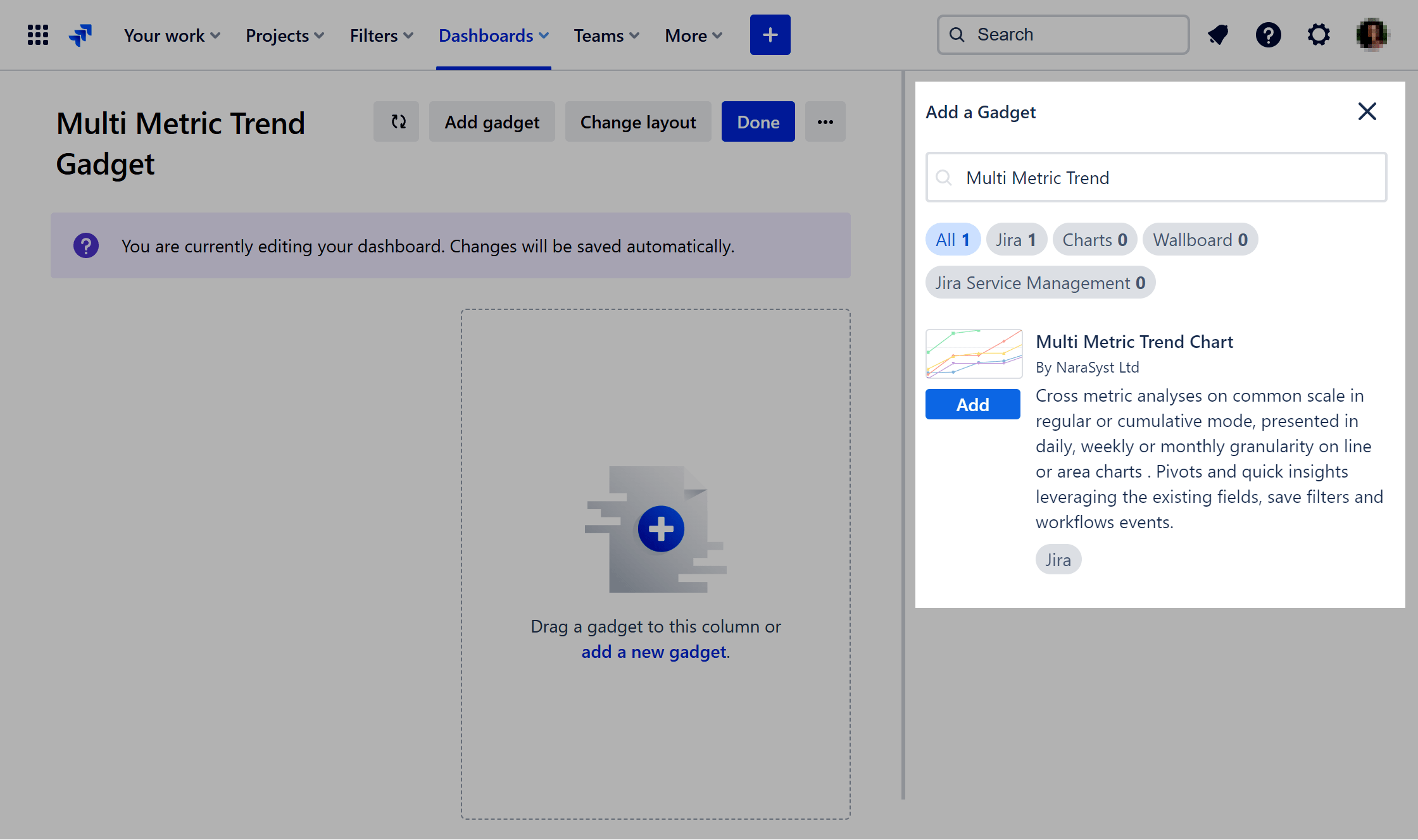
To begin using the gadget, navigate to Jira Dashboards, select “Add gadget,” type “Multi Metric Trend” into the search bar, and then click “Add.”
Key Features of the Multi Metric Trend Jira Dashboard Gadget
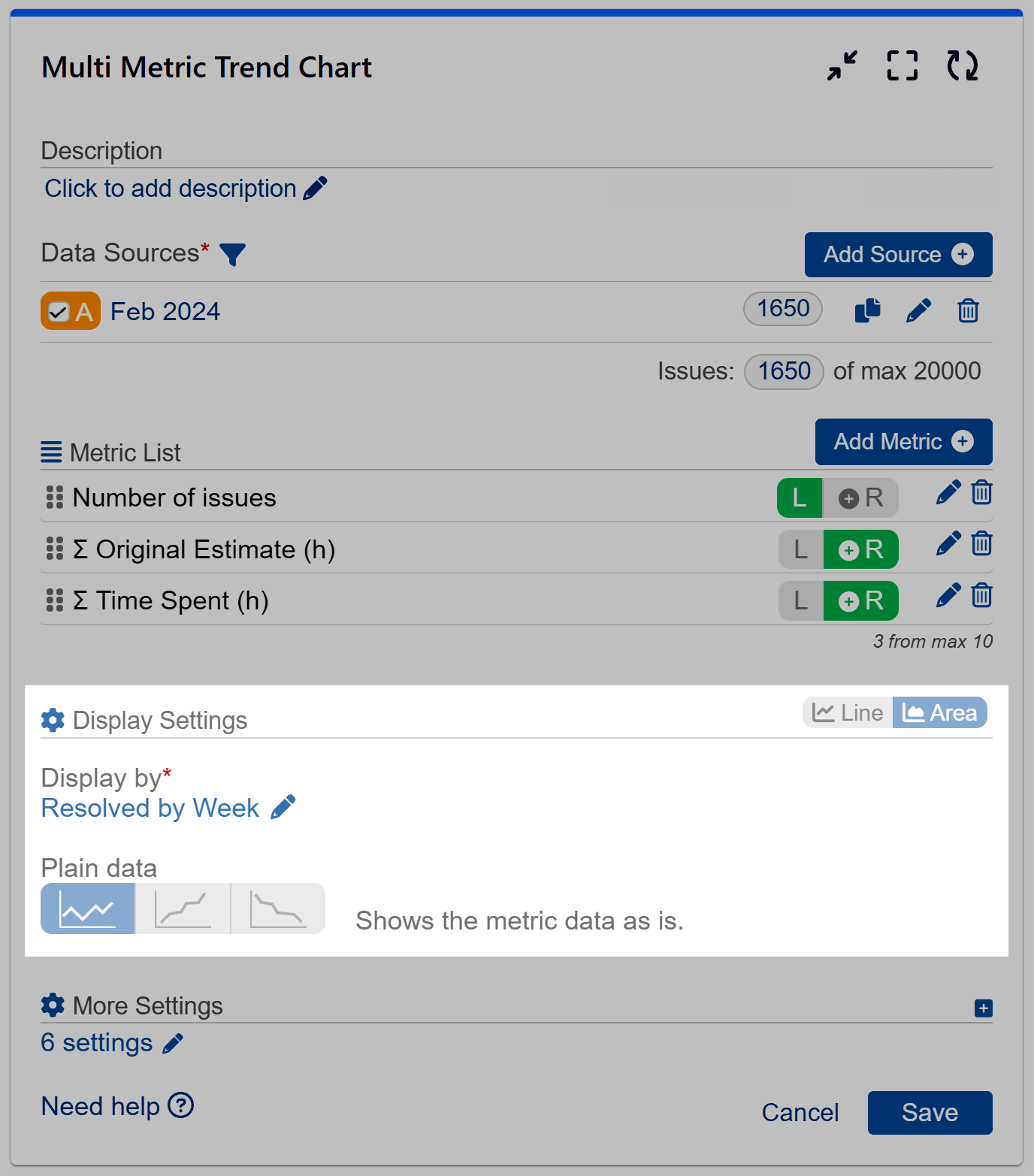
Multiple Data Sources and Data Segmentation
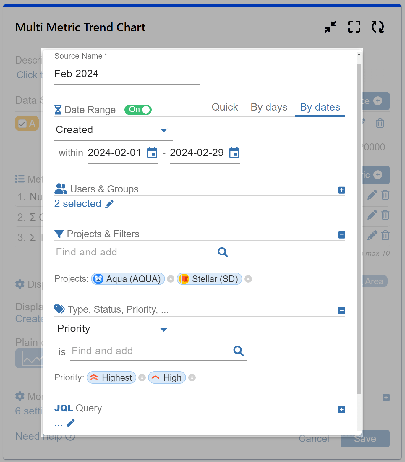
Take advantage of the ability to incorporate multiple data sources and customize each one using our data segmentation feature. Utilize separate filters for each data source and compare them on a single chart.
Measure Settings
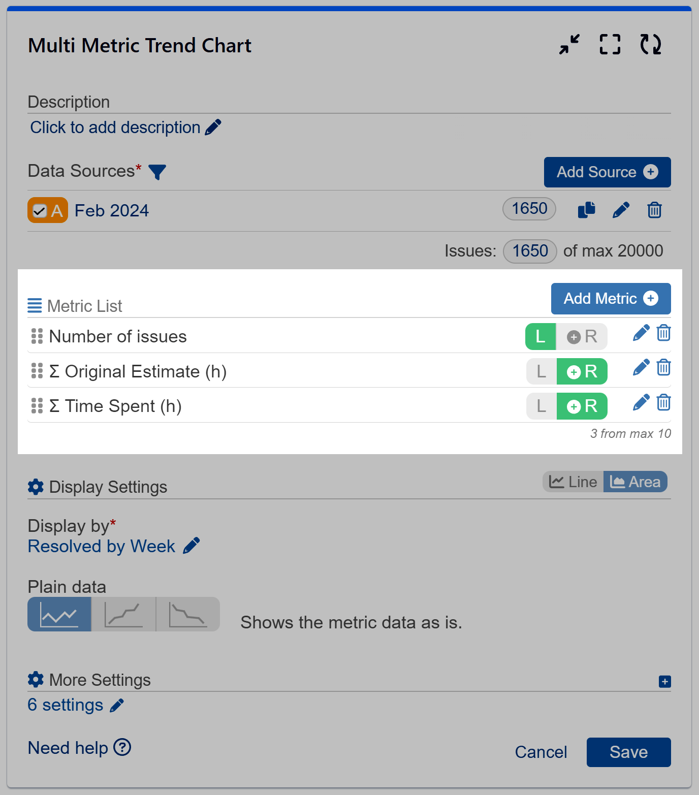
Add up to 10 metrics and display them across multiple y-axes on a single chart. For optimal data readability, we recommend using no more than 3-4 metrics per chart. Choose from a variety of basic and ready-to-use metrics (for a full list, check our Configuration overview article) or create custom metrics using the Conditional feature.
Choose to place the y-axis ranges on either the left or right side of the chart. When choosing the left side, all metrics on the left will share the same y-axis scale, allowing for easy comparison. Conversely, placing metrics on the right side means each metric will come with its separate scale on the y-axis.
Easily reorder the added metrics using simple drag and drop.
Select the calculation method – sum or average – for each metric you add.
Display Settings
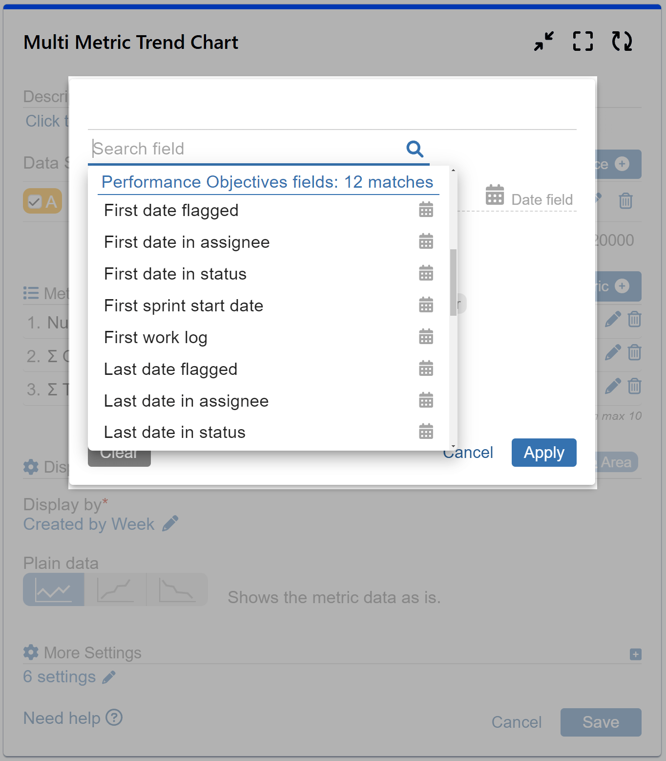
Display your data in either line or area mode. The Multi Metric Trend chart only supports date-type fields for the x-axis to enable trend and correlation analysis, so select one from the drop-down menu.
Additionally, you can choose from Plain, Cumulative, and Declining display modes. However, please note that this gadget does not support stacking and grouping.
Toggle on the “Exclude Items with 0 Metric Values” feature to filter out dates without records.
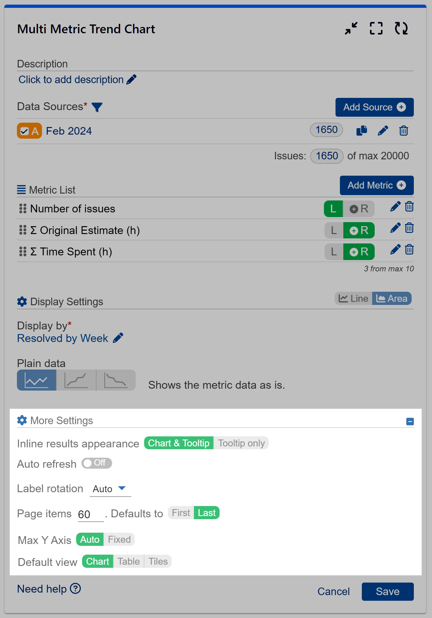
Customization and More Settings
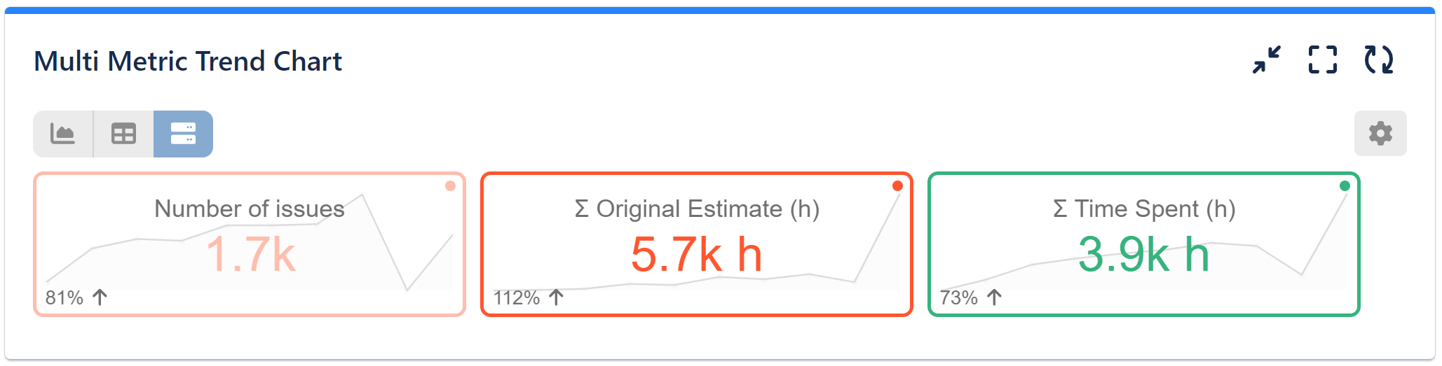
Under More Settings, you will discover additional features for customizing the appearance of your chart. Moreover, directly from the chart, you can select custom colors for each metric or switch from chart to table or tiles view. The tiles view provides a summarized and easy-to-grasp overview of totals per metric, percentage change index, along with a beautiful sparkline.
Dual-Axis Chart Examples: Multi Metric Trend Gadget in Action
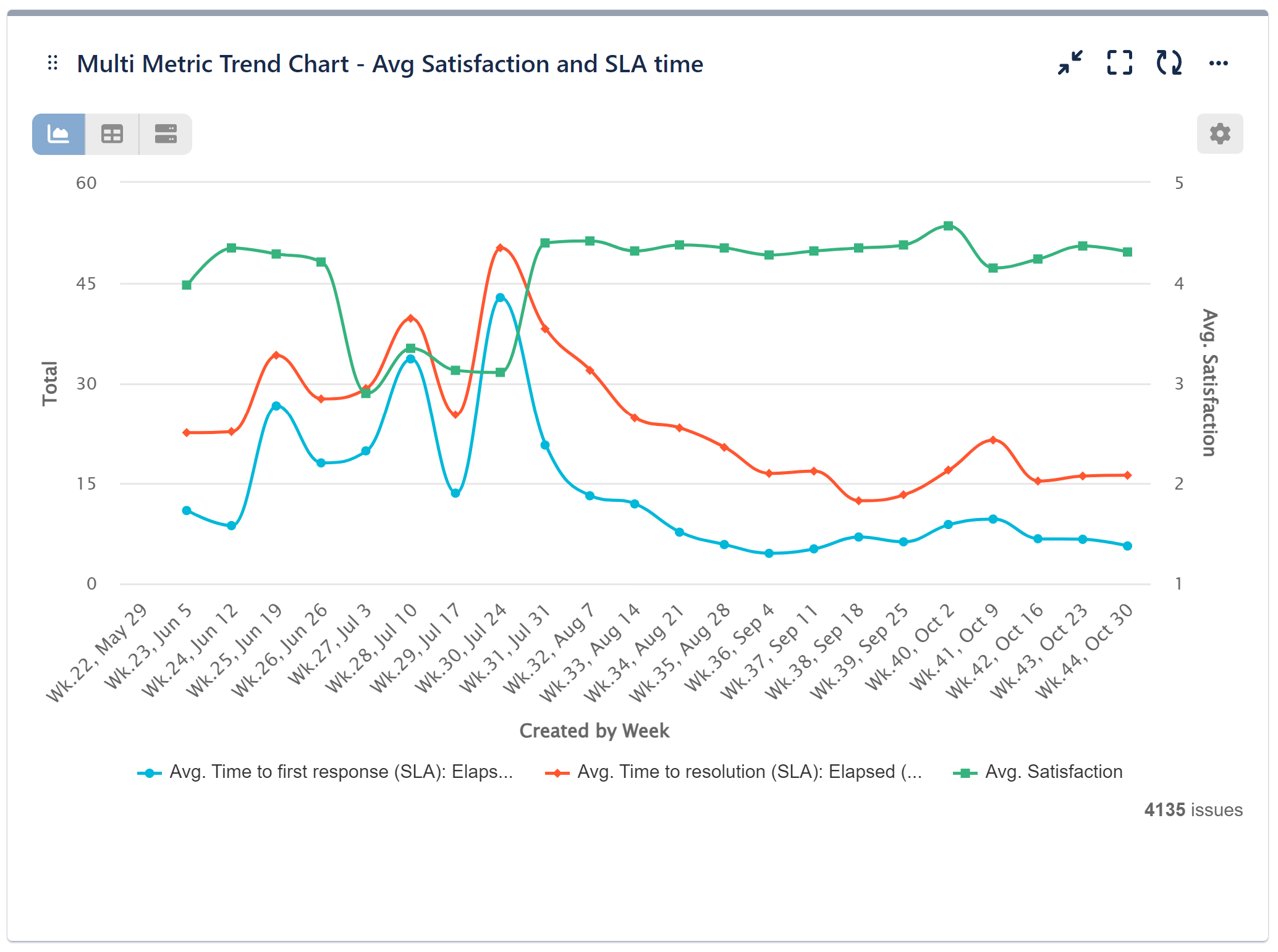
In our sample reports, we’ve utilized the Multi Metric Trend chart gadget to demonstrate its effectiveness. On the chart below, you’ll see three trend lines representing different Jira Service Management metrics for issues created weekly. We’ve selected to calculate averages for the time-tracking SLA metrics (Time to First Response and Time to Resolution) and Satisfaction. We have opted for the plain line mode for simplicity.
Here, we are utilizing the Left / Right option to ensure a comprehensive representation of our data. We’ve placed both time metrics (SLAs) on the left, sharing the same y-axis range, allowing for easy comparison, while the number metric (Satisfaction) is on a separate y-axis positioned on the right side. This setup provides clear insights into performance trends, aiding decision-making and planning.
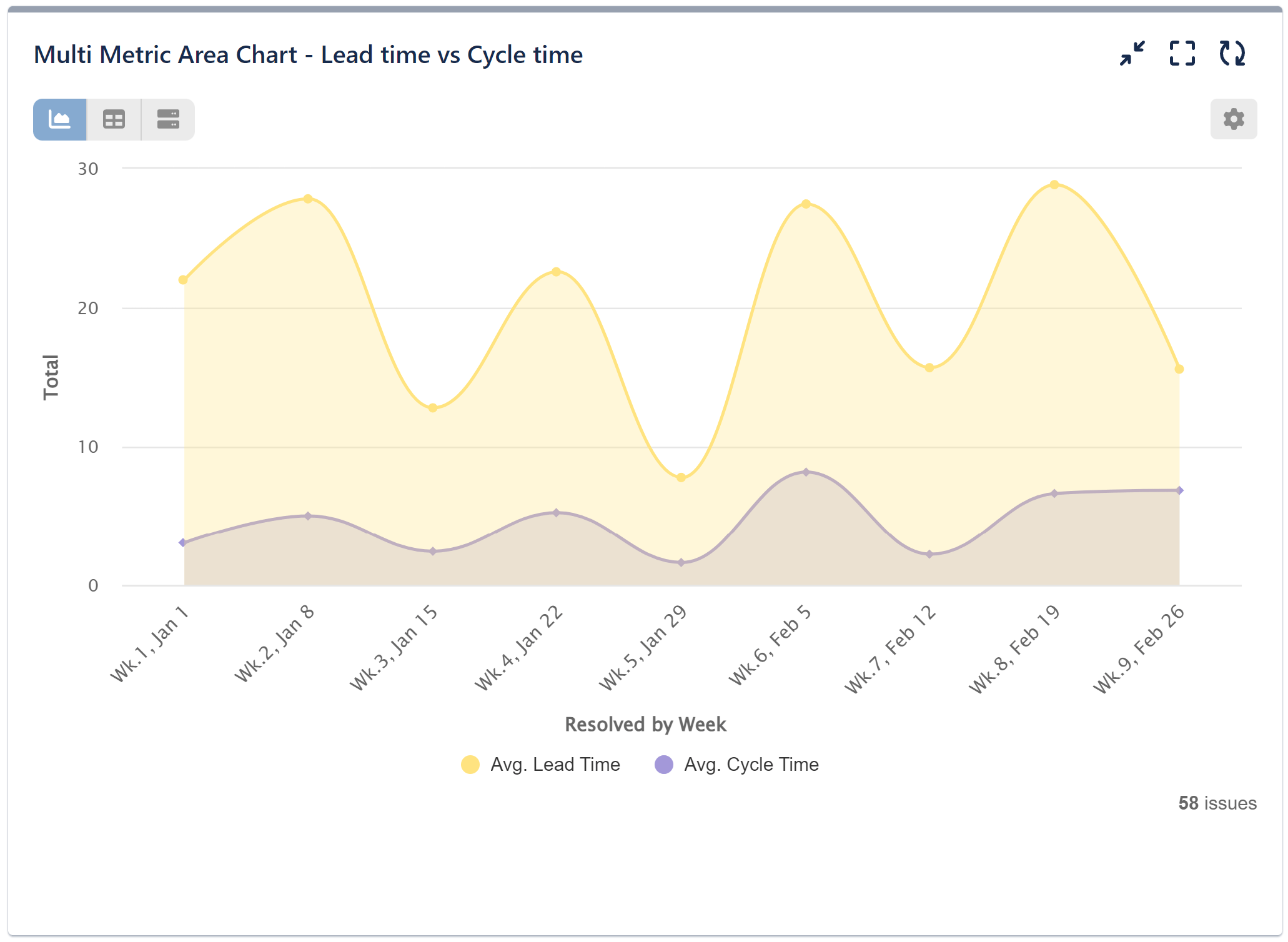
In our second sample chart, we’ve compared two metrics – the average lead time, which signifies the duration from issue creation to resolution, with the average cycle times, reflecting the actual time spent on issue resolution tasks. Both metrics play crucial roles in performance management, offering insights into how work progresses over time and highlighting potential process bottlenecks. Understanding the average duration required to complete a cycle enables managers to establish baselines and benchmarks for assessing their Jira team’s performance. Here, we have opted for the area mode to visualize the data.
Note that we have placed both time metrics on the left side, assuring they share the same y-axis scale. This arrangement enhances chart readability.
Would you like to explore the Multi Metric Combined Chart gadget or all the features of the app? Check out our User Guide. Discover our KPI examples for inspiration on the diverse Jira reports achievable with the robust features of the app.
Start your 30 days free trial of Performance Objectives: Charts for Jira from Atlassian Marketplace.