Table of Contents
Simplify Data Interpretation with Pie Charts in Performance Objectives App
Pie charts enjoy widespread popularity due to their simplicity. They are easy to understand and widely used in various business contexts and scenarios. These charts are particularly effective in visualizing part-to-whole comparisons within small datasets. With their clear segments, they allow for quick comprehension of the relative proportions of different categories or components and grasping the overall picture at the same time.
This article focuses on how Performance Objectives: Charts for Jira enables you to collect, showcase, and emphasize valuable business insights on your Jira dashboard through the use of Pie charts. Among the ten Jira dashboard gadgets available in the app, one notable feature is the ‘Circular Chart’. This gadget empowers you to generate interactive pie charts, switch to a donut chart or a responsive table view, and enrich your Jira dashboard with visually captivating and informative Sunburst charts by adding additional levels of metrics and fields to your report.
Pie Charts at Their Best: Standout Features in the Performance Objectives App
Pie charts enable viewers to grasp the overall picture and the relative significance of each segment. Unlike the native Jira pie chart, with the Circular gadget, you can change the colors of each segment to highlight important or downplay less significant ones.
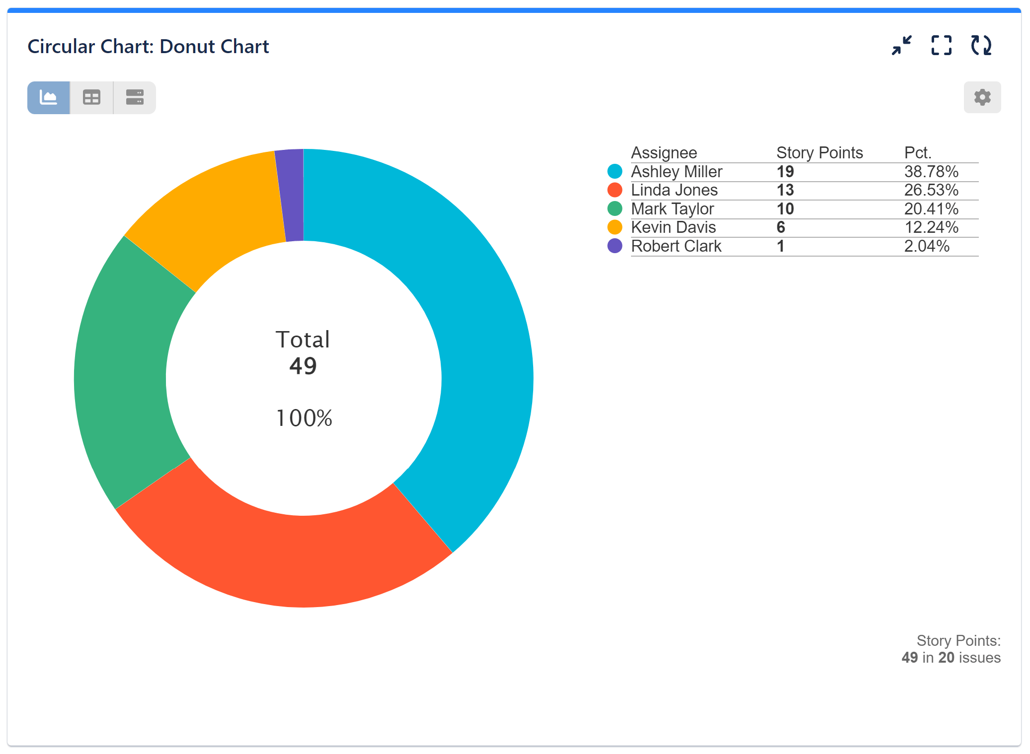
From the pie chart, you can easily switch to the table view to examine the details in a tabular form. Alternatively, you can switch to the donut chart, which supports slice selection, allowing for further emphasis on specific parts of the chart.
To maintain clarity and readability, it is important not to overload the pie chart with excessive data. Therefore, it is best to use it for basic reports such as:
- number of issues by priority
- time spent by assignee
- original estimate by issue type
- story points by assignee
However, you can use any standard Jira or custom metric available in the app to create a custom Jira pie chart.
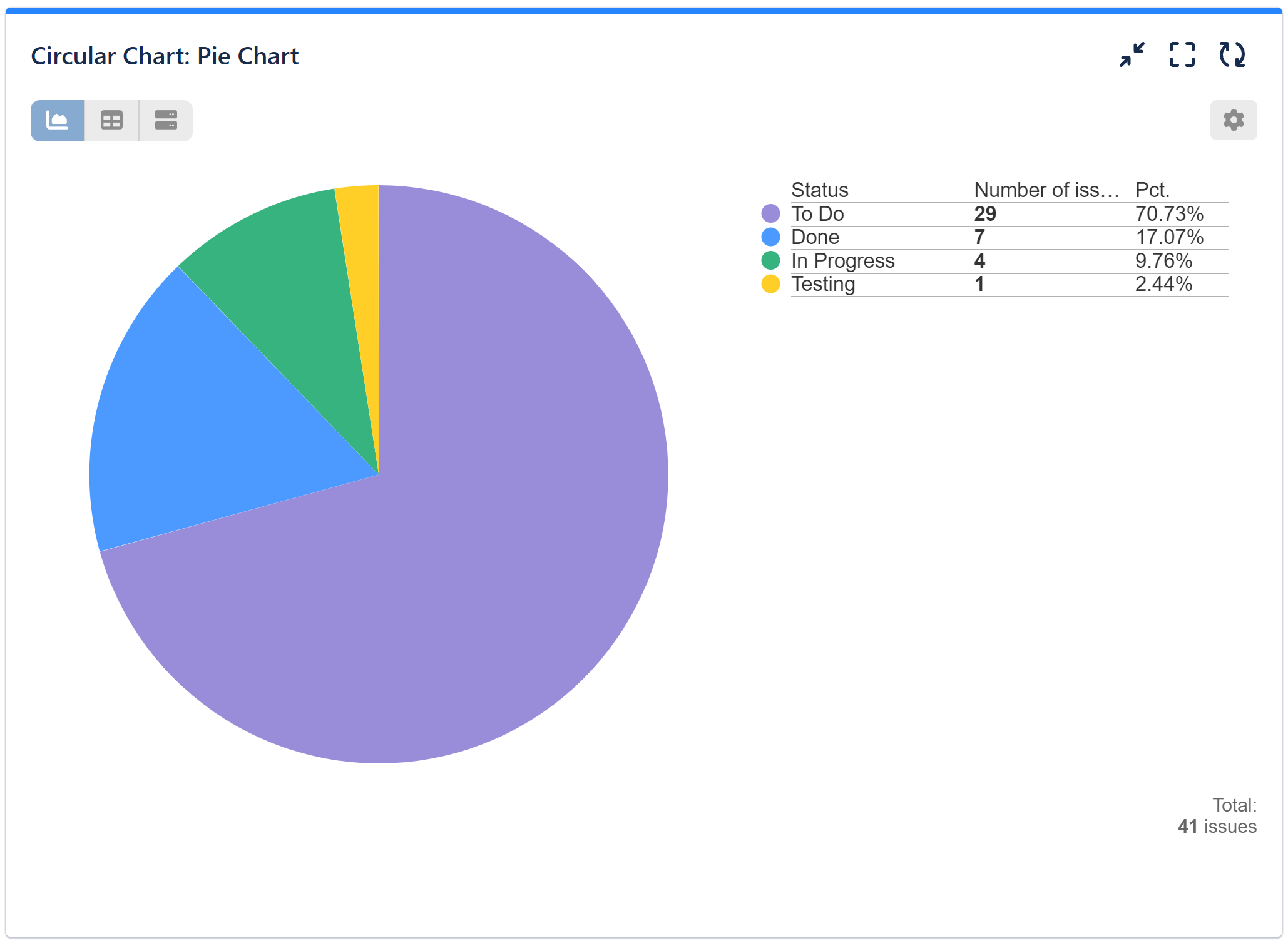
Configuration steps for Number of Issues by Status Pie Chart:
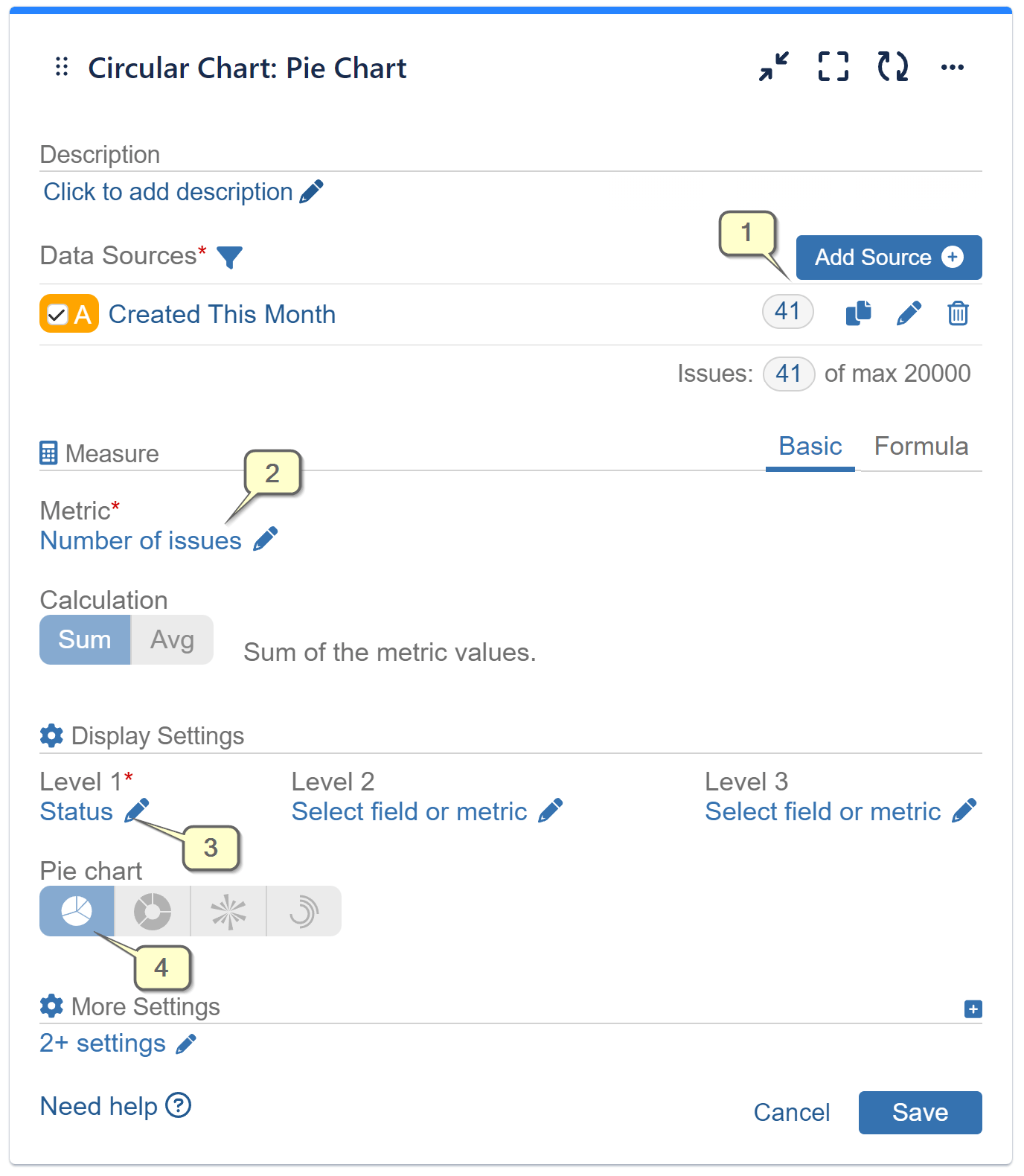
Step 1: Add a data source and filter out the issues you need to analyze. To explore Data Source options, please check the Configuration Overview article.
Step 2: Select metric ‘Number of Issues’ from the available options.
Step 3: In the Display Settings, choose the field ‘Status’ for Level 1 from the available field options. Save the configuration.
Step 4: (Optional) Keep the default Pie chart, or switch to a Donut chart in the Display Settings to highlight the percentages of specific segments in the report.
Optionally, customize the colors of your Pie chart to your preference.
Multi-level Jira Dashboard Reports with Circular Chart Gadget
To explore the selected data further and enrich your report with additional details, expanding the configuration is a simple process. By selecting a relevant field or metric for Level 2, you can create a two-level sunburst chart, as illustrated in the image below. Similarly, adding a field or metric for Level 3 will generate a three-level sunburst chart, allowing for even deeper insights.
Here is the visualization with ‘Status’ for Level 1 and ‘Priority’ for Level 2. You can choose ‘Components’ for the second level, or any other field or metric that makes sense for your report.

Let’s examine a business case scenario: It’s almost the end of the current quarter, and we want to analyze the proportion of issues created during this period based on their statuses: To Do, In Progress, Testing, and Done. It appears that the majority of the issues are still in the To Do status. Now, we would like to assess the priority of the issues that have not been started within the defined period.
To visualize this information, let’s create a chart with the Level 2 ‘Priority’ metric. We will focus on the number of issues with high priority that remain in the To Do list. If this number deviates from our quarterly roadmap or poses a potential risk of escalation, we can draw special attention to these issues by customizing the color of this segment in a vibrant color.
By configuring the ‘Circular Chart’ gadget in five easy steps, we can gain insights into the distribution of issues across different statuses and prioritize the items that need immediate attention. Let’s see it in action:
The ‘Circular Chart’ dashboard gadget provides a range of versatile chart types, in addition to Pie and Donut charts. These include Sunburst, Radial bar, and Wind rose charts. This variety of charts in a single gadget allows you to effortlessly switch between different ways of presenting your data. For detailed examples and sample settings, please refer to our User Guide.
Start your 30 days free trial of Performance Objectives: Charts for Jira from Atlassian Marketplace.