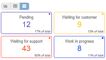
Diverse Jira Dashboards with Seamless Integration of Charts, Tables, and Tiles With our app, Jira users can elevate their user…
Diverse Jira Dashboards with Seamless Integration of Charts, Tables, and Tiles With our app, Jira users can elevate their user…
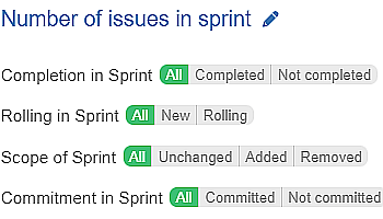
Introducing New Sprint-Related Filtering Options In addition to the wide range of Agile metrics and fields already built into the…
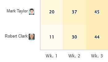
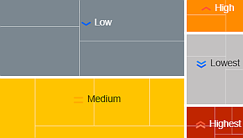
The Heat Map is one of the 10 standalone gadgets available within our app, Performance Objectives for Jira. Discover the…
Using the Performance Objectives app, you can leverage a variety of sprint-related metrics and fields to build comprehensive sprint reports…
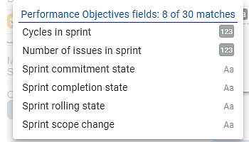
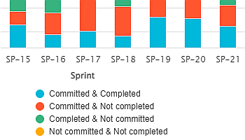
Drive productive sprint retrospectives with valuable reports using our new metrics and fields. Enhance team discussions with data-driven insights.
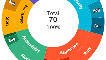
Create impressive interactive reports with Sunburst chart visualization on your Jira Dashboard using the ‘Circular Chart’ gadget available within the…
Performance Objectives for the Jira app comes with a variety of 10 dashboard gadgets to suit the reporting needs of…
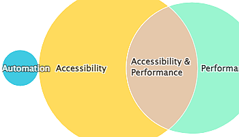
The Venn diagram is one of the 12 chart types supported by the Performance Objectives app for Jira. It’s a…
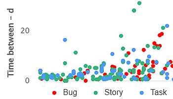
Powerful Data Insights: Harness the Potential of Scatter Charts The Scatter chart, also known as a scatter plot, is a…
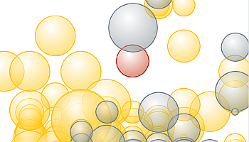
The Bubble chart is among the 12 available chart types within our app, enabling you to visualize tasks using up…