The Bubble chart is among the 12 available chart types within our app, enabling you to visualize tasks using up to 3 metrics on a single chart directly on your Jira Dashboard.
Utilize the Bubble chart to showcase three dimensions of data. With this feature, you can set metrics for the x-axis, y-axis, and for the size of the bubble. Plus, the option to employ a field for the x-axis remains available, ensuring flexibility in your data representation.
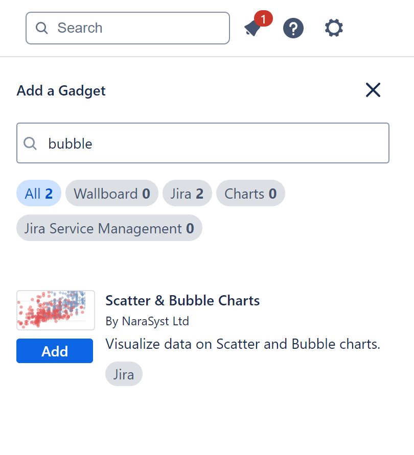
The chart can be easily configured on any Jira standard dashboard using the ‘Scatter & Bubble charts’ gadget available in Performance Objectives app.
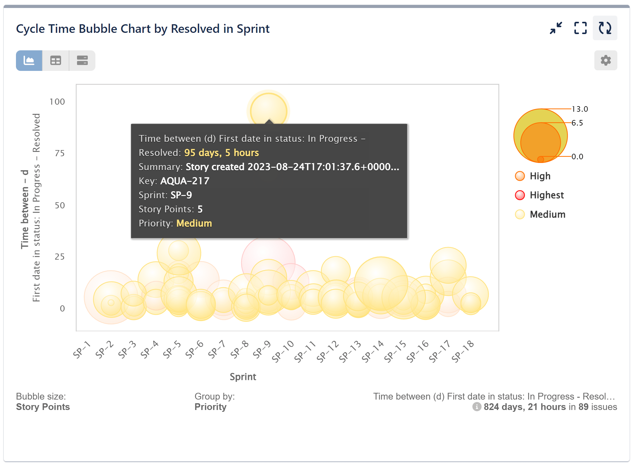
Spotting Outliers: Analyzing Cycle Time Variations in Sprint Resolutions with Bubble Chart
Leverage our Bubble chart to visually depict Story Points and their associated cycle time data intuitively, facilitating rapid identification of trends and patterns. By utilizing bubble sizes to represent Story points, outliers and anomalies can be easily spotted, enabling teams to pinpoint areas of inefficiency or potential bottlenecks within the sprint resolution process. In our sample “Cycle Time by Resolved in Sprint Report” for Jira, we’ve filtered only Medium, High, and Highest priority issues. However, it’s important to note that this step is not mandatory.
Follow the configuration steps outlined below for this report:
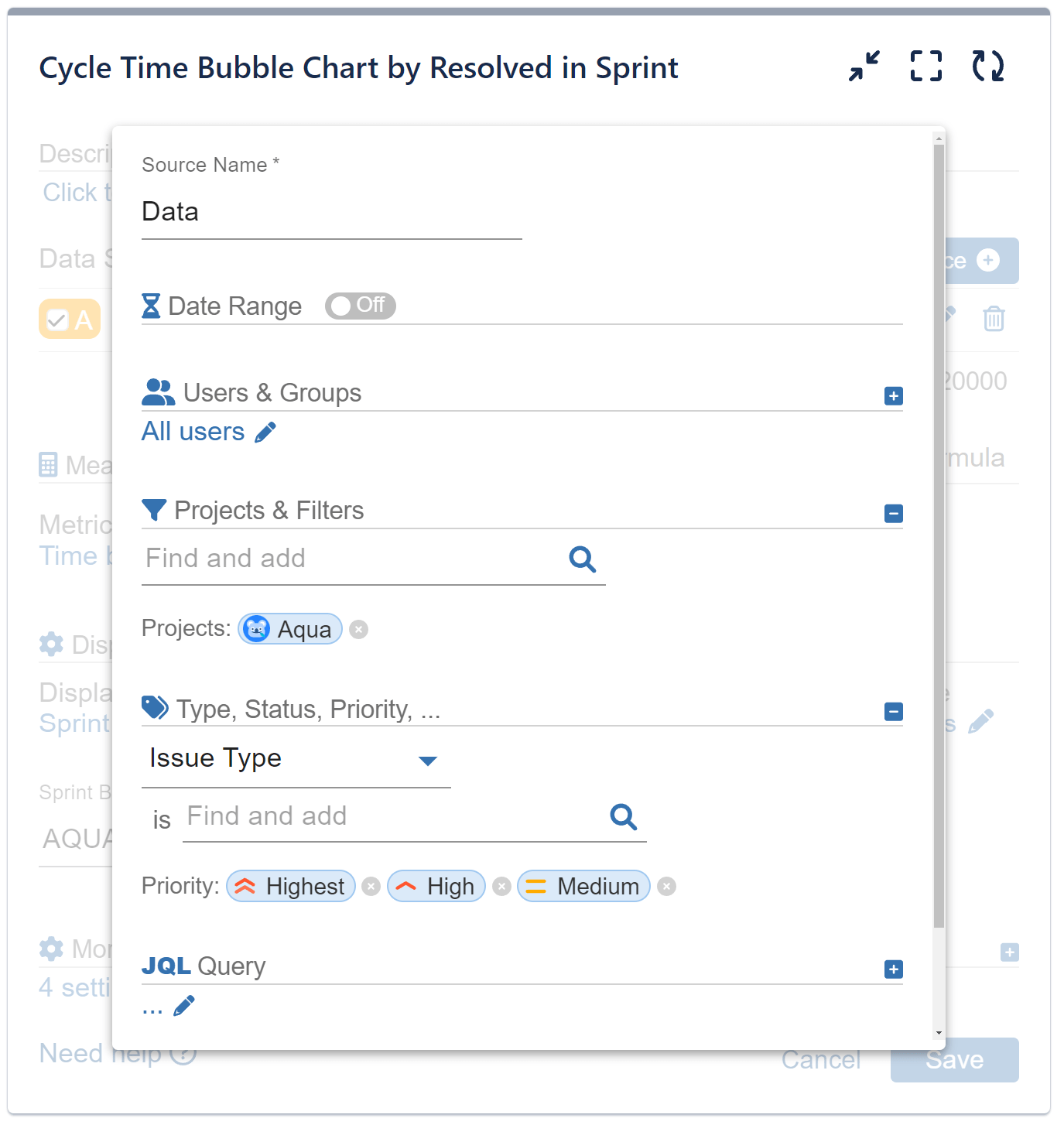
Step 1: In our sample, we have disabled the Date range feature and applied a filter to display only the project we are interested in. Additionally, we have specified priority settings to filter the displayed issues accordingly.
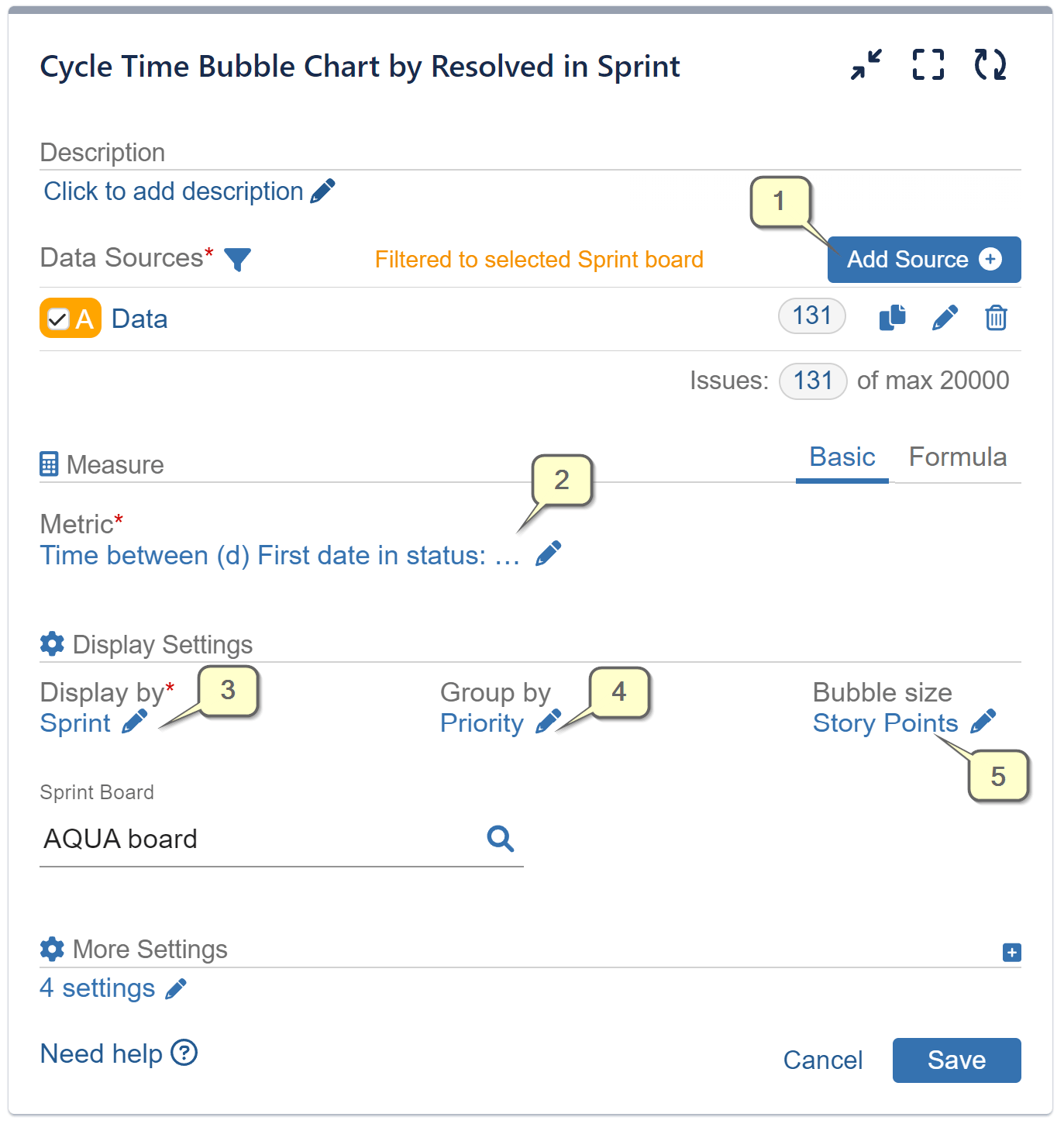
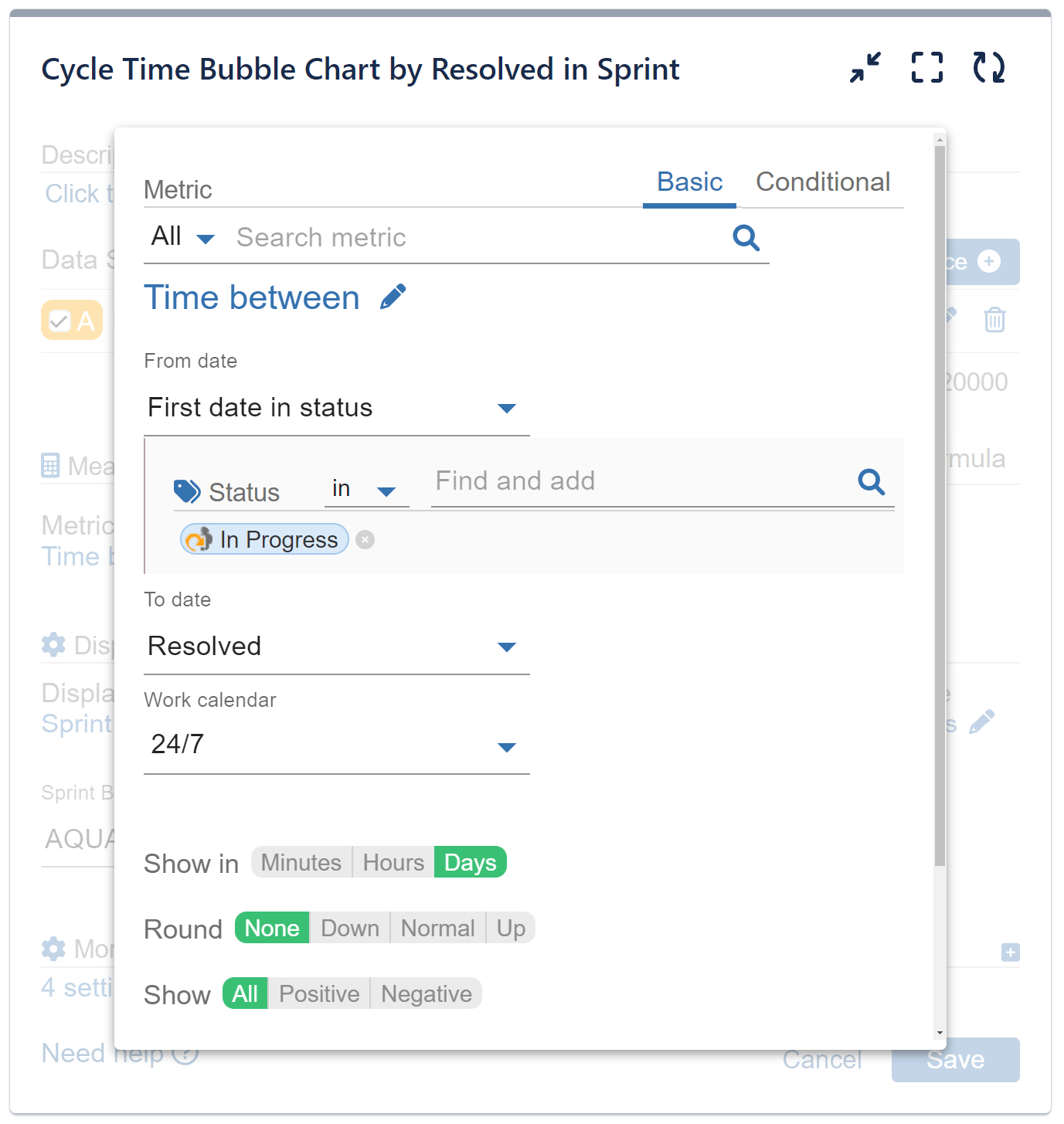
Step 2: Select the metric ‘Time between’ from the available metric options. Specify the First date in the Status “In Progress” to the date “Resolved” – displayed in Days.
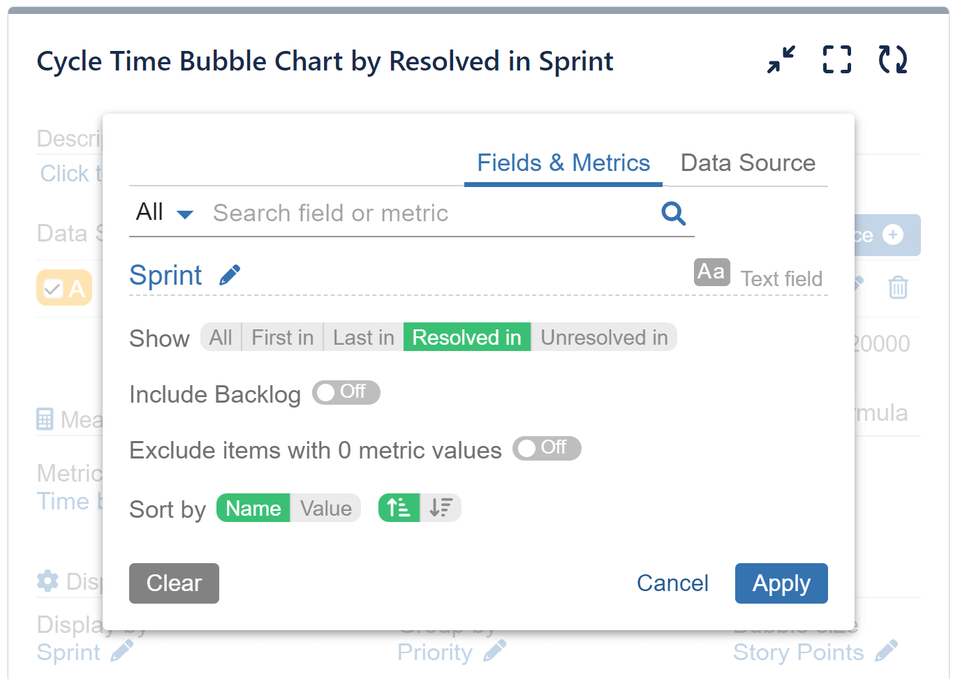
Step 3: Select the field ‘Sprint’ for ‘Display by’ and specify to show only issues “Resolved in Sprint”. Choose the Sprint Board that you wish to analyze.
Step 4: Select field ‘Priority’ for ‘Group by’ from the available field and metric options.
Step 5: Select metric ‘Story Points’ for ‘Bubble size’ and save the configuration.
Additional screens providing details for Steps 1, 2, and 3. Click on each image for an expanded view.
To see an example using a Scatter plot, please check out our Scatter Chart Article.
Start your 30 days free trial of Performance Objectives: Charts for Jira from Atlassian Marketplace.