Table of Contents
Exploring ‘Group by’ Feature in Performance Objectives
Performance Objectives: Charts for Jira offers three data view options for the x-axis of your charts: ‘Display by’, ‘Group by’, and ‘Stack by’. The ‘Group by’ option, also referred to as ‘Split by’ in other data visualization tools allows you to cut the data into separate columns and display them side by side if you are using a bar or column chart. This powerful feature is available in the ‘Performance Objectives’, ‘Performance Trend’, and ‘Scatter & Bubble Charts’ gadgets of the app.
With the ‘Group by’ configuration, you can break down your data by a second dimension, which could be any Jira field, metric, or custom segment defined as Data Source. It allows you to group data points, providing a clearer view, facilitating analysis, and enabling exploration of data and trends in your visualizations.
When using grouping you have the flexibility to choose attributes or variables that suit your needs and project specifics. Here are some example metrics and fields: Assignee, Issue Type, Priority, Original estimate, Story Points, Time spent, Organization, SLA metrics, and more. By grouping data based on these attributes, you can analyze performance, productivity, identify bottlenecks, track milestones, and discover patterns for areas of improvement.
Period over Period (PoP) Analysis Made Easy
Grouping is widely used and particularly useful for Period over Period (PoP) analysis. It allows Jira users to visually compare data from different time periods. For instance, you can compare the ‘Time Spent’ per ‘Assignee’ for the last and current quarter or, if you are working Agile, evaluate the average velocity of your team across different sprints.
The ‘Group by’ option in Performance Objectives app empowers you to unleash the potential of your data, gain valuable insights, and make data-driven decisions for improved project management and performance analysis.
In this article, we will explore a Period over Period (PoP) analysis example using the ‘Group by’ feature in Performance Objectives dashboard gadget and sample use cases of the feature in other gadgets:
‘Group by’ in Performance Objectives
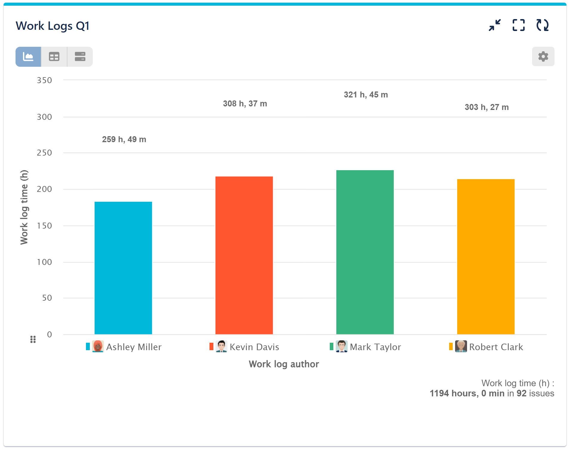
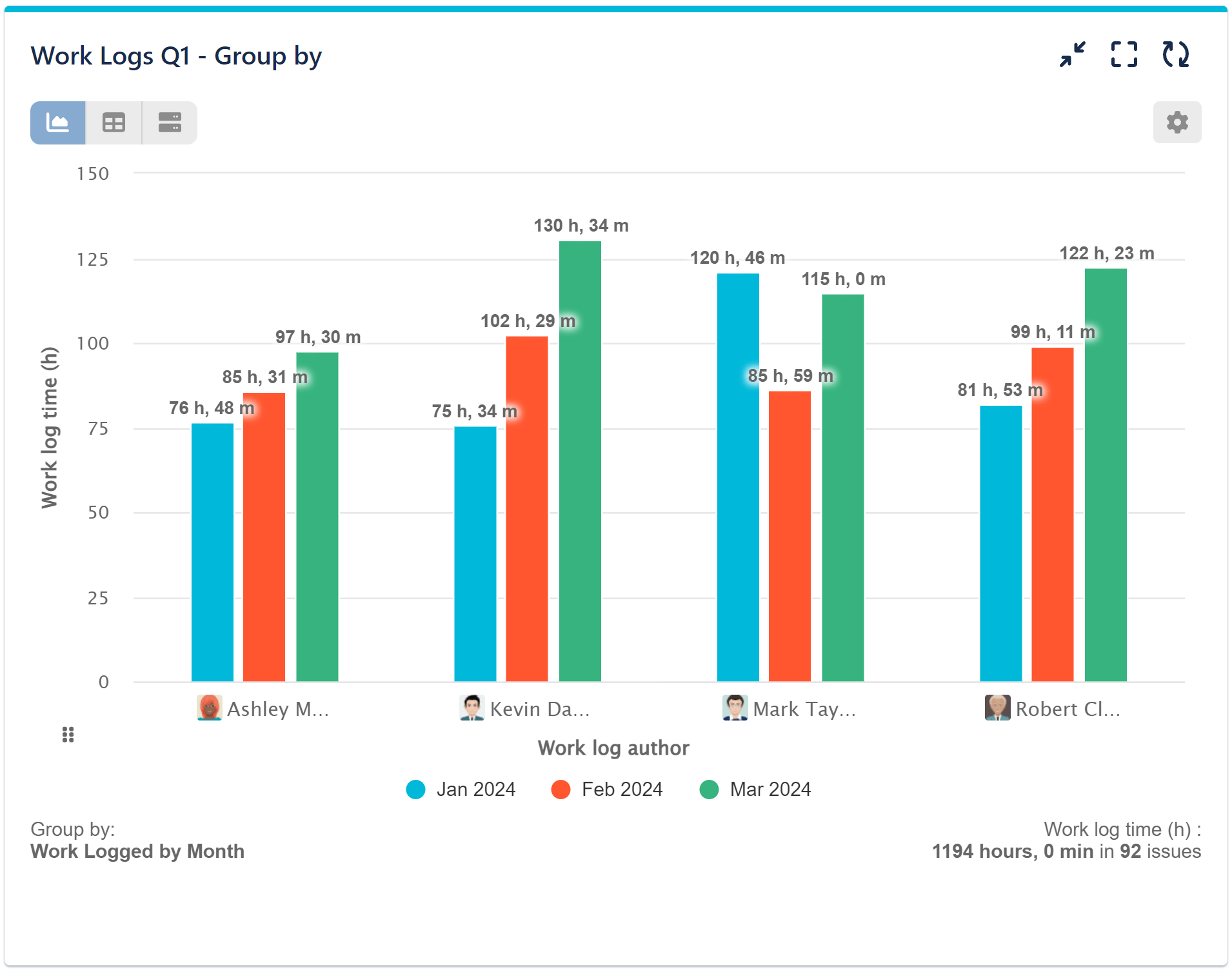
In the first image below, you can see the total work log time for the specified period, project, and users from the Data Source. However, this alone doesn’t allow for PoP analysis.
In this particular use case, our objective is to compare work log hours between last three months. To achieve this, we utilize the ‘Work log time (h)’ metric for the y-axis. By selecting ‘Work Log Author’ for the display by option, we categorize the work logs by individual team members. To facilitate a direct comparison of the three periods, we use the grouping feature and group the data by month based on the time of work logs.
Configuration video:
Application of ‘Group by’ in Other Gadgets
‘Group by’ in Performance Trend
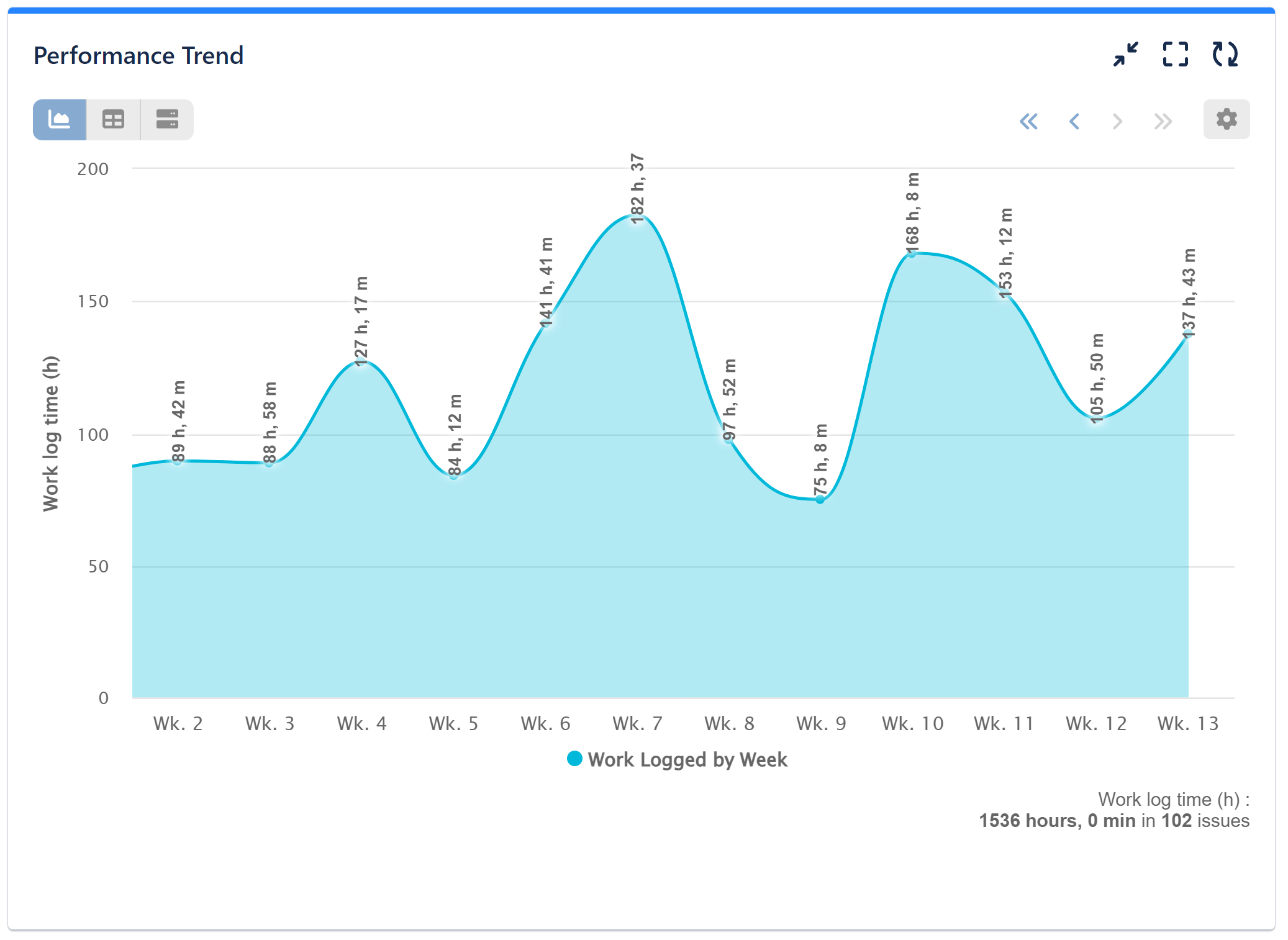
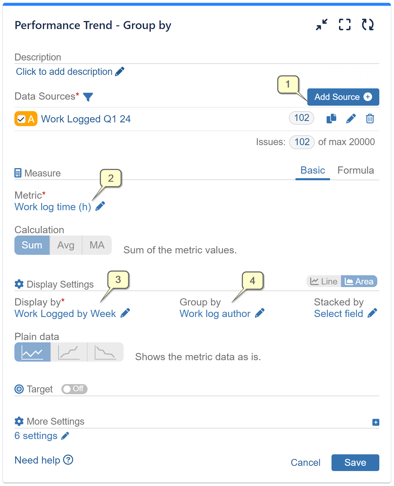
Grouping is also available in other gadgets of Performance Objectives app. One such example is the ‘Performance Trend’ gadget, where the vertical orientation proves to be more readable and effective when displaying multiple data periods. It also provides an improved visualization for comparing and analyzing performance trends over time.
In the first image, you can observe the trend of ‘work log time’ logged by the team throughout an entire quarter, providing a comprehensive overview of the team’s log activity fluctuations. However, if you need to further analyze the trend lines for each team member, you can utilize the ‘Group by’ feature and select ‘Work log Author’, as in the second image. This enables you to delve into and compare the work log trends of individual team members, gaining deeper insights into their contributions and tracking their specific work log patterns throughout the quarter.
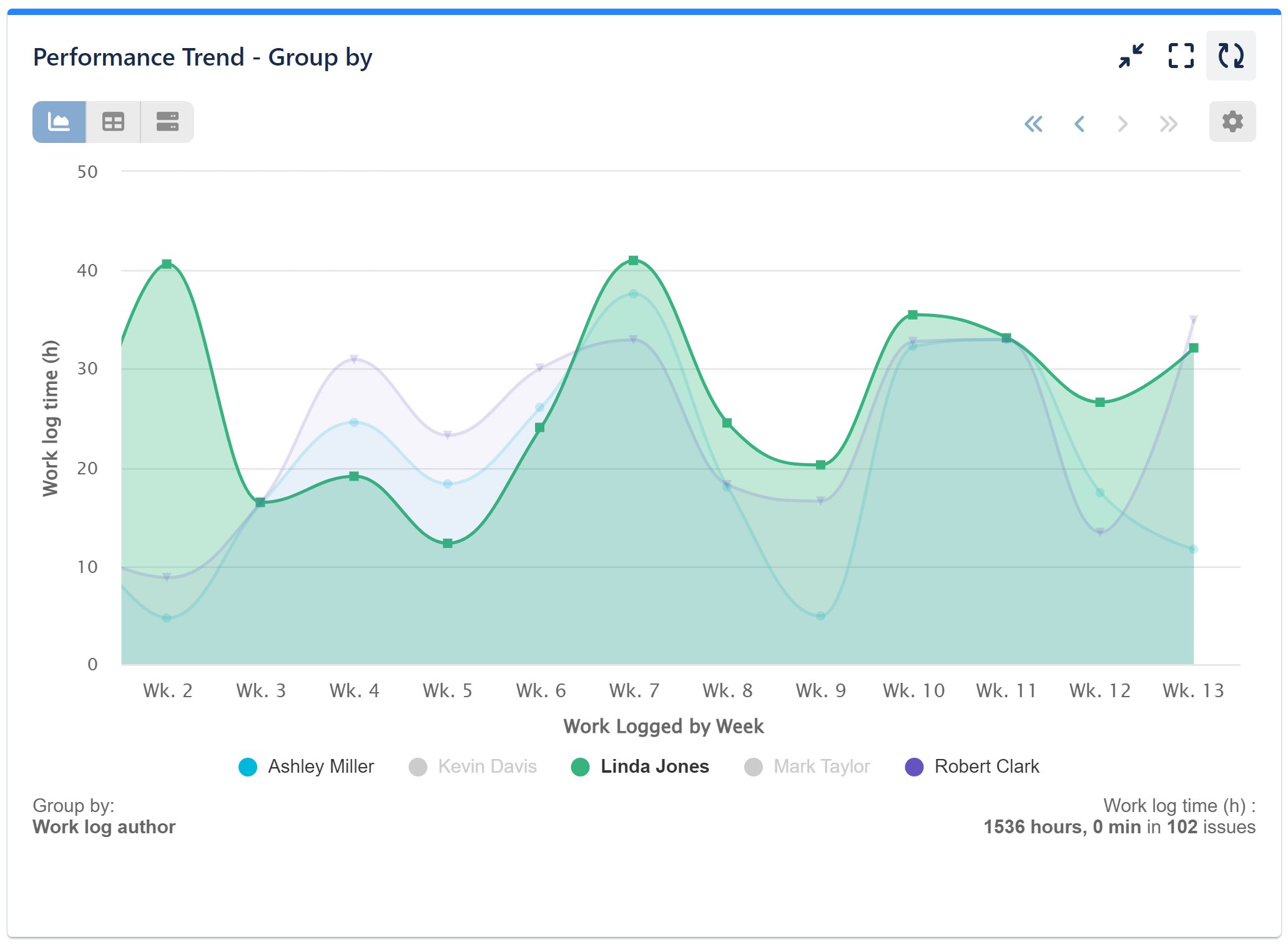
Step-by-step configuration for this chart:
Step 1: Filter your Data Source to include Resolved Issues during your desired period.
Step 2: Select ‘Work log time (h)’ metric.
Step 3: Display by “Work Logged by Week”
Step 4: Group by “Work log author” and save your configuration.
‘Group by’ in Bubble chart
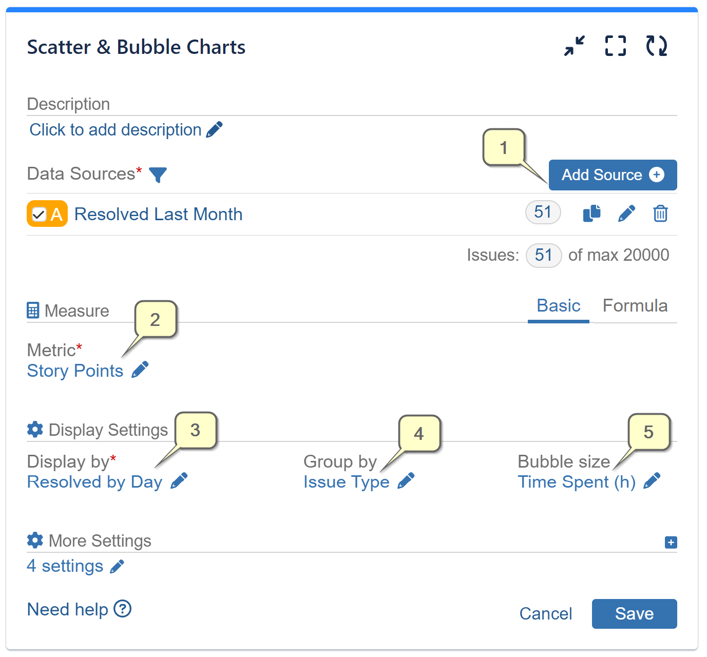
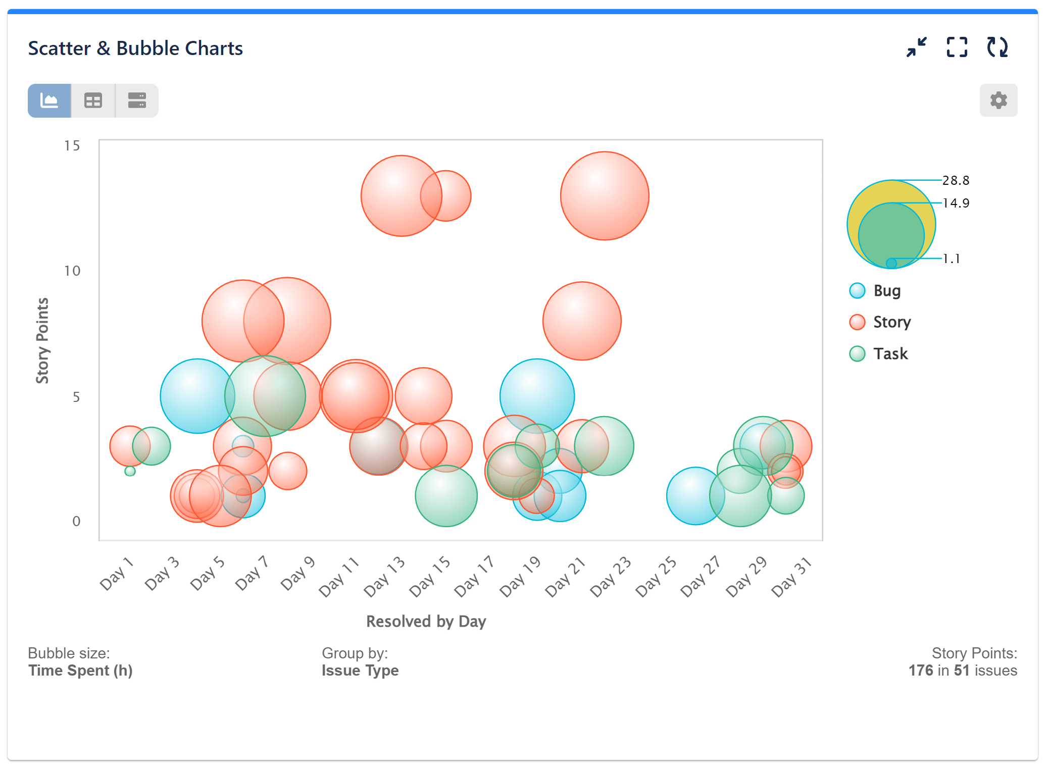
‘Scatter & Bubble charts’ gadget in Performance Objectives: Charts for Jira app offers a practical and visually appealing way to display three dimensions of data on a single chart. In this specific use case, we demonstrate the configuration steps for using the Bubble chart. Here’s how it works:
Step 1: Y-axis: We set the vertical axis to represent ‘Story Points’
Step 2: X-axis: The horizontal axis is configured to display the ‘Resolved by day’
Step 3: Group by ‘Issue Type’
Step 4: Bubble Size: The third dimension is represented by the size of the Bubble, which we set as ‘Time Spent (h)’
Grouping the data by issue type in this specific case offers valuable benefits. With this single chart, you can easily identify which issue types required the most time to complete, gaining insight into their story points and observing their distribution throughout the month. This analysis provides clarity on time-intensive issues, aids in understanding story point allocation, and offers a comprehensive view of issue progression over time. Here’s the visualization:
Would you like to know how Grouping differs from Display by and Stack by? Explore our articles on Stacked Mode and Data Segmentation & Dimensions to gain a better understanding.
Additionally, Bubble charts article can provide you with various ideas for creating visually appealing yet insightful charts.
Start your 30 days free trial of Performance Objectives: Charts for Jira from Atlassian Marketplace.