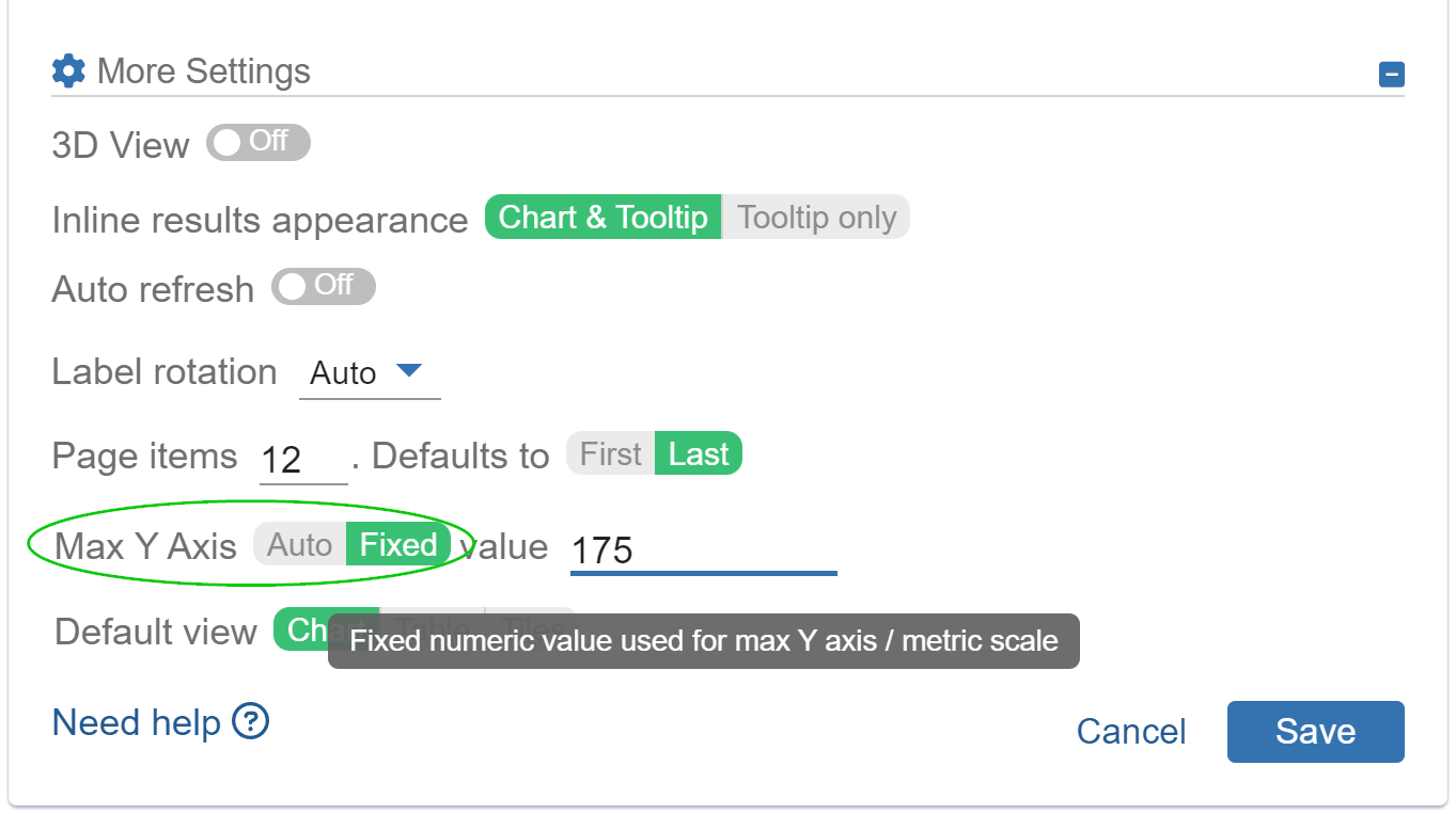
A new toggle is now available in Performance Objectives for Jira app. It gives you control over the maximum y-axis value in your bar charts.
By default, the app automatically adjusts the vertical axis (y-axis) scale based on your dataset. However, this new feature allows you to tailor the scale to match your specific requirements.
Empower Your Charts in Jira with Custom Y-Axis Value Scaling
You can access this feature in the ‘More Settings‘ section when you’re editing your dashboard gadget, as demonstrated on the right image:
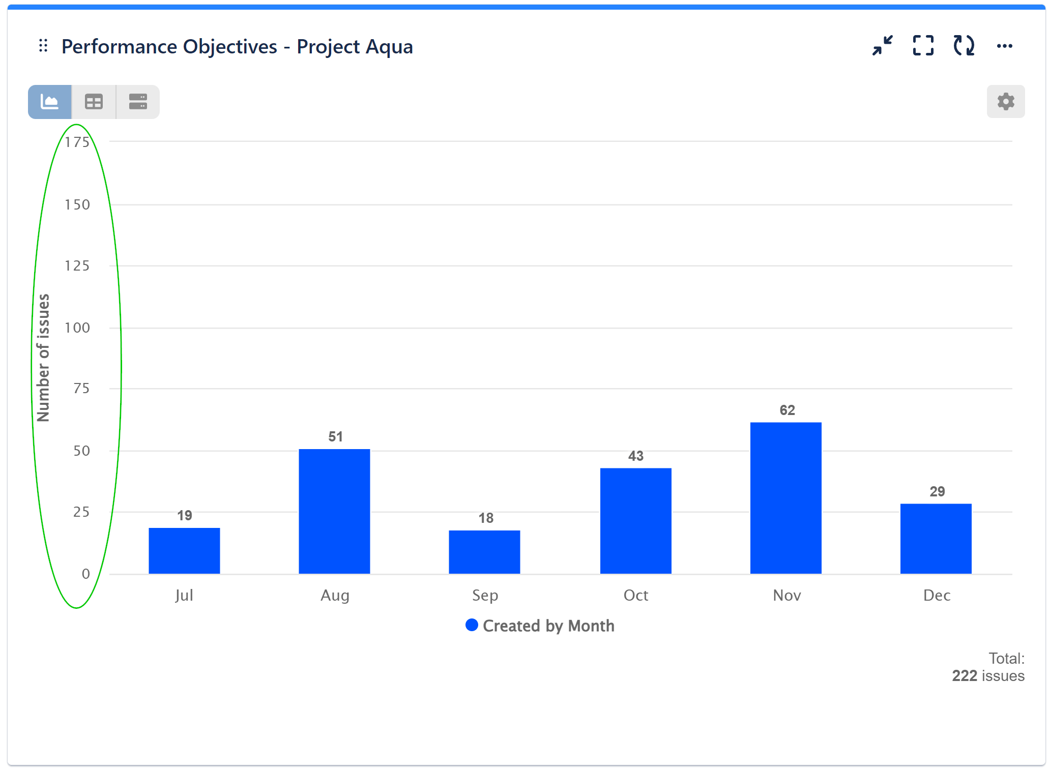
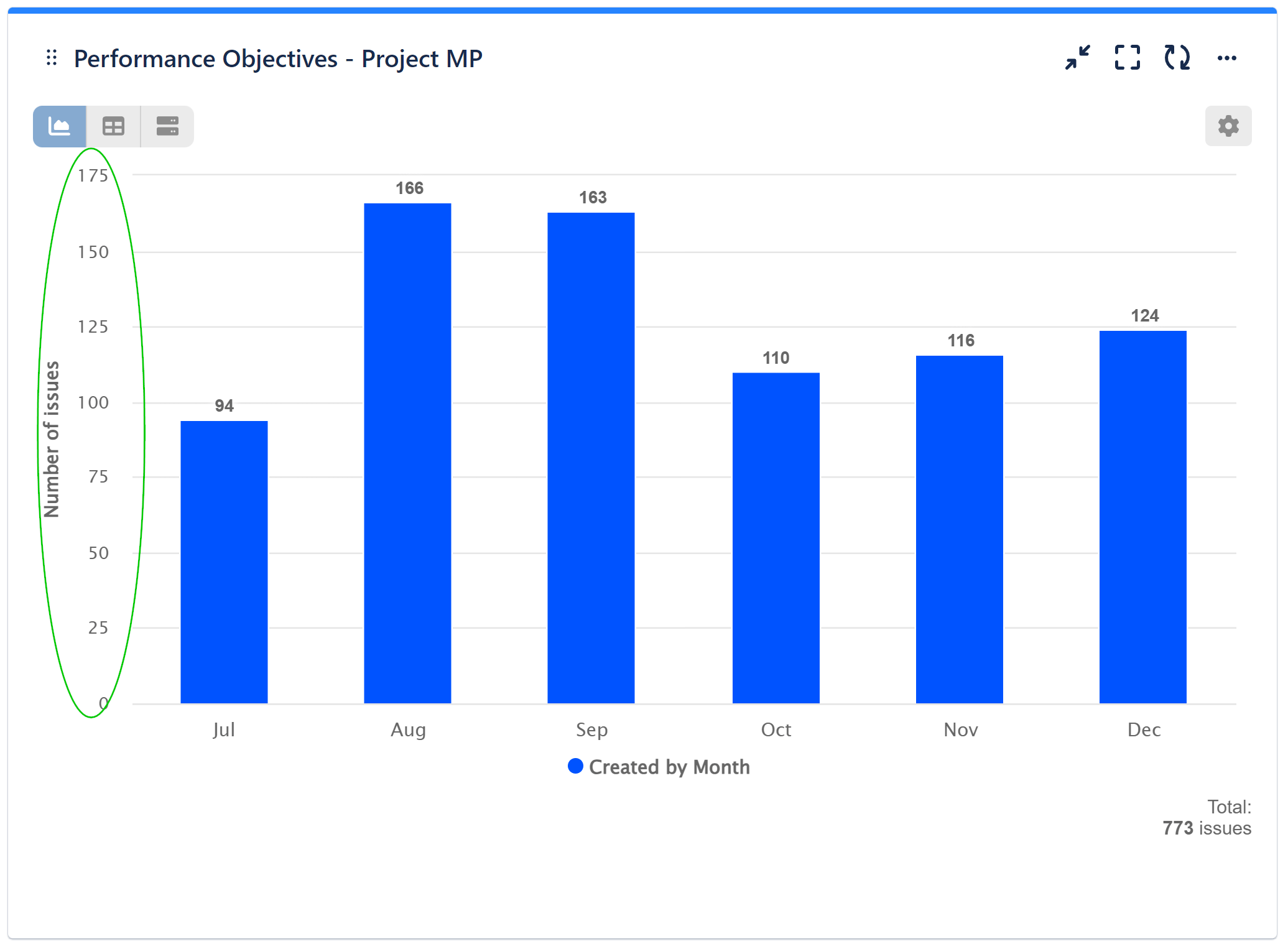
Here’s an illustrative example of how this feature can be beneficial:
Suppose you’ve generated reports with identical metrics but significant variations in result values, displayed on your dashboard for various projects or products.
In the provided dashboard example, each chart is configured with a consistent y-axis value (175). This deliberate choice simplifies result comparisons among the different charts and facilitates clear communication of information to your audience.
If you opt not to activate the ‘Fixed’ toggle, the y-axis value will be automatically determined for each chart based on their respective maximum values, resulting in the following display:
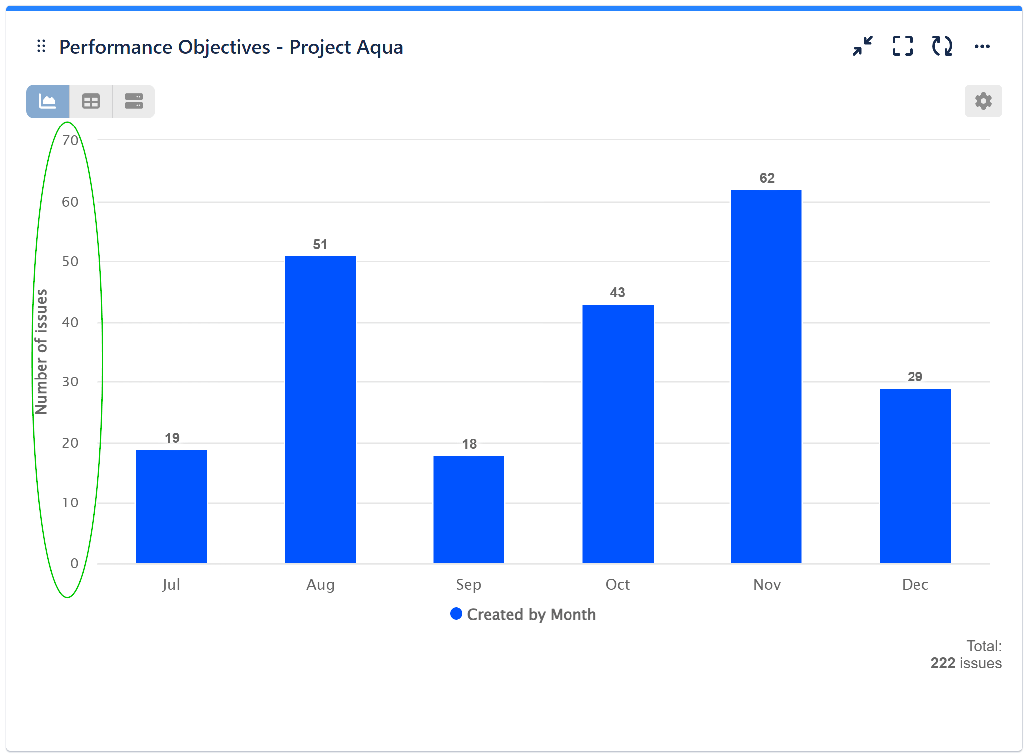

Although the underlying data remains consistent across charts, without a ‘Fixed’ y-axis value, visual comparisons become more challenging. In such cases, the bar heights fail to effectively communicate the values in relation to other charts.
Please keep in mind that the default setting is ‘Auto.’ When considering the use of the ‘Fixed Value,’ exercise caution, as improper configuration may result in data being cut off from your chart. It’s crucial to take into account the specific metric values when making this adjustment.
Feel free to explore the full range of features, customization, and styling options for your custom charts and reports on our User Guide page.
Start your 30 days free trial of Performance Objectives: Charts for Jira from Atlassian Marketplace.