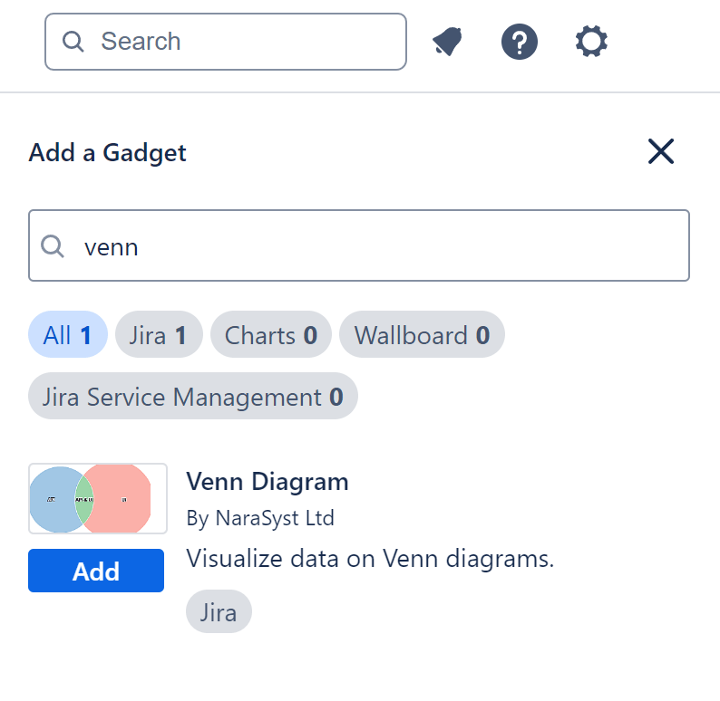
The Venn diagram is one of the 12 chart types supported by the Performance Objectives app for Jira. It’s a standalone gadget that can be seamlessly added to any standard Jira dashboard.
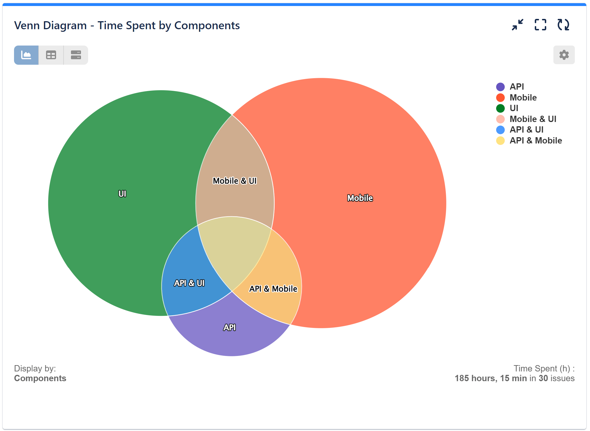
The Venn diagram offers a dynamic way to analyze data intersections based on various display fields such as: Components, Labels, Fix Versions, and Participants.
Its intuitive interface presents overlapping circles, enabling users to visually identify intersections between datasets. Moreover, users can delve deeper into these intersections by simply clicking on the relevant sections of the diagram.
Generate “Time Spent by Components” Report in Jira Using Venn Diagram
Choosing the Venn diagram for this report helps Jira users quickly understand complex relationships data. By studying the report, teams can make smarter decisions about where to allocate resources, which tasks to prioritize, and how to improve workflows, which boosts project efficiency and productivity. The clear visualization of time spent by components fosters better collaboration among team members by providing a common understanding of resource utilization and priorities within the project.
Please find the configuration steps below for ‘Time spent by Components’ report:
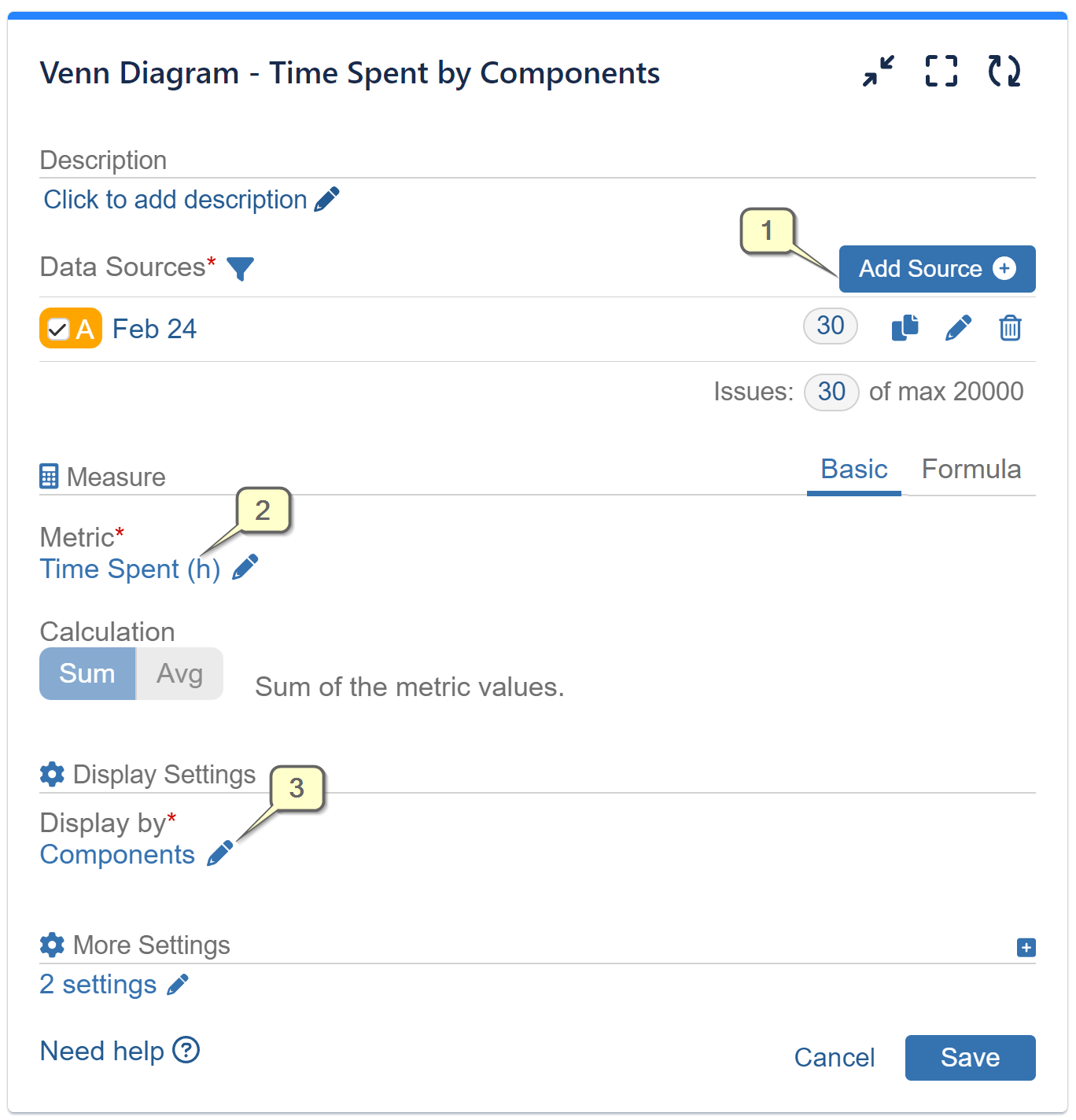
Step 1: Add data source. Filter out the issues that need to be analyzed.
Step 2: Select metric ‘Time spent’ from the available metric options.
Step 3: Select field ‘Components’ for ‘Display by’ from the available field options. Save the configuration.
Check the other charting options we provide for your Jira data in our Chart types Overview page.
Start your 30 days free trial of Performance Objectives: Charts for Jira from Atlassian Marketplace.