Table of Contents
Exploring Stack by Feature in Performance Objectives app
In Performance Objectives: Charts for Jira, you have the freedom to choose among three data view options for the x-axis of your charts: ‘Display by’, ‘Group by’, and ‘Stack by’. In this article, we will explore the advantages of using the ‘Stack by‘ functionality, also referred to as Stack mode. This feature is supported by the ‘Performance Trend’ and ‘Performance Objectives’ dashboard gadgets. Stacked mode allows you to display the distribution of a metric based on any Jira field, metric, or data segment. Let’s take a closer look at two sample use cases of this feature.
But first, what exactly is Stacked mode? The ‘Stack by’ option enables you to stack and compare different sets of data within the same chart, resulting in a clearer visual representation of their individual contributions. By stacking the data, you can easily analyze and identify patterns, trends, and understand relationships or relative proportions between different categories or dimensions.
Stacked Area Chart in ‘Performance Trend’
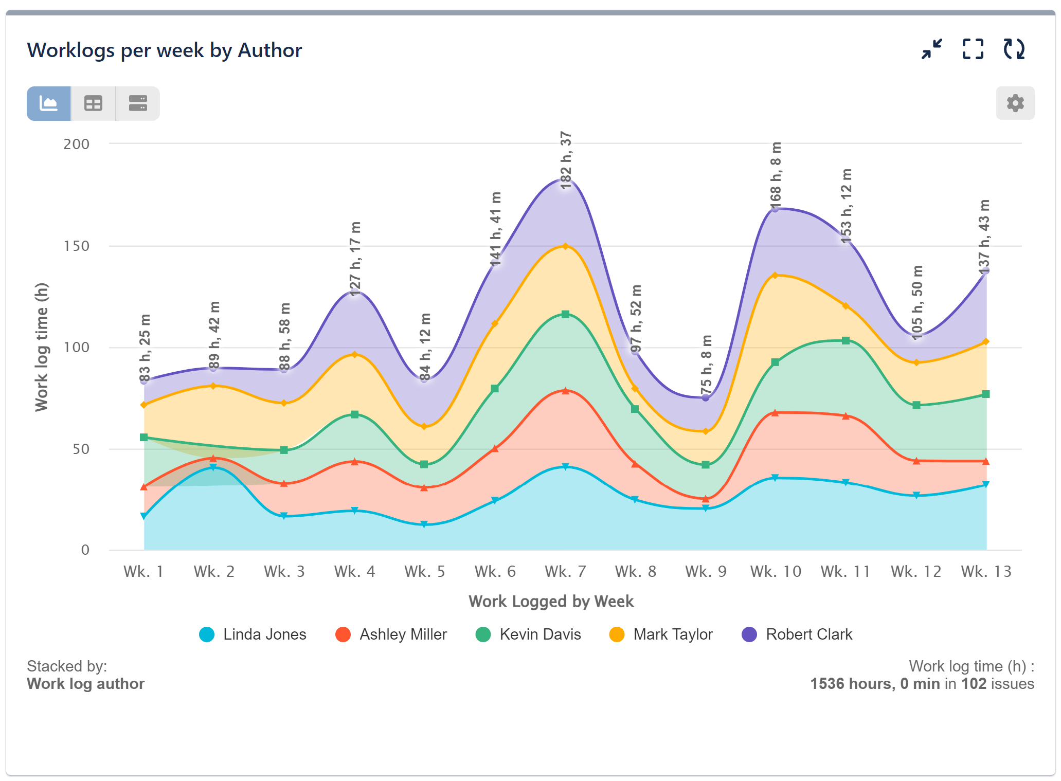
In the images below, we have a Work Log time report divided into weeks of the quarter. The first picture shows the overall totals, but it lacks the ability to explore the data composition in detail.
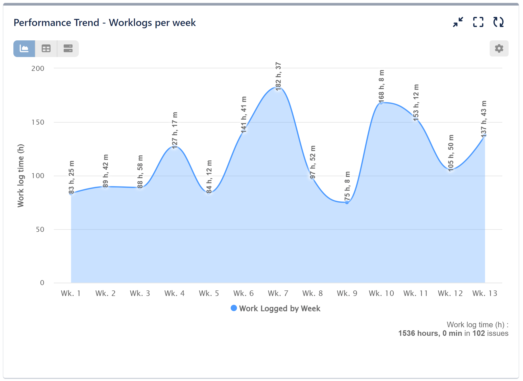
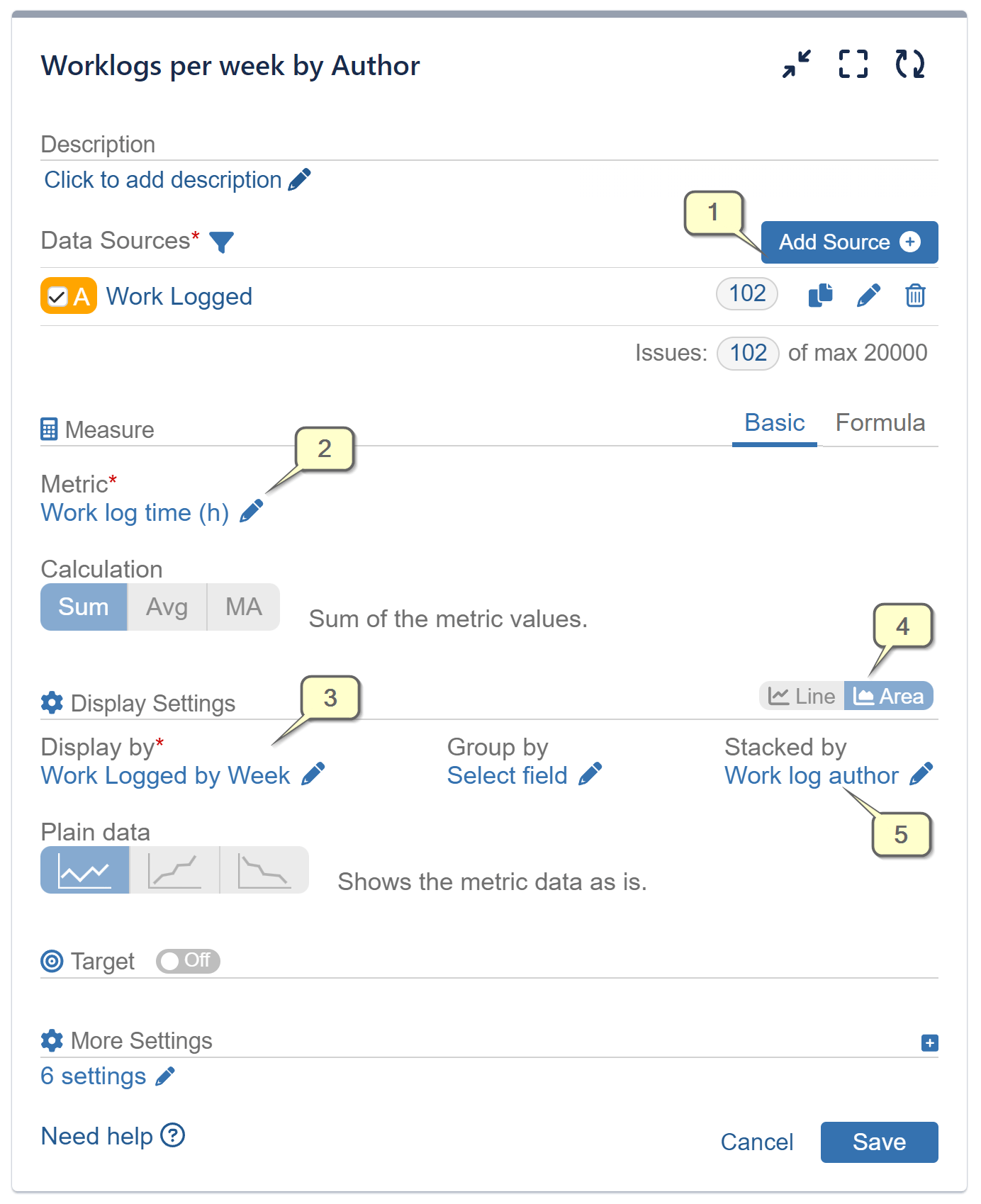
To gain a deeper understanding of the Work Logged by Week, including contributions from individual work log creators and their relative proportions, please select the ‘Work log author’ for ‘Stack by’ data view. Additionally, switch from the Line chart to the Area chart. This will create a Stacked Area Chart that provides comprehensive insights.
Step-by-step configuration:
Stacked Bar Chart in ‘Performance Objectives’
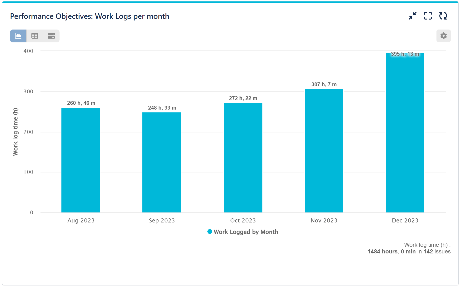
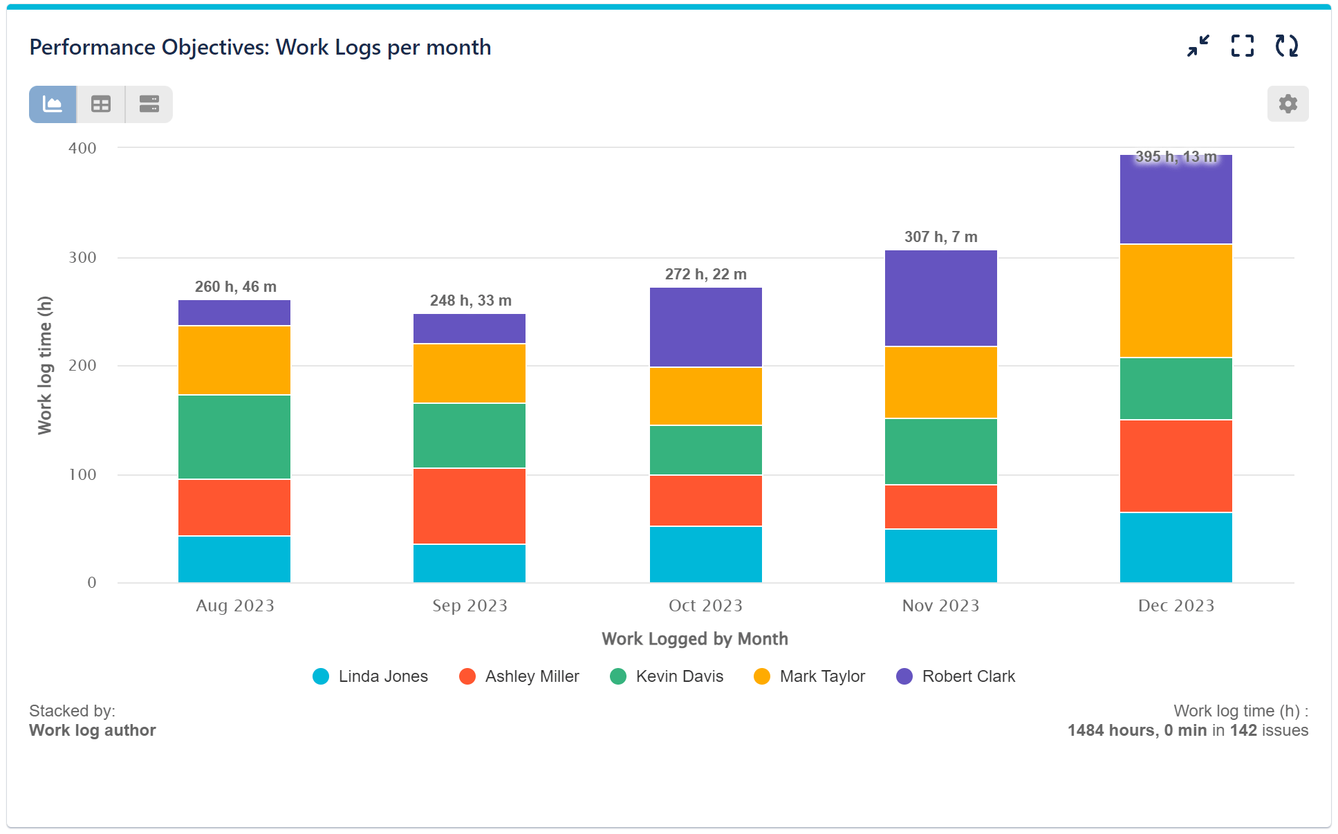
If you prefer bar charts, you can easily generate a Work Log time by Month report using the Performance Objectives dashboard gadget. Simply select the stacked mode, and you’ll be able to visualize the contributions of individual log creators spread across months in a vibrant stacked bar chart.
In the first image below, we have a ‘Work Logged by Month’ report that facilitates straightforward month-to-month comparisons of total times. However, it doesn’t provide insights into the underlying reasons for the data.
In the second image, we selected the ‘Work log author’ option for the ‘Stacked by‘ data view. Here, each vibrant segment represents a specific contributor, making it effortless to compare the contributions of different individuals or teams within each month.
Here’s a video recording made using this configuration:
Would you like to know how Stacked mode differs from Display by and Group by? Explore our articles on Data Segmentation & Dimensions and Group by to gain a better understanding.
Start your 30 days free trial of Performance Objectives: Charts for Jira from Atlassian Marketplace.