Can you create a Budget vs Actual cost report in Jira? Absolutely! The Performance Objectives: Charts for Jira app presents an array of advanced features customized for the diverse reporting needs of Jira users. Among its standout capabilities is the integration of Formulas for metric calculations. In this article, we’ll walk you through using this feature to directly create a Budget vs Actual Cost of Work report within Jira. Yet, you can use the Formula feature to effectively monitor other custom-calculated costs based on specific criteria or Jira fields.
Stay on Budget Using a Budget vs Actual Cost Report in Jira
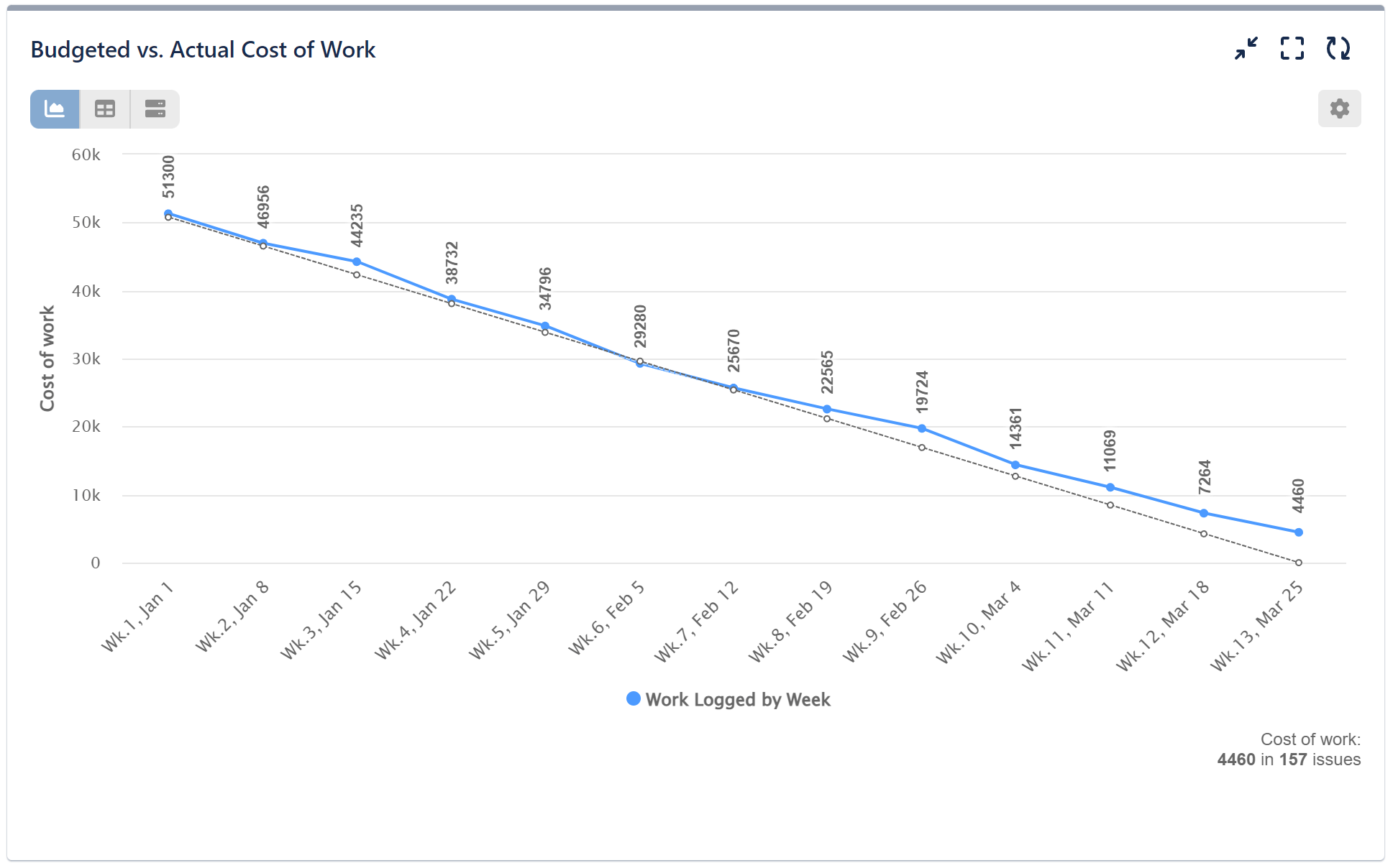
Keeping track of actual costs is essential to see how a company is performing compared to its budget over time. In our example report, we’ll utilize the Performance Trend gadget to build up a budget tracking report. However, it’s worth noting that a comparable chart can also be generated using the Performance Objectives gadget.
Refer to this comprehensive step-by-step guide for configuring a cost report in Jira using the Performance Trend gadget:
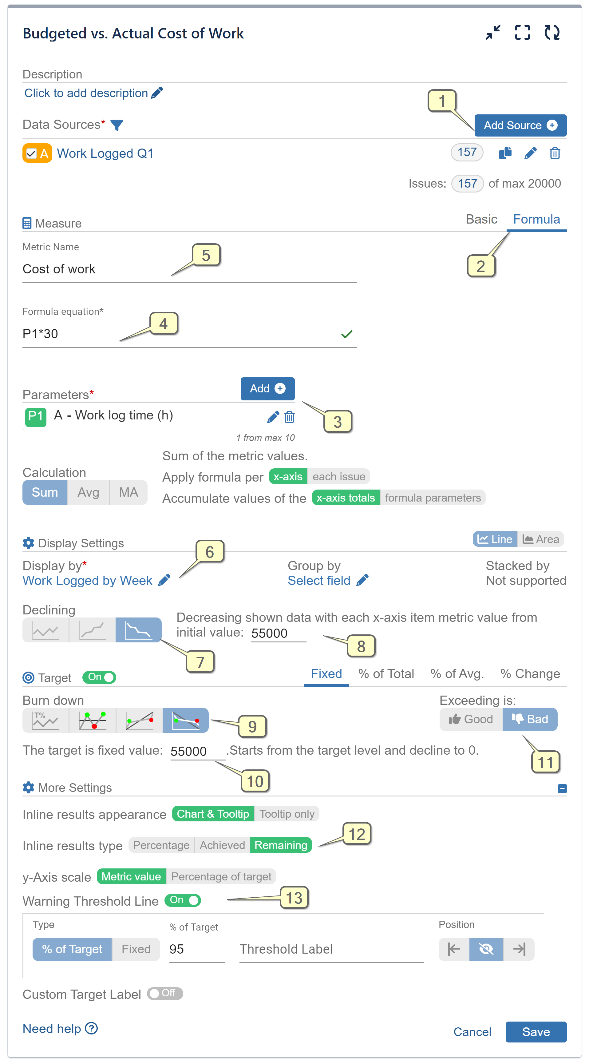
Step 1: Begin by selecting “Work Logged” date field and specifying the desired time period for analysis within the Data Source.
Step 2: Select ‘Formula’ for your metric calculation.
Step 3: Add the metric ‘Work log time (h)’ as a parameter in the formula.
Step 4: Define the formula equation as ‘P1*30’, representing “Work log time x Hourly rate,” with an assumed cost per hour of 30 USD.
Step 5: Assign a name to your Formula metric.
Step 6: Opt for ‘Work Logged by Week’ for the ‘Display by’ field.
Step 7: Choose the Decreasing mode for the metric.
Step 8: Establish the initial value from which the calculated metric value will decrease.
Step 9: Activate the Target section and select the ‘Fixed’ tab. Opt for the ‘Burndown’ option to track progress from target level to 0.
Step 10: Determine the starting point of the Target value, which will progressively decrease to zero, providing an ideal guideline on the chart. If it matches the value from Step 8, both will commence from the same level on the chart.
Step 11: Switch the ‘Exceeding is’ to ‘Bad’. This implies that achieved values above the target level will be marked in red, indicating a negative result.
Step 12: (Optional) Select your preferred inline result type to be displayed on the top of the x-axis items. In our demonstration we have chosen to display the remaining values.
Step 13: (Optional) Enable the ‘Warning threshold’ to color values above the threshold and below the target in amber.
Watch the comprehensive step-by-step configuration video:
Using the Performance Objectives: Charts for Jira app, you have the ability to create a dedicated “KPI Dashboard” directly on your Jira dashboard. This dashboard can include a set of reports focused on your objectives, all aimed at reinforcing your SMART goals. Our support team is prepared to assist you.
For additional use cases that can enhance your performance management process, take a look at the KPI Examples page.
Start your 30 days free trial of Performance Objectives: Charts for Jira from Atlassian Marketplace.