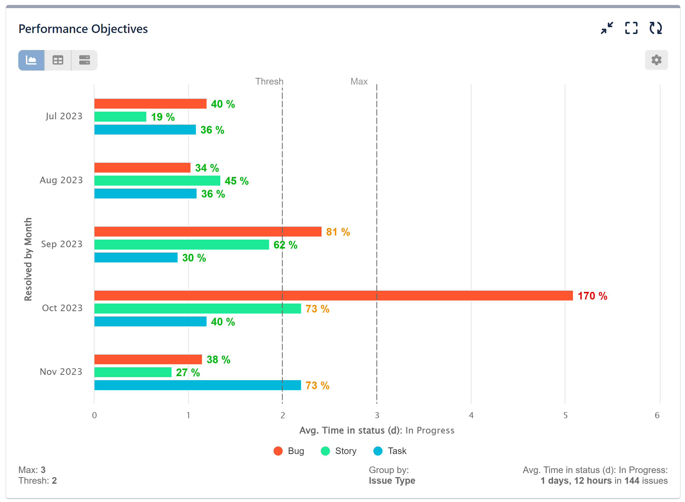
Cycle Time is defined as the time spent working on an issue and is calculated as the time between the start and completion of work.
Create custom Cycle Time Report for your Jira issues statuses with Performance Objectives: Charts for Jira app. Use historic data to set targets for your team’s performance.
Depending on the issue lifecycle defined in your Jira instance, there are different statuses that you may decide to include in your calculation. In any case, information on what is the average time between the beginning and the end of each status or group of statuses is key to identifying bottlenecks in the process.
Creating a Cycle Time Report Using the Time in Status Metric
Calculate the average time in any status and display it in days or in hours on a bar chart. For this configuration we are using status ‘In Progress’, but according to your workflow you may add ‘review’, ‘testing’ or any other status in ‘In Progress’ Category that indicates time spent working on the issue.
Find below the step-by-step configuration instructions:
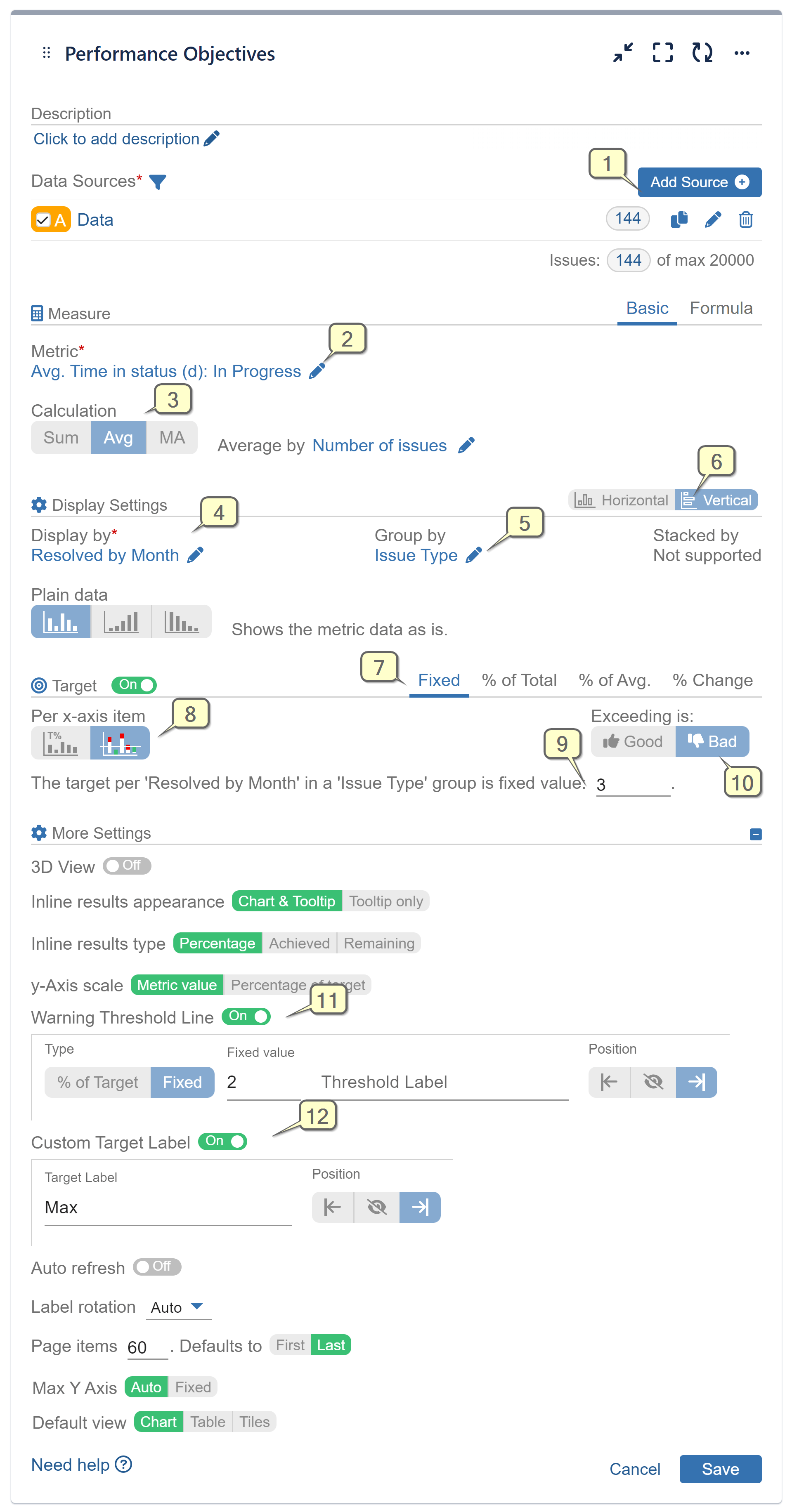
Step 1: Select the data source/s you need to analyze. Here you have numerous options to define particular users/groups, projects, issue types etc. For more information, please check the Configuration overview page.
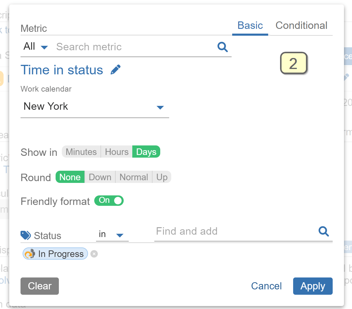
Step 2: Select metric ‘Time in status’ with status ‘In Progress’ or status by your choice.
Step 3: Select Avg calculation and average by ‘Number of Issues’ field.
Step 4: Set ‘Display By’ with ‘Resolved’ field and choose date granularity ‘by month’.
Step 5: (Optional) Set ‘Group by’ field with ‘Issue type’. Other suitable fields to ‘group by’ may be ‘components’, ‘Assignee’, or any field that would enrich your analysis.
Step 6: (Optional) Choose vertical orientation of the chart. The height area is not restricted and allows more items to fit better on the x-axis.
Step 7: Switch on Target section and keep the ‘Fixed’ tab selected.
Step 8: Select results to be evaluated per x-axis item.
Step 9: Set target level value.
Step 10: Set Target as negative by setting ‘Exceeding is’ to Bad. Thus, when the achieved result exceeds the target level it will be colored in red.
Step 11: Expand the ‘More Settings’ section and enable the ‘Warning threshold‘ to color values above it and below the target level in amber.
Step 12: Enable the ‘Custom Target Label‘. Set label that will indicate the target is negative, e.g., Max.
Recording: Please watch the following recording with detailed configuration settings
An alternative approach to create this report is to use the ‘Time between‘ metric. Please note that for this particular KPI the Time between may not give you the precise picture, especially if reopening issues is common to your process, as it will also calculate the period between any issue is set as resolved and its later reopening.
Following this 3 min Jira configuration will help you to enrich your Jira data by capturing more date events from your workflows. Analyze it afterwards with the Performance Objectives dashboard gadgets.
Explore another configuration example featuring the ‘Time in Status’ Metric.
Start your 30 days free trial of Performance Objectives: Charts for Jira from Atlassian Marketplace.