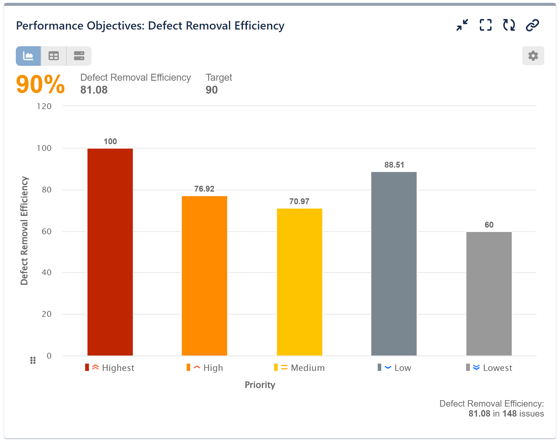
Defect Removal Efficiency (DRE) is a metric used in software engineering to measure the effectiveness of the defect detection and removal processes during software development. It indicates the percentage of defects identified and fixed before the software is released to customers.
A higher DRE value indicates a more effective defect detection and removal process, implying better software quality. Conversely, a lower DRE value suggests that many defects are escaping the testing phases and reaching the end-users, which could point to the need for improved testing and quality assurance processes.
This article will walk you through the steps of monitoring Defect Removal Efficiency (DRE) using the Performance Objectives: Charts for Jira app, right on your dashboard.
Generating a Defect Removal Efficiency Report in Jira
In our scenario, we’ll employ the Performance Objectives dashboard gadget. To gauge Defect Removal Efficiency via the Performance Objectives: Chart for Jira app, we’ll leverage the app’s custom metric formula and data segmentation capabilities.
The formula for calculating DRE is:
DRE = (A/(A + B)) * 100
where A stands for total defects removed before release, B stands for the sum of defects removed before release and defects found after release (in production).
Below you can watch the video with the configuration steps for Defect Removal Efficiency report on your Jira dashboard.
Here is also a summary of the configuration steps to build Defect Removal Efficiency report in Jira:
Step 1: Add the ‘Performance Objectives’ gadget to your dashboard.
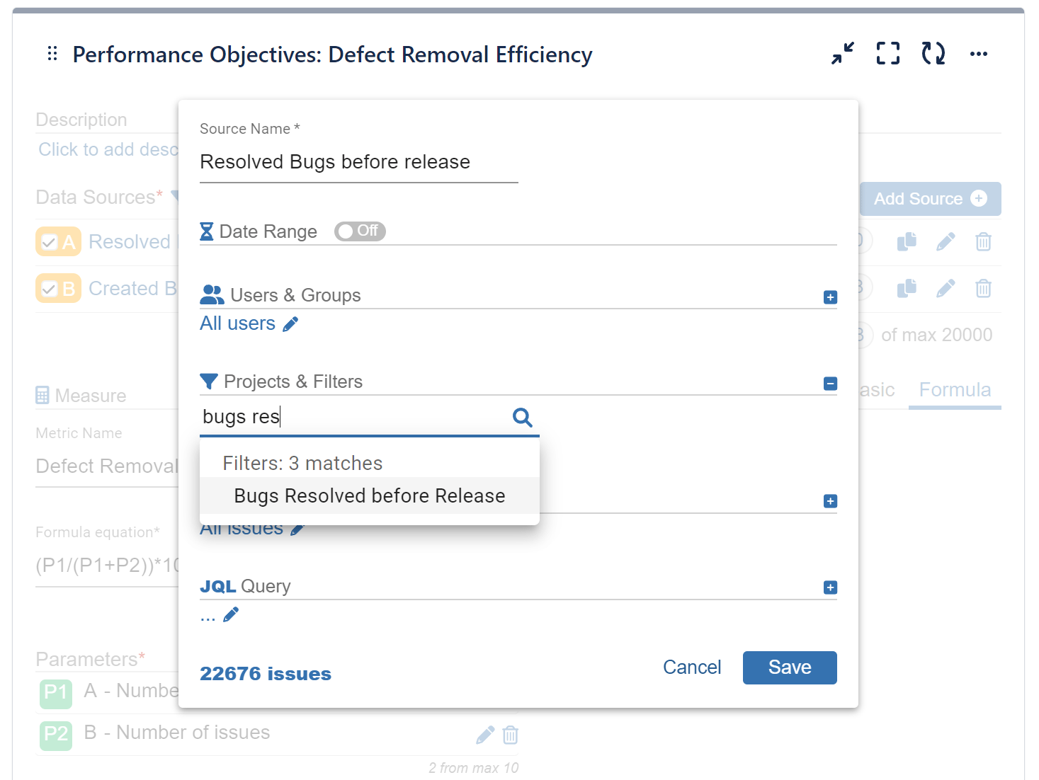
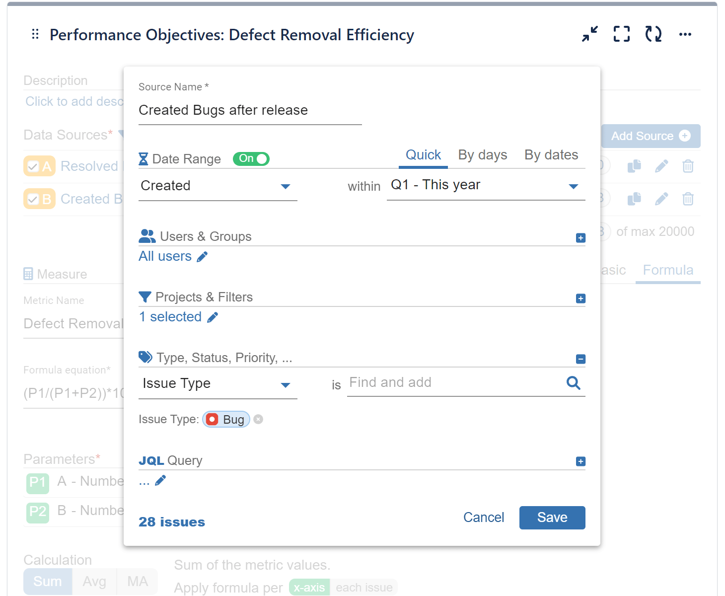
Step 2: Add 2 data sources, one with Bugs resolved before release, and the second one with Bugs reported after release. For this step you can use the app’s advanced data segmentation options or use saved filters in the data source settings:
Data Source 1 (P1 in our equation):
Bugs resolved before release
Data Source 2 (P2 in our equation):
Bugs created 90 days after release
Step 3: Select ‘Formula’ tab for the Metric calculation.
Step 4: Add 2 parameters – first (P1) with the number of issues from data source A: ‘Resolved bugs before release’ and second (P2) with the number of issues from data source B: ‘Bugs reported after release’.
Step 5: Use the parameters above in the formula equation: “(P1/(P1+P2))*100” for Defect Removal Efficiency (%) KPI.
Step 6: Choose ‘Priority’ for the ‘Display’ by field.
Step 7: Switch on Target section and select ‘Overall’ visualization. Keep the ‘Fixed’ tab selected and set a target value.
Step 8: Expand the ‘More Settings’ section, enable the ‘Warning Threshold Line’ and set value as % target. This will color the results above that value and below the target in amber.
For insightful guidance on structuring your data to calculate Defect Removal Efficiency (DRE), refer to the book The Economics of Software Quality by Capers Jones and Olivier Bonsignour (Addison-Wesley Professional, 2011). This resource explains why your calculations should include only valid and unique defects, the importance of limiting the post-release period for gathering data to 90 days, and how to handle bad fixes. Additionally, the book explores numerous other software quality metrics that have proven invaluable.
You may also check the Formula Metrics Article for more ideas on how to use the Formula feature.
Start your 30 days free trial of Performance Objectives: Charts for Jira from Atlassian Marketplace.