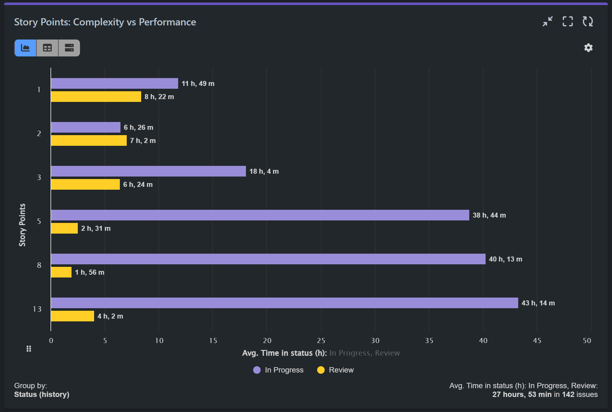
With Performance Objectives: Charts for Jira, your team can gain valuable insights into the average time it takes to complete issues with varying story point estimates. A Complexity vs Performance report can provide your clients with the data they need, enhancing their understanding of project progress and performance.
In practice, opinions on how to use Story Points vary, with some teams adopting a hybrid approach to estimate Product Backlog Items (PBIs) by combining Fibonacci sequence numbers and time estimates in order to handle client expectations. Clients might not fully comprehend the advantages of relative sizing and Story Points estimation. Instead, they often seek data directly reflecting the actual time required for different tasks. This article addresses these concerns by guiding you on creating a complexity vs performance KPI report using the ‘Time in status’ metric available in the Performance Objectives app.
Analyzing Story Points: Assessing Complexity vs Performance through Average Time in Status
Gain deeper insights into your team’s performance, identify areas for improvement, and make data-driven decisions to enhance overall efficiency and effectiveness in your project delivery. Based on a complexity vs performance report your agile teams can fine-tune their estimation processes, improve requirements gathering, and leverage individual expertise for better outcomes.

Improve your Sprint retrospectives by analyzing the average Time in status for issues with specific complexities, evaluating their estimation accuracy, requirements quality, and developer expertise within your Agile team.
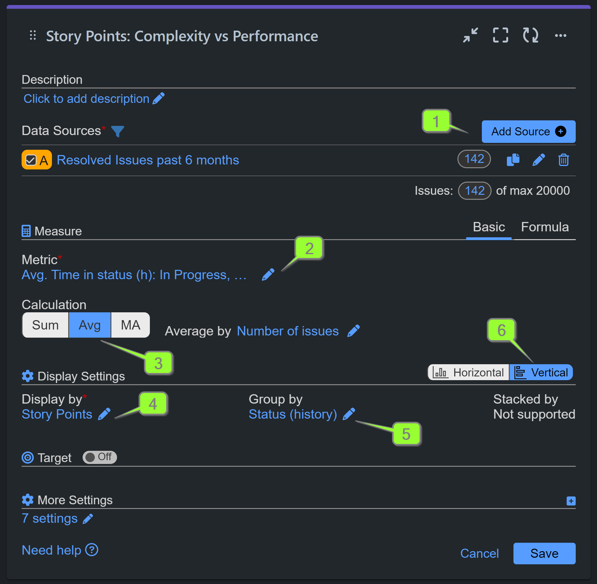
Here’s a step-by-step guide on how to configure complexity vs performance report in Jira with our app:
Step 1: Filter out the data you wish to analyze as your ‘Data Source’. In our example we have filtered all resolved issues for the past 6 months in our Scrum demo project.
Step 2: Select the ‘Time in status’ metric and add one or more applicable statuses to analyze, e.g., In Progress, Review, Testing.
Step 3: Choose the ‘Average’ calculation method and leave the average to be calculated by Number of issues.
Step 4: Select ‘Story Points’ for the ‘Display by’ field.
Step 5: (Optional) Further break down the data by selecting ‘Status (history)’ or any other relevant criteria.
Step 6: (Optional) Opt for the ‘Vertical’ orientation to accommodate more items on the x-axis.

You can switch to Pivot table view or Tiles view directly form your chart. You can also export the report data in CSV format for comprehensive analysis, and download it as PDF.
Watch this configuration video with the easy steps to create a Complexity vs Performance report in Jira.
For additional performance-related reports, please visit our KPI examples. To find inspiration for reporting from your Jira data, explore the list of supported metrics and fields in our Configuration Overview.
If you require assistance with chart configurations, our support team is readily available to help you!
Start your 30 days free trial of Performance Objectives: Charts for Jira from Atlassian Marketplace.