With Performance Objectives: Charts for Jira, you can easily make period over period comparison of your Jira data. There are different ways to set up your report, but the most effective is using PoP comparison alongside a target. Our app’s “Targets” feature, available in both Performance Objectives and Performance Trend gadgets, helps you create meaningful PoP reports with ease.
This article will delve into a practical use case, demonstrating the application of the % Change target – one among the four target calculation options facilitated by the Targets feature.
You can set up a Period over Period (PoP) goal like Year over Year (YoY), Quarter over Quarter (QoQ), or Month over Month (MoM), measured as a percentage change compared to the previous period. Enabling you to assess and track performance enhancements directly from your Jira dashboard, this approach cultivates a goal-focused environment and offers valuable insights into your team’s progress and accomplishments.

Period over Period Comparison: Achieving Goals Through Percentage Change Analysis
Ensure that your team’s performance aligns with your organization strategic objectives by setting improvement goals as KPIs and track improvement over time.
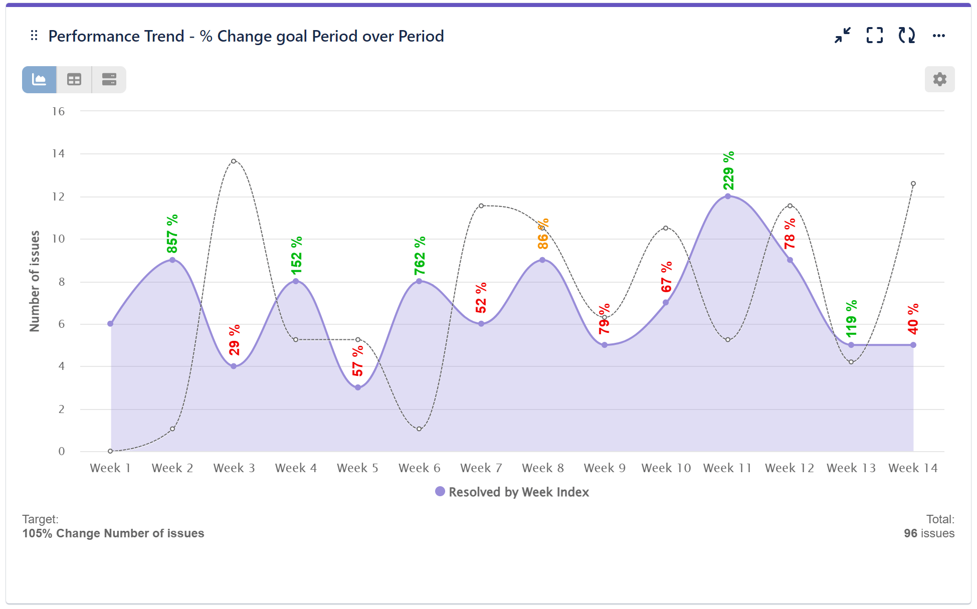
Here’s a sample PoP % change report:

In our sample example, our team’s goal is to increase the number of resolved issues, features, or user stories delivered in Q1 this year by 5% compared to the previous quarter. However, you have the flexibility to select other metrics for evaluation, aiming at improvement of efficiency, quality, cycle time, velocity, backlog management, or any other relevant parameter that aligns with your specific objectives and set Period over Period goal as a percentage of change of the current metric.
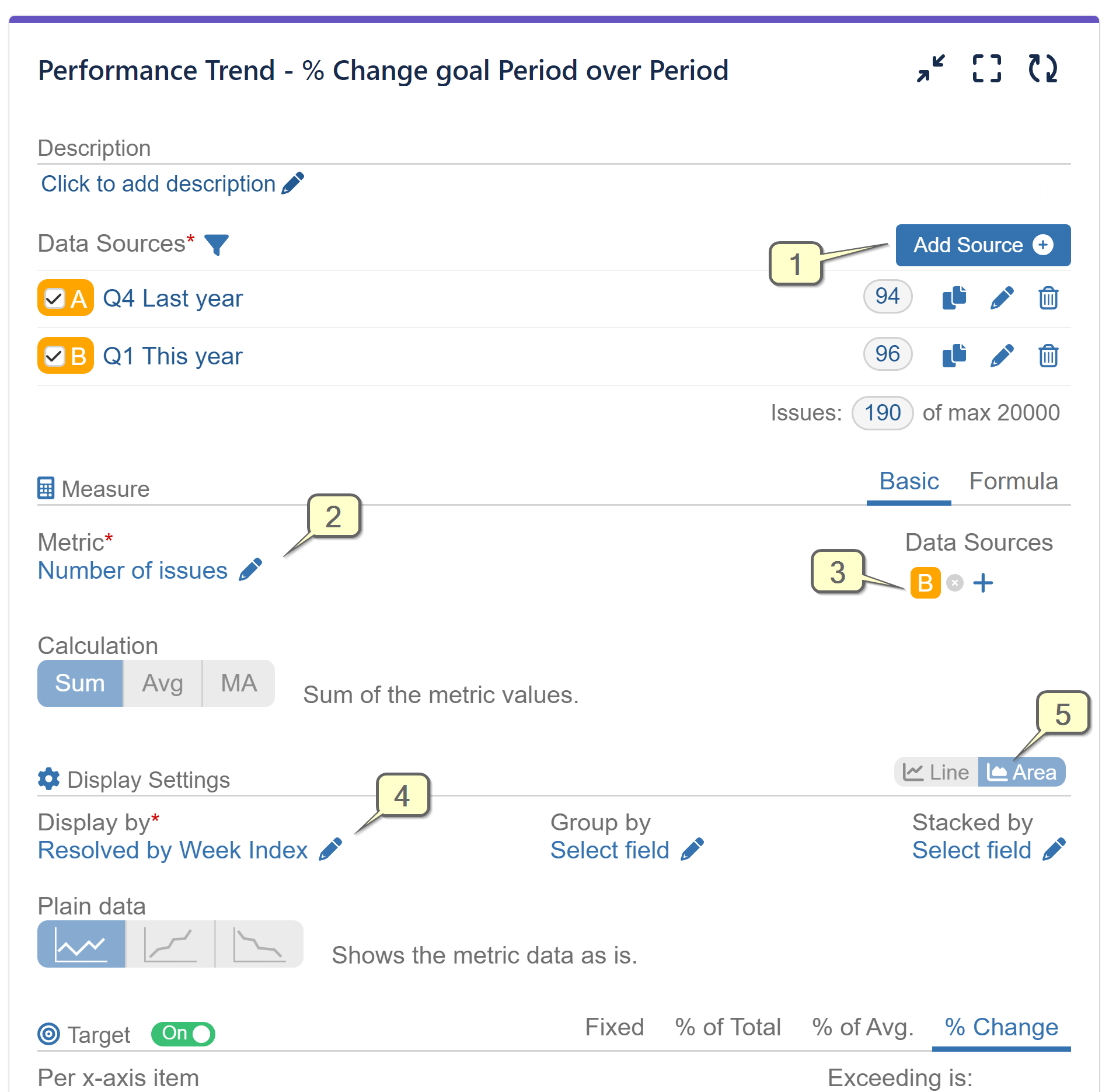
Here’s the configuration screen and a step-by-step guide for setting up this chart:


Step 1: Add two data sources with two periods for comparison, such as two consecutive quarters.
Step 2: Choose the metric to be evaluated. In our example, we are using the default metric ‘Number of issues’.
Step 3: Select Data source B (The latter period data – Q1 This year in our case) for metric value calculation.
Step 4: Set the Display by field with the selected granularity and check the ‘by Index’ toggle to enable period-over-period data display on the x-axis.
Step 5: (Optional) Select the area mode of the trend chart.
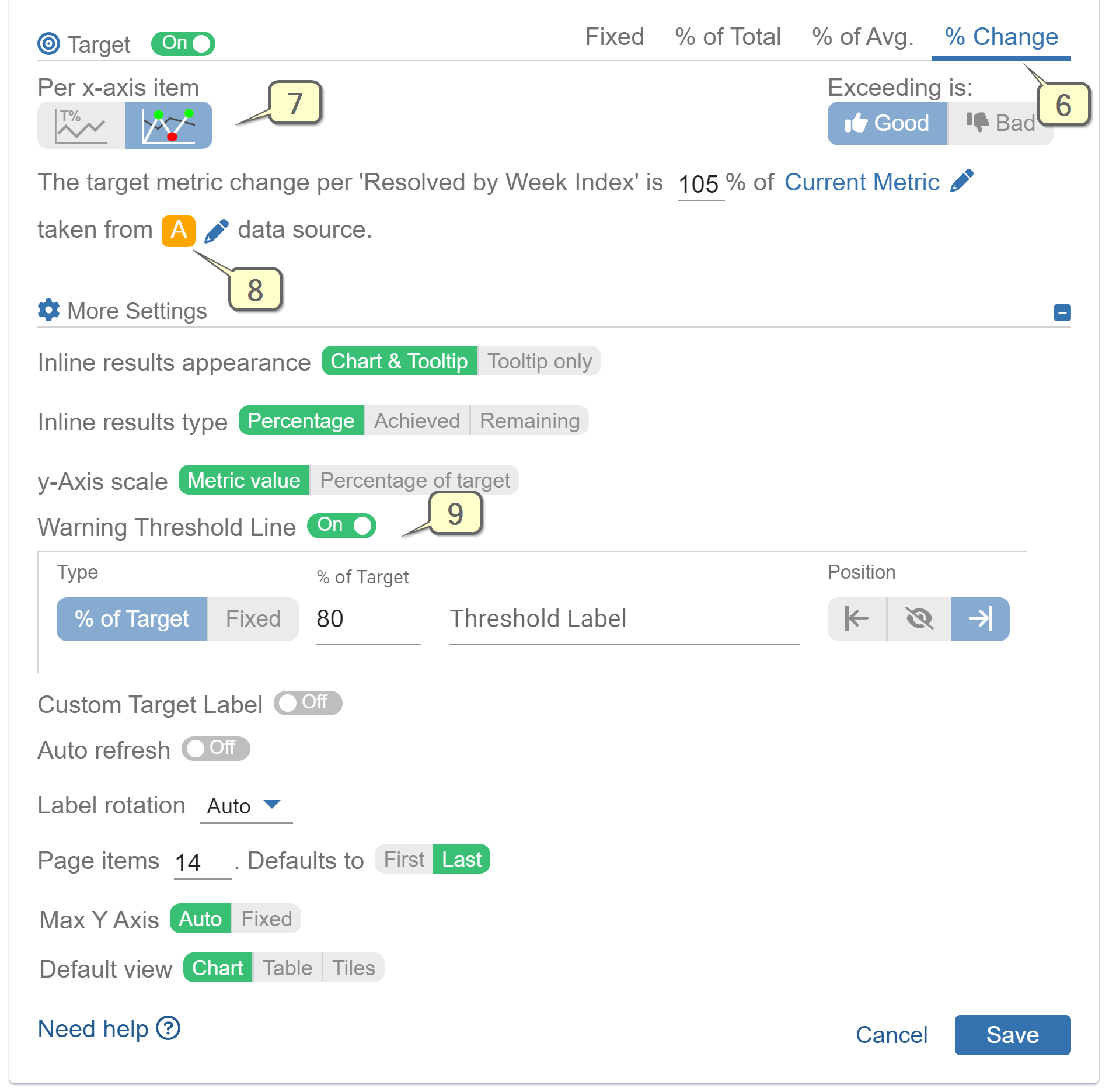
Step 6: Turn on the Target section and choose ‘% Change’ target type.
Step 7: Select the ‘per axis item’ calculation and set a target percentage of your choice.
Step 8: Choose data source A (previous period data – Q4 Last year in our example) for the target value calculation.
Step 9: (Optional) Add a warning threshold.
Refer to the video recording for creation of a PoP % change KPI report:
Explore the four Target types and various target customization options available in the app. For further inspiration on optimizing Targets and elevating your performance management in Jira, visit our KPI Examples section. It offers valuable insights to help you make the most of the app’s capabilities.
For an all-inclusive list of gadgets, features, chart types, and supported metrics and fields within the app, refer to the Configuration overview.
Start your 30 days free trial of Performance Objectives: Charts for Jira from Atlassian Marketplace.