Efficiently managing support requests is crucial for any organization, and having insights into the busiest hours can greatly enhance shift planning and resource allocation. Within the Jira user community, there is a widespread demand for generating support requests report based on the time of day, providing teams with valuable insights into peak hours.
While Jira offers some out-of-the-box solutions, users often seek more comprehensive options for visualization and detailed analysis. In this article, we explore how the Performance Objectives: Charts for Jira app can empower you to create custom support requests reports based on specific timeframes such as by hour of day, day of week, week of the month, and more.
With this app, you can go beyond Jira’s default features and unlock a range of visualization and detail level options to suit your specific requirements. The app offers a variety of gadgets to choose from for this report, like Performance Objectives gadget, Circular Chart, or Heat Maps gadget, allowing you to select the chart type that aligns with your preferences. By harnessing these powerful tools, you can easily analyze support requests data and gain actionable insights to enhance your operations.
Table of Contents
Step-by-Step Guide: Configuring ‘Circular Chart’ Gadget for Effective Visualization of Support Requests by Time of Day

Step 1: Add ‘Circular Chart’ gadget to your Jira dashboard.
Step 2: Filter the data you want to analyze – e.g., use a saved filter, select one or multiple projects, all issues created in the past 6 months, etc. You can also filter only certain issue types you want to analyze – e.g., technical support, bugs, incidents.
Step 3: Leave the default metric ‘Number of issues’ as it is.
Step 4: In the Display settings choose for Level 1: ‘created’ and granularity ‘by hour’. Consolidate data by ‘hour of day’.
Step 5: (Optional) Switch on ‘Exclude empty’ button.
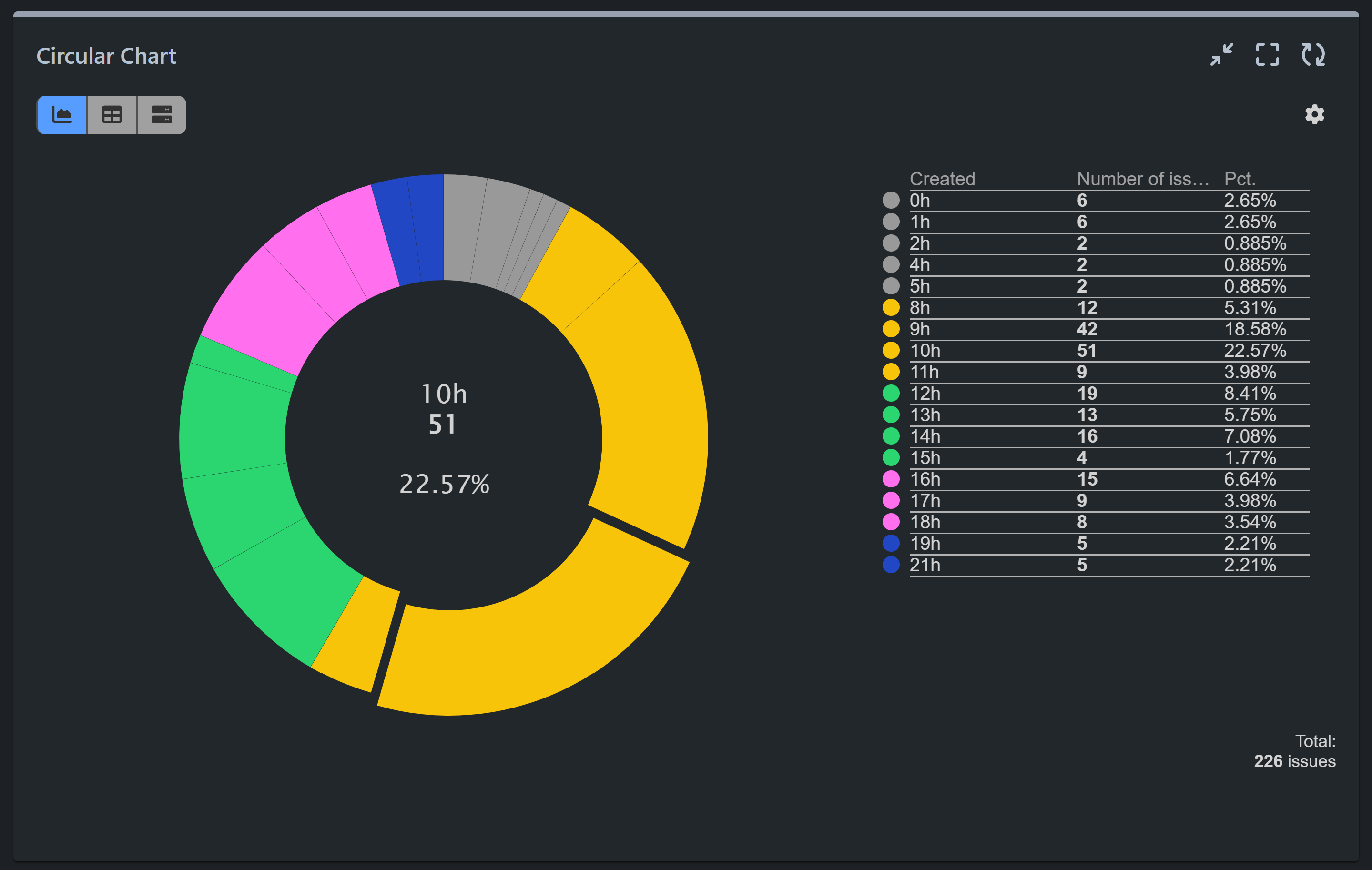
Step 6: Select the type of Circular chart to visualize data (we are using Donut chart in the configuration as it allows for easy comparison of proportions. Users can quickly see the relative sizes of each hour segment in relation to the whole.
Step 7: (Optional) Utilize the color change feature on the chart to customize the color codes for better visualization of your results. For instance, we’ve colored support requests based on different time frames, such as midnight to 5 am colored in grey, 6 am to 11 am in yellow, and 12 pm to 3 pm in green. This color segmentation enhances the readability of the data, allowing for easier interpretation.
Unveiling Support Request Trends: Exploring Busiest Days and Hours with the Heat Map Gadget Configuration
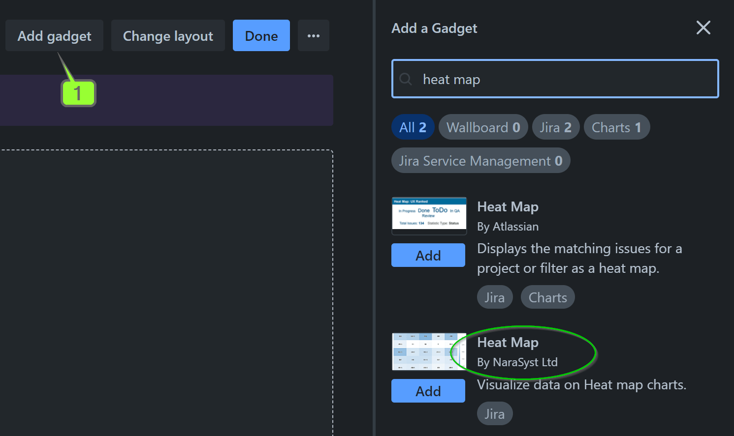
Step 1: Choose the Heat Map gadget as a first step:

Step 2: Filter the data you want to analyze – e.g., use a saved filter, select one or multiple projects, all issues created in the past 6 months, etc. You can also filter only certain issue types you want to analyze – e.g., technical support, bugs, incidents.
Step 3: Leave the default metric ‘Number of issues’ as it is.
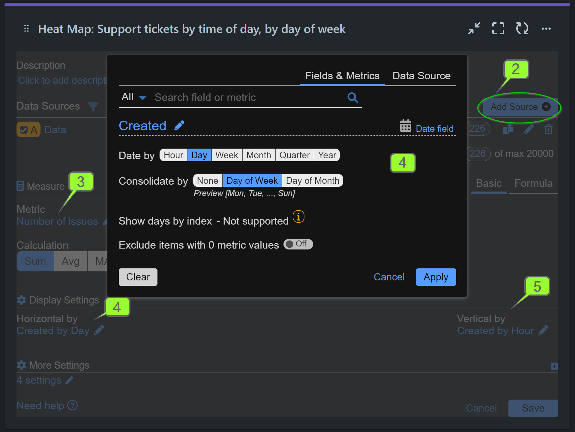
Step 4: In the Display Settings section set horizontal by ‘Created by day’ and consolidate by ‘day of week’:
The Performance Objectives app offers a wide range of data granularity options, providing you with flexibility and customization in visualizing your data. Apart from displaying issues by day or month, the app allows you to consolidate data by week of month, week of quarter, or even quarter of year, depending on your preferences. For a comprehensive overview of all available selection options in the “Display by” section, we recommend referring to the Date Granularity article.
Step 5: Set vertical by ‘Created by hour’ and consolidate by ‘hour of day’. Click Save.

Here you may watch a step-by-step configuration recording:
Unraveling Deeper Insights: Exploring the Relationship between Support Request Report by Time of Day and SLA Breaches with the Multi Metric Combined Chart Gadget
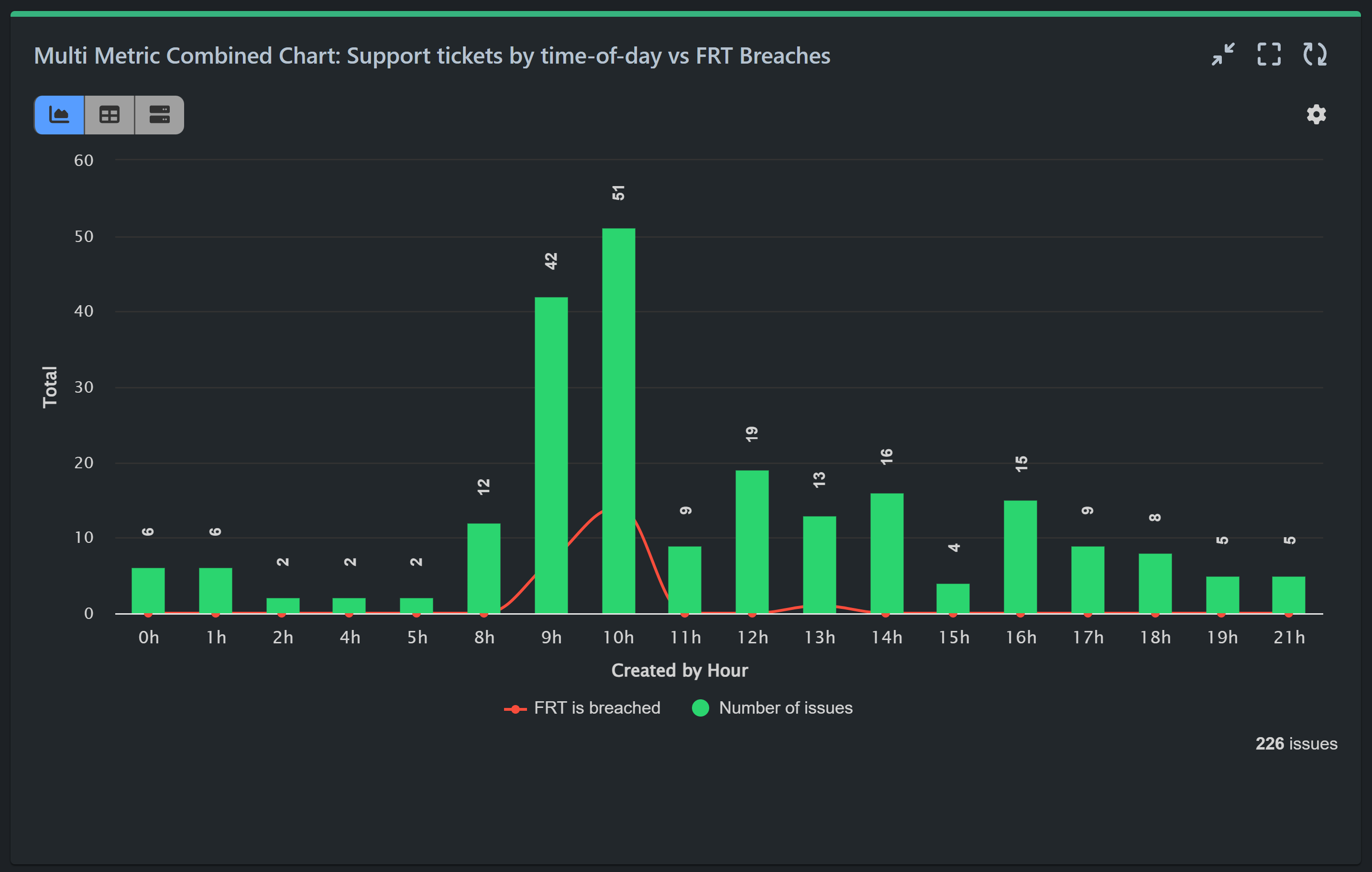
To delve deeper into your Jira data and gain comprehensive insights, consider utilizing the Multi Metric Combined Chart Gadget. This powerful tool enables you to explore potential relationships, such as the correlation between the busiest hours for support tickets in Jira Service Management (JSM) and instances of ‘Time to First Response’ breaches. Visualizing this relationship is made easy with the chart example provided below:

To gain a better understanding of the functionalities and capabilities offered by the Multi Metric Combined Chart gadget for Jira reporting, we invite you to explore our comprehensive article Multiple Metrics. This resource will provide you with detailed insights into how this gadget operates and the various features it offers to enhance your reporting experience within Jira.
If you require assistance with the configuration process or have any additional questions, please do not hesitate to reach out to our dedicated support team. We are here to provide you with the guidance and support you need to make the most of the Performance Objectives: Charts for Jira app.
Start your 30 days free trial of Performance Objectives: Charts for Jira from Atlassian Marketplace.