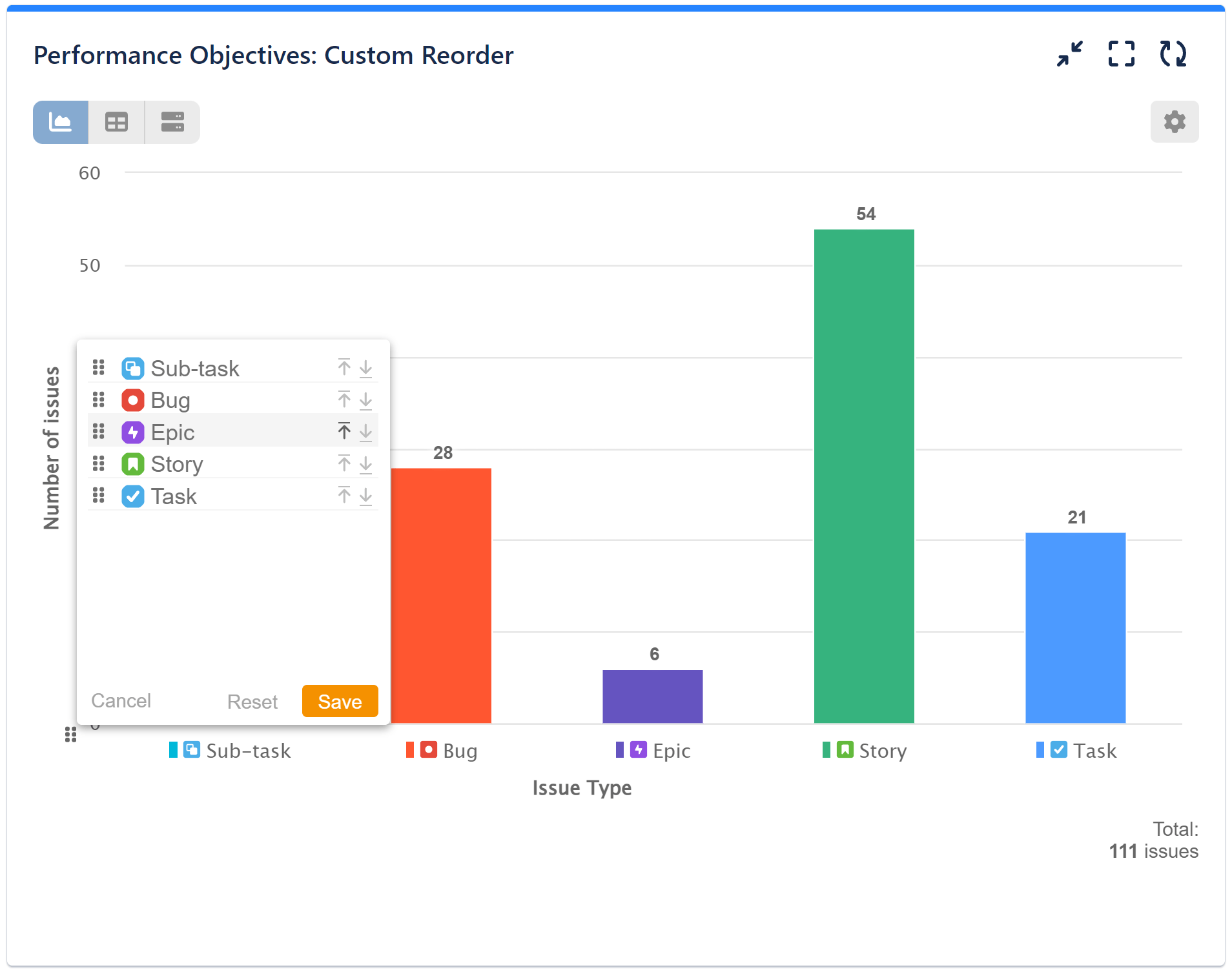
Introducing a game-changing customization feature supported by the Performance Objectives app: the drag-and-drop capability to select the sort order of x-axis items directly from your chart. This functionality brings numerous advantages to Jira users, enabling them to create more customizable and interactive charts and reports.
With this feature, users can effortlessly arrange and prioritize the display order of their x-axis items, enhancing the clarity and visual impact of their data visualizations. This level of control empowers users to tailor their reports precisely to their preferences, streamlining data analysis and decision-making processes. Say goodbye to static reports and hello to dynamic, user-driven data insights with Performance Objectives app.
Interactive Jira Data Analysis with Custom Reorder

The Custom Reorder feature is accessible for the ‘Performance Objectives‘ and ‘Multi Metric Combined’ dashboard gadgets, as well as in the Radial bar chart and Windrose chart of the ‘Circular gadget’. You can apply reordering to all Jira field types set for ‘Display by‘ except for the “date” type.
To see this in action, please review the following recording showcasing its usage. Harness the power of custom reorder for enhanced control and precision in your data presentation.
Among the array of customization options offered by the Performance Objectives for Jira app, you’ll find features such as Custom Colors, Result Formatting, Warning Threshold, etc.
Start your 30 days free trial of Performance Objectives: Charts for Jira from Atlassian Marketplace.