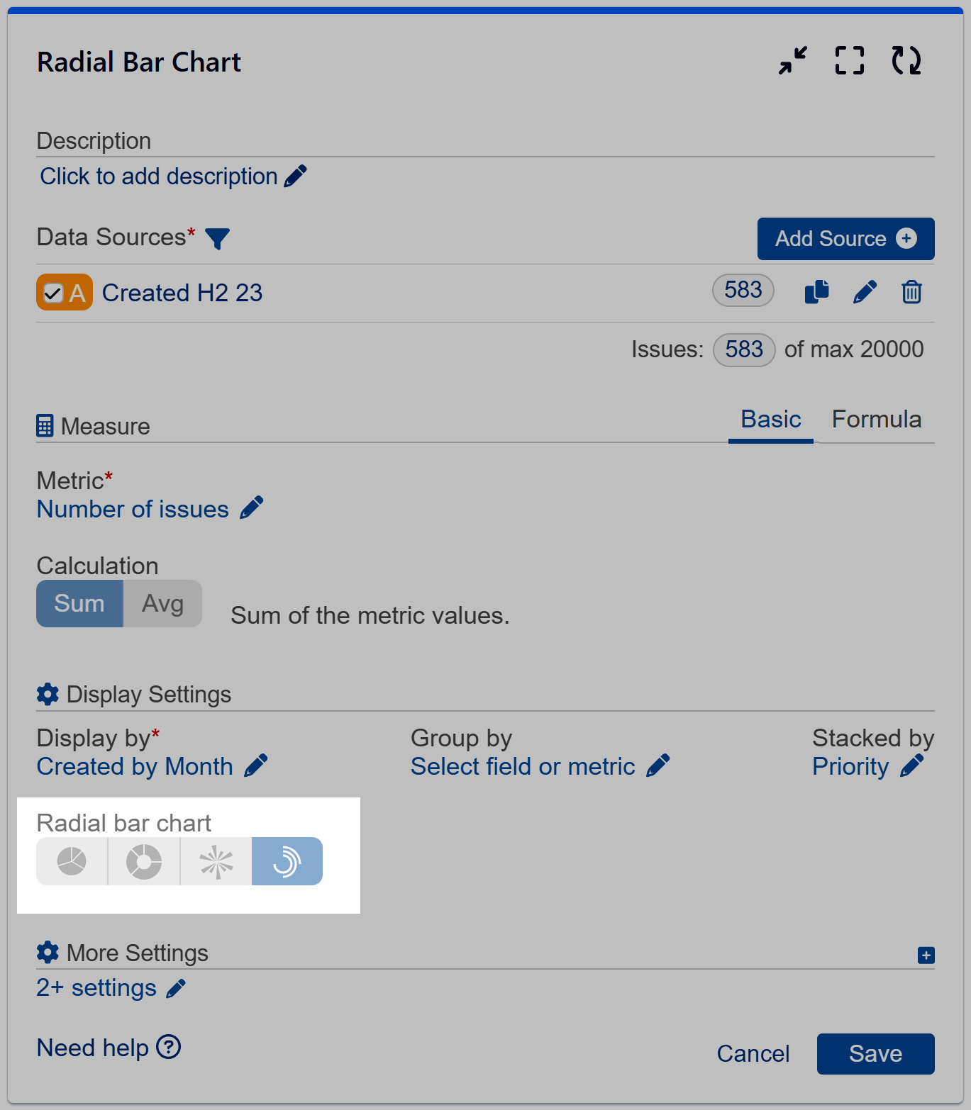
Create Radial Bar Charts on your Jira dashboard by utilizing the ‘Circular Chart’ gadget within the Performance Objectives app. This chart type offers an intriguing alternative to standard bar charts, enabling you to create visually captivating reports that resonate with your audience.

It is good for presenting small number of categories that follow certain sequence or hierarchy, e.g.:
- to display one metric by year for up to 5-7 years
- compare one metric for multiple projects
- to visualize the distribution of one metric on various issue types, etc.
Explore Various Radial Bar Chart Visualizations
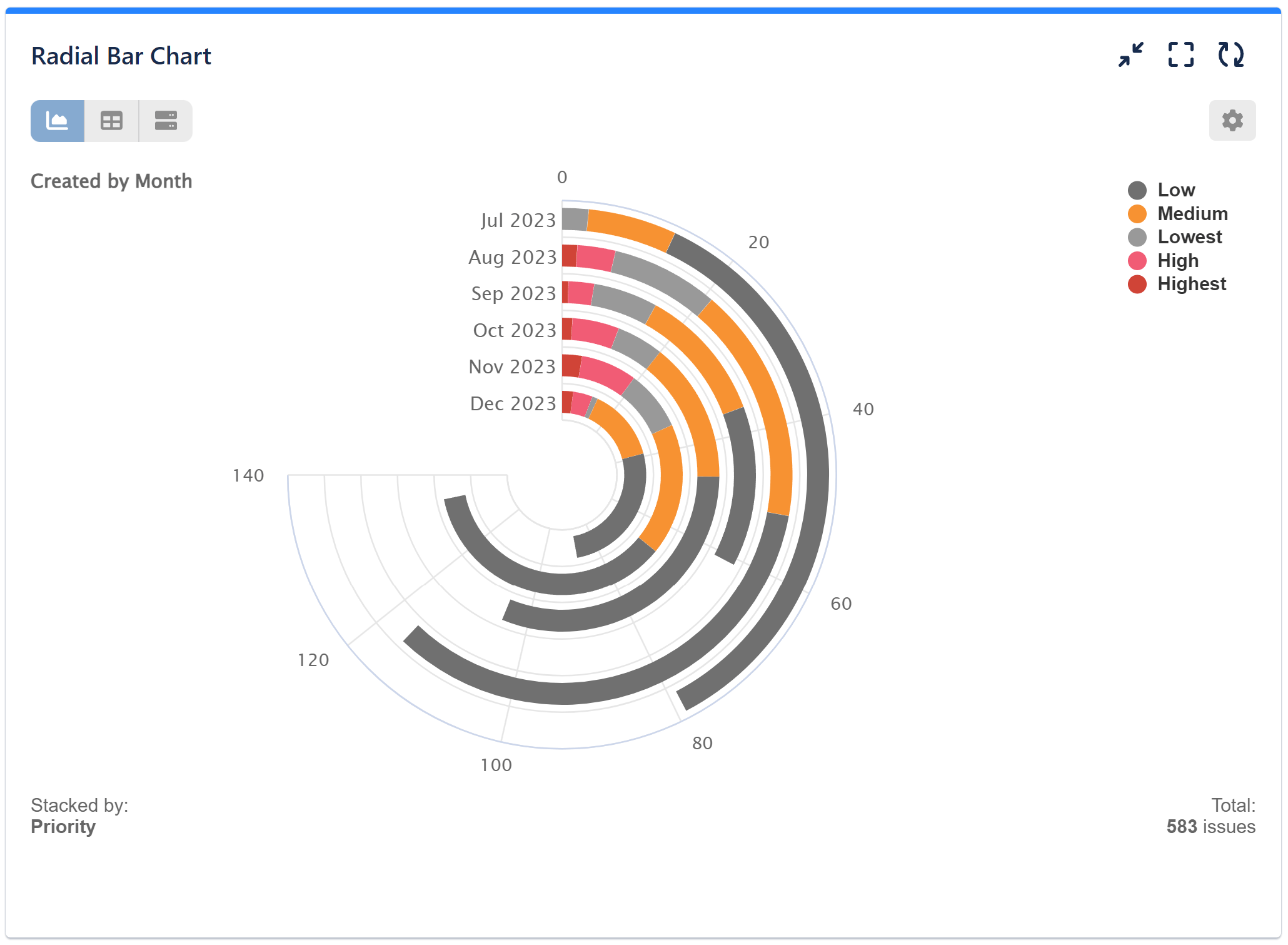
Basic Radial bar chart ‘Stacked By’ field ‘Issue Type’. Metric is ‘Number of issues’, displayed ‘By Month’.

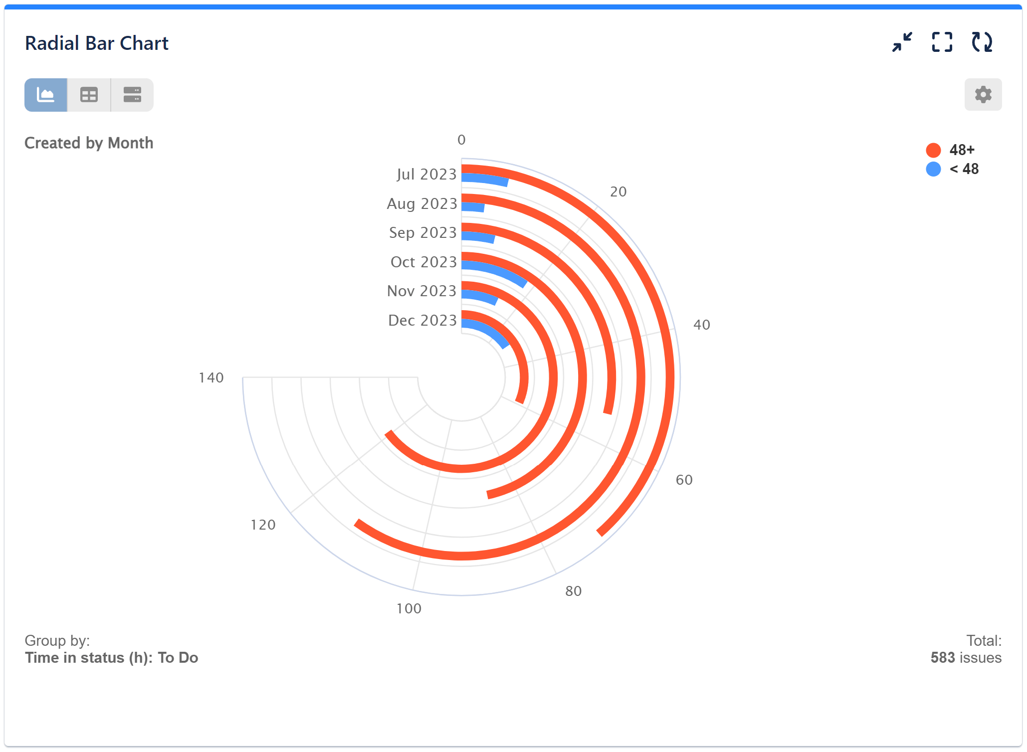
Basic Radial bar chart configured with ‘Group By’ option. Chart metric is ‘Number of Issues’, grouped by metric ‘Time in Status (h): ‘To do’, configured with one Metric Distribution Slot – 48h:

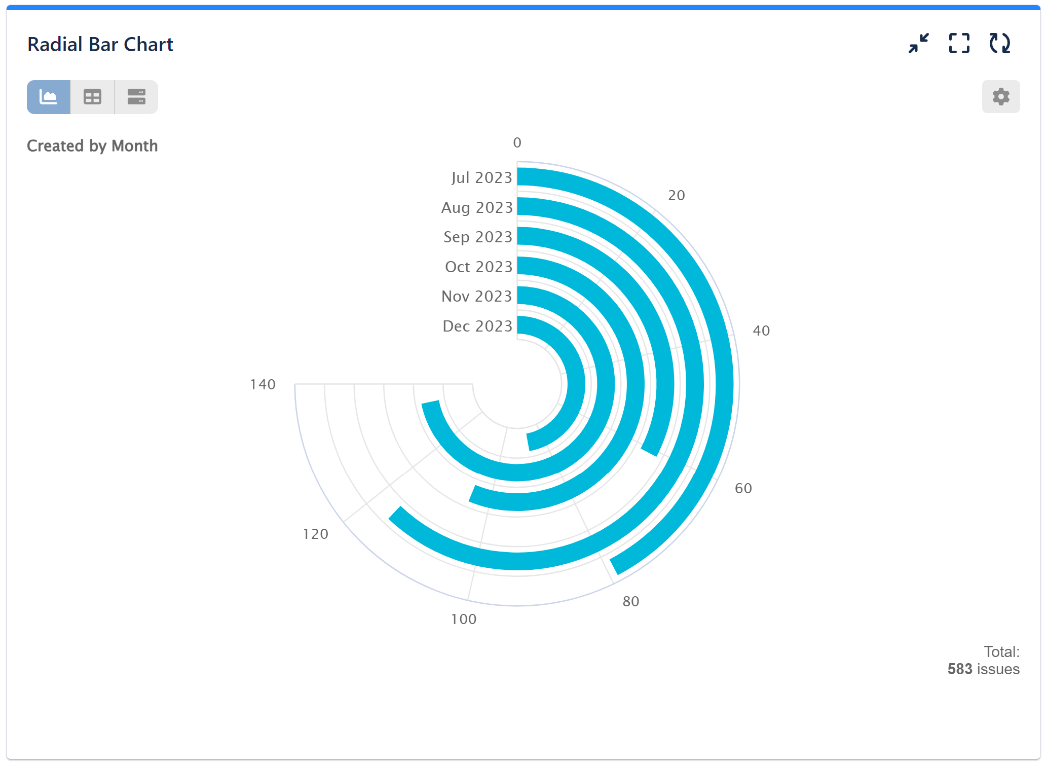
Basic Radial bar series. Metric is ‘Number of Issues’, displayed by ‘Created By Month”:

Check the video with configuration steps for the above examples:
You can combine ‘Group By’ and ‘Stack By’ options one in Radial Bar chart, but it may become too difficult to read, depending on the selected data source and metric. Consider using one of the other charting options available in the app when you need to segment metric by more than 2 fields or other metrics.
Check the other chart types in Performance Objectives app in our Charts overview page.
If you need further help configuring your reports and KPIs, please contact our Support team.
Start your 30 days free trial of Performance Objectives: Charts for Jira from Atlassian Marketplace.