Create impressive interactive reports with Sunburst chart visualization on your Jira Dashboard using the ‘Circular Chart’ gadget available within the Performance Objectives app.
Choose it when you need to visualize hierarchical data and provide quick summaries. Click on any of the inner elements to drill down and inspect the data in more details. Change the default colors to fit your data best and improve the visual effectiveness of the report.
Switch from Donut to Sunburst Chart with Slice-Level Drill Down
Explore the versatility of our charts as we delve into various levels of data visualization, each with its unique use case and impact.
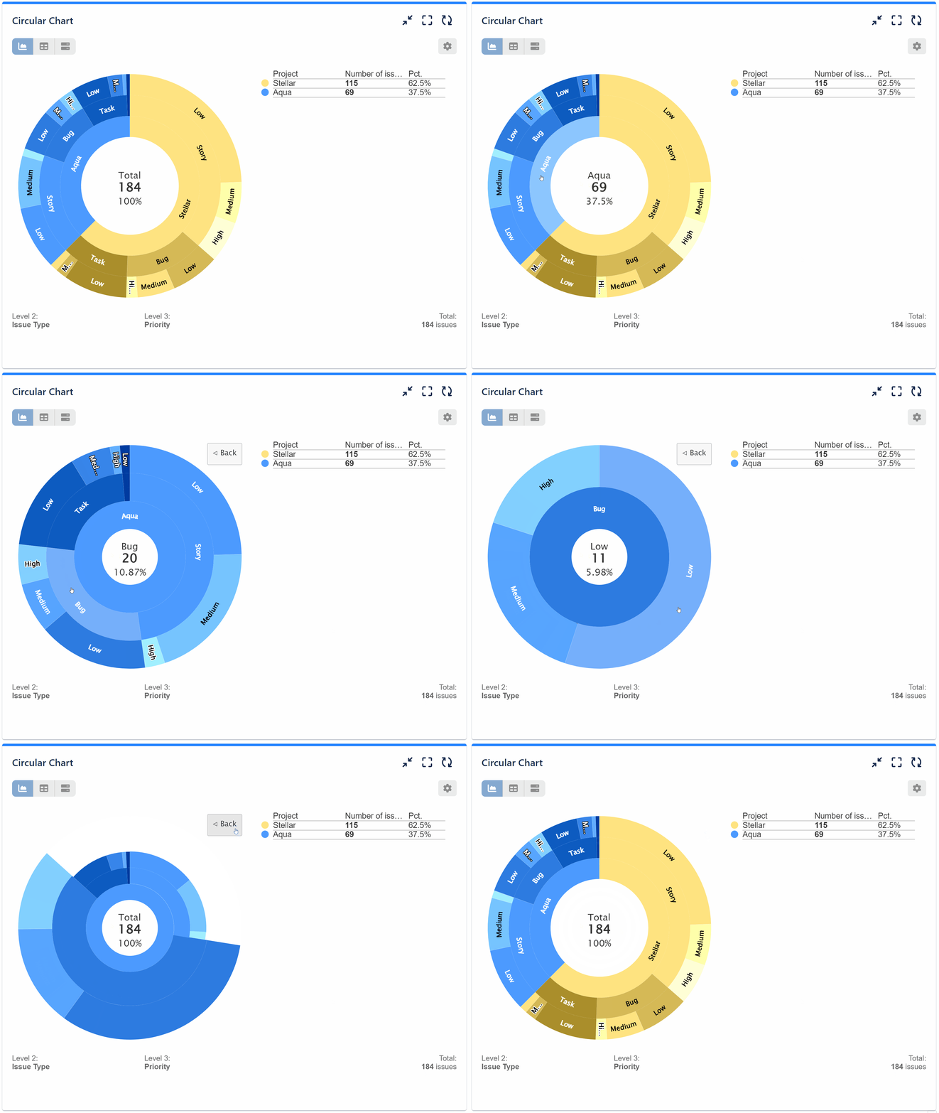
3-level Sunburst Chart
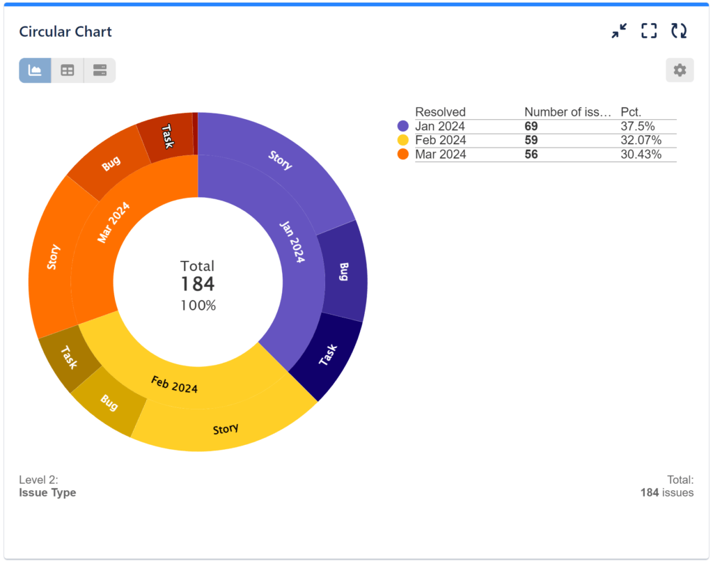
2-level Sunburst Chart
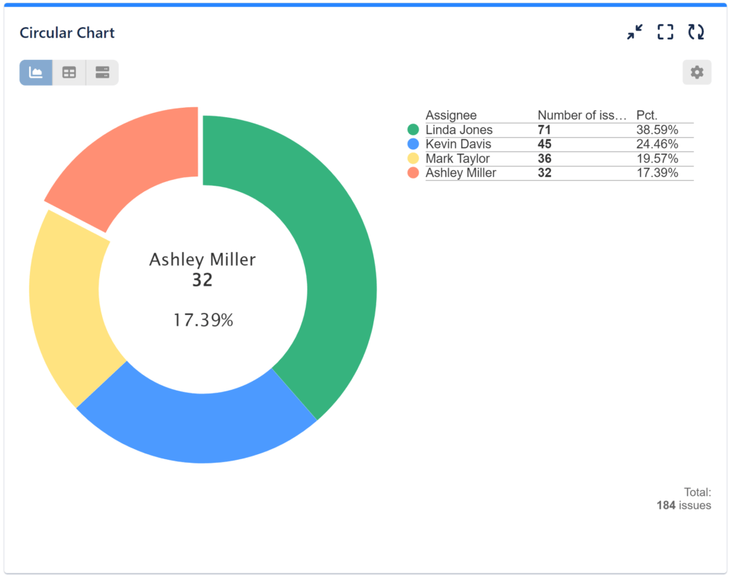
1-level Sunburst / Simple Donut Chart with Slice Selection
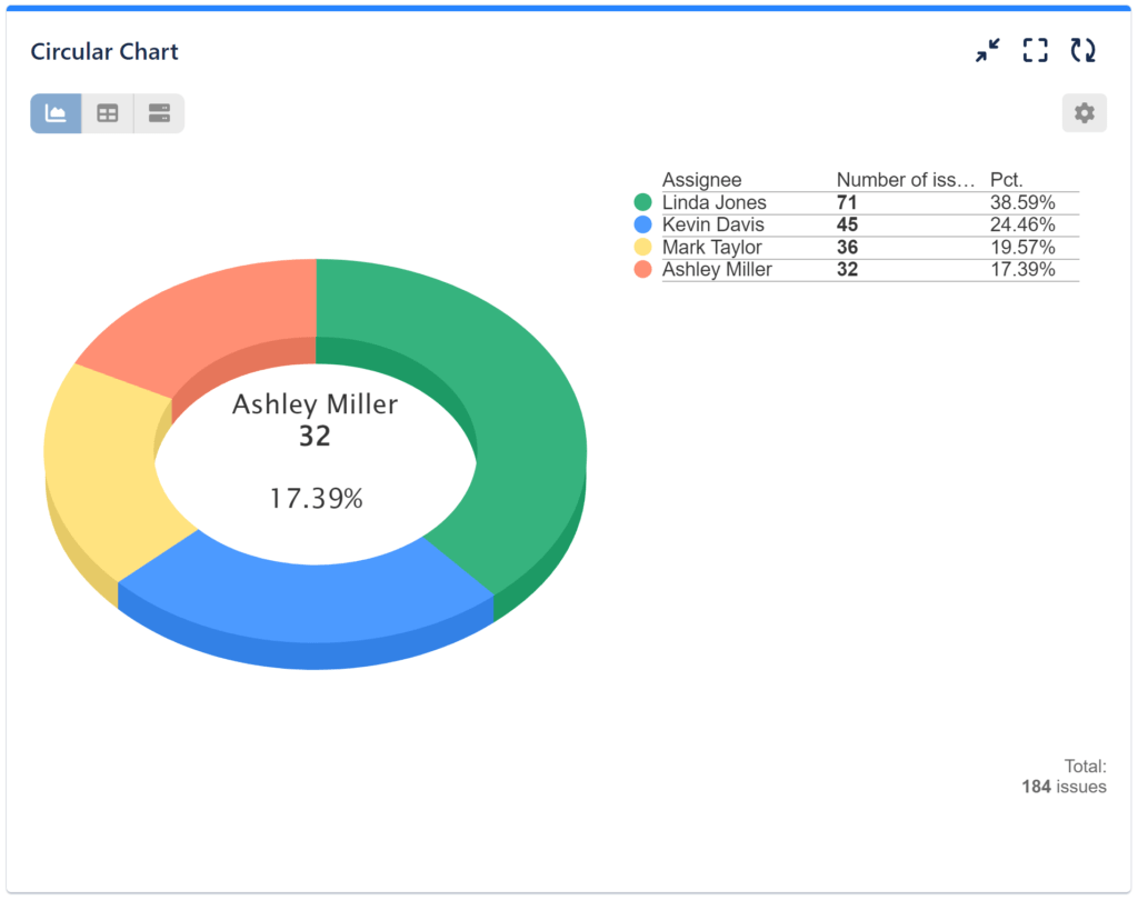
1 Level Sunburst Chart in 3D View
Guided Configuration for a 3-Level Sunburst
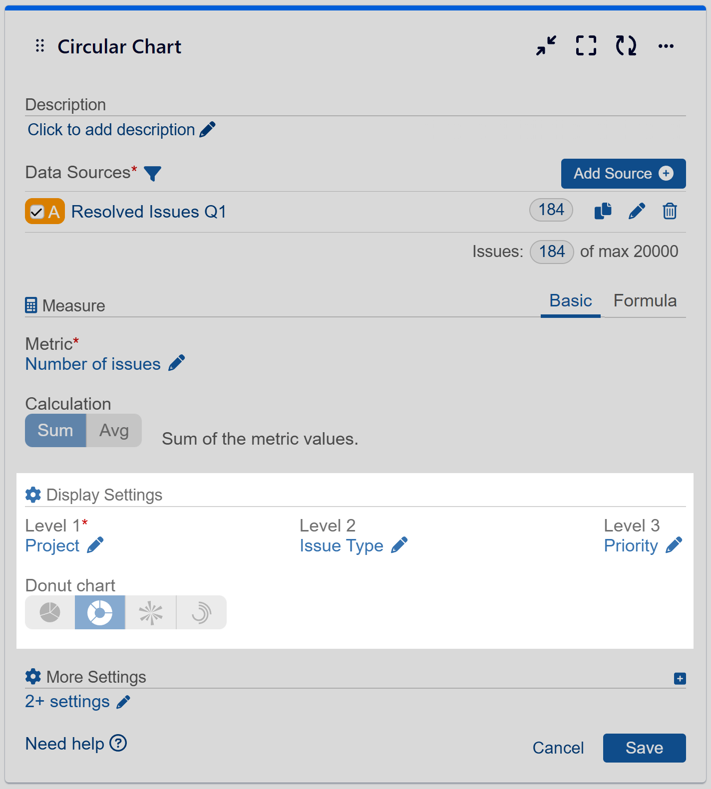
Step 1: Add data source. Filter out the issues that need to be analyzed. To explore Data Source options, please check the Configuration Overview article.
Step 2: Select metric ‘Number of issues’ from the available metric options.
Step 3: In the Display settings select field ‘Project’ for ‘Level 1’ from the available field options.
Step 4: Select field ‘Issue Type’ for ‘Level 2’ from the available field options.
Step 5: Select field ‘Priority’ for ‘Level 3’ from the available field options. Save the configuration.
Step 6: (Optional) Choose custom colors for your chart.
Video recording with the sample configuration steps:
Use the ‘Circular chart’ gadget to create reports like Support requests by hour of day.
Explore the other chart types available in the app.
Start your 30 days free trial of Performance Objectives: Charts for Jira from Atlassian Marketplace.