One of the four charts supported by the ‘Circular Chart’ gadget of the Performance Objectives: Charts for Jira app is the Wind rose chart. Also known as a Polar Area chart or Wind Rose diagram, it finds common use in fields like meteorology or environmental science, but its versatility extends to various other scenarios as well, including Jira reporting.
The Windrose chart is particularly valuable when dealing with data that has both direction and magnitude components. It allows you to visualize patterns, trends, and data distributions across different directions, enhancing Jira reporting capabilities.
In this article, we will guide you through the process of experimenting with the rich display options (display by, group by, stacked by) of Windrose charts using the ‘Circular Chart’ gadget in Jira. This will enable you to make the most of this powerful tool for your reporting needs.
Wind rose Chart Display Options
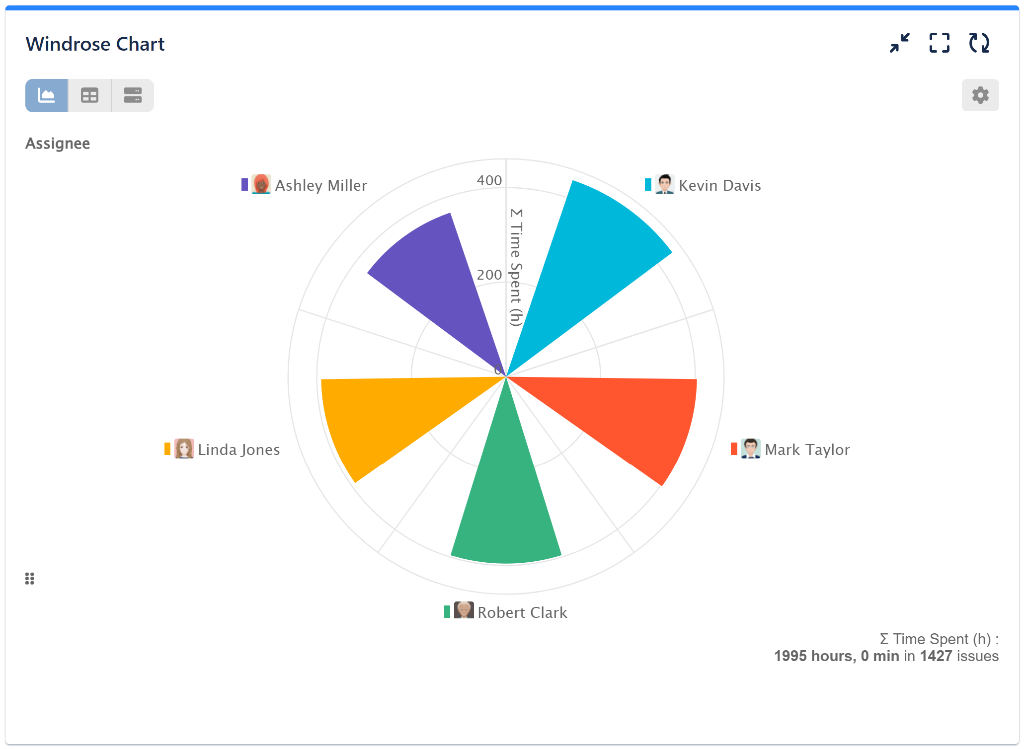
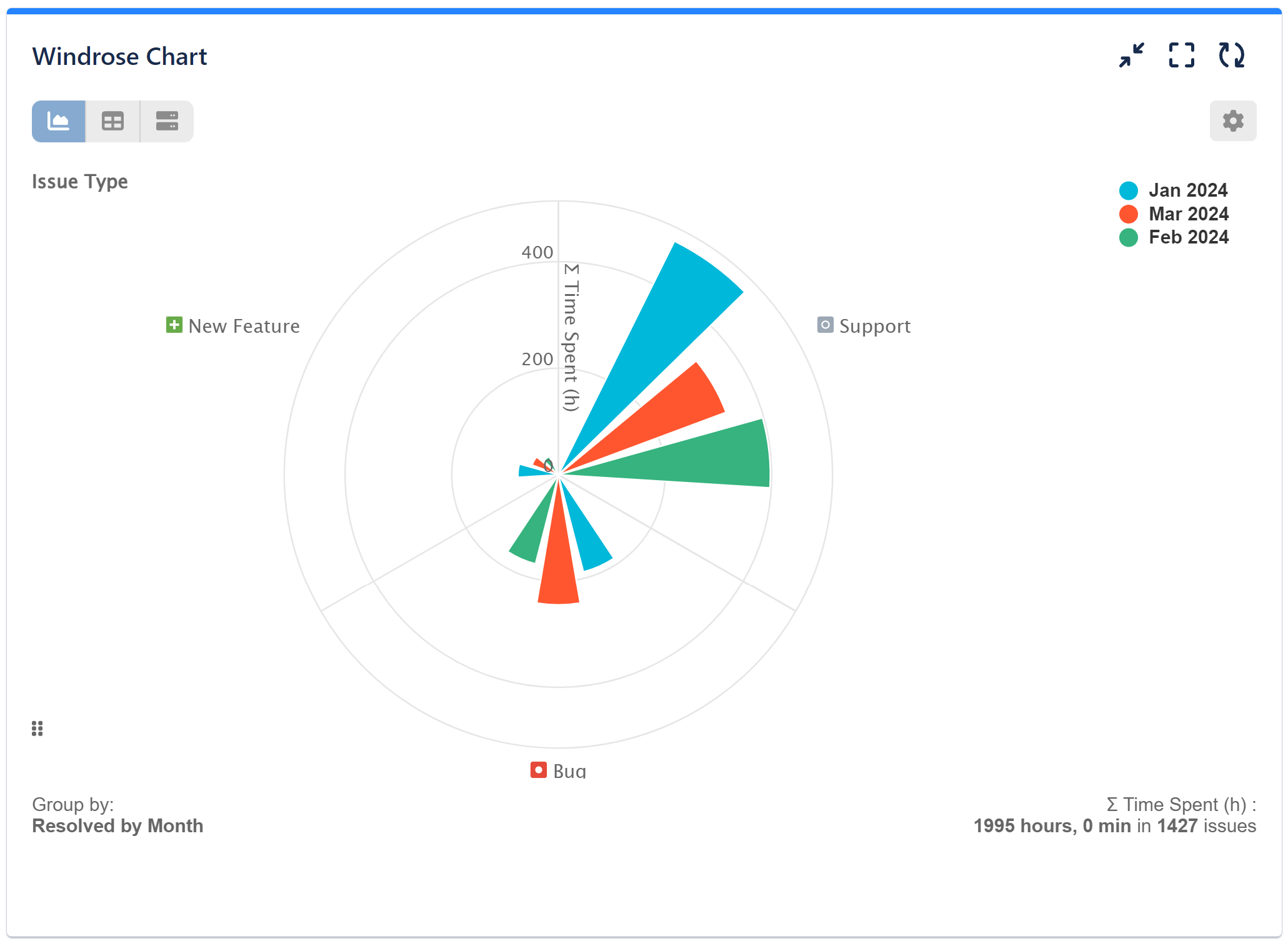
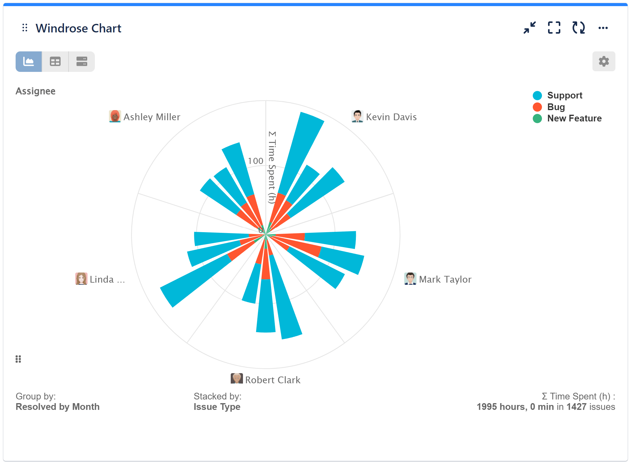
To gain valuable insights directly on our Jira dashboard into how time is allocated among assignees across various issue types, leading to improved resource management and issue resolution tracking, let’s explore the configuration settings for a 3 Level Wind Rose chart. This chart will display the time spent per assignee for different issue types resolved by month, providing a comprehensive view of resource distribution and productivity over time.
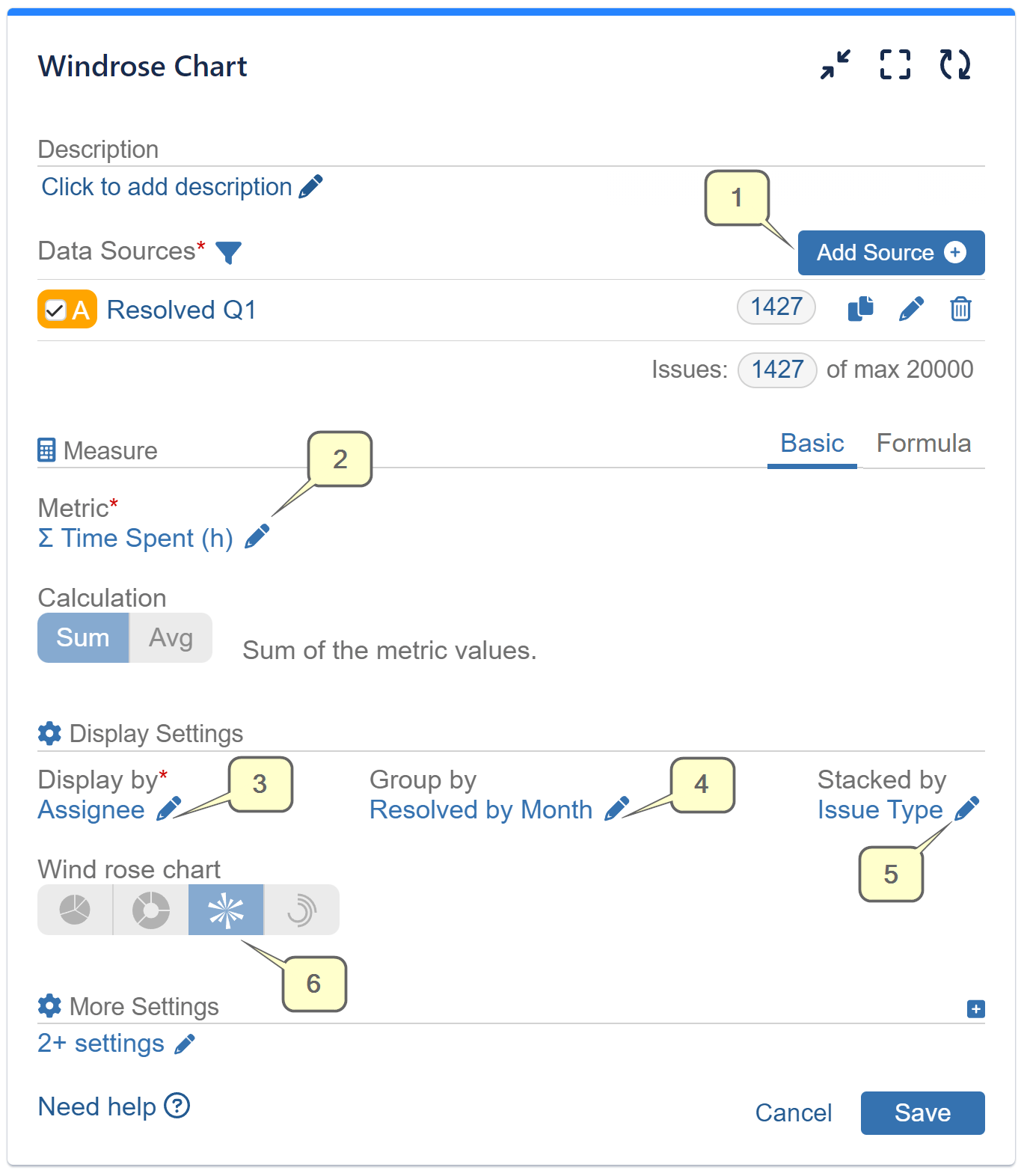
- Step 1: Add a Data Source according to your needs.
- Step 2: Select metric ‘∑ Time Spent (h)’
- Step 3: Choose the ‘Assignee’ field for ‘Display by.’
- Step 4: For ‘Group by’ set ‘Resolved by Month’
- Step 5: For ‘Stacked by’ set ‘Issue Type’
- Step 6: Select Wind rose chart and save your configuration
Enhance Your Chart: Customization Options
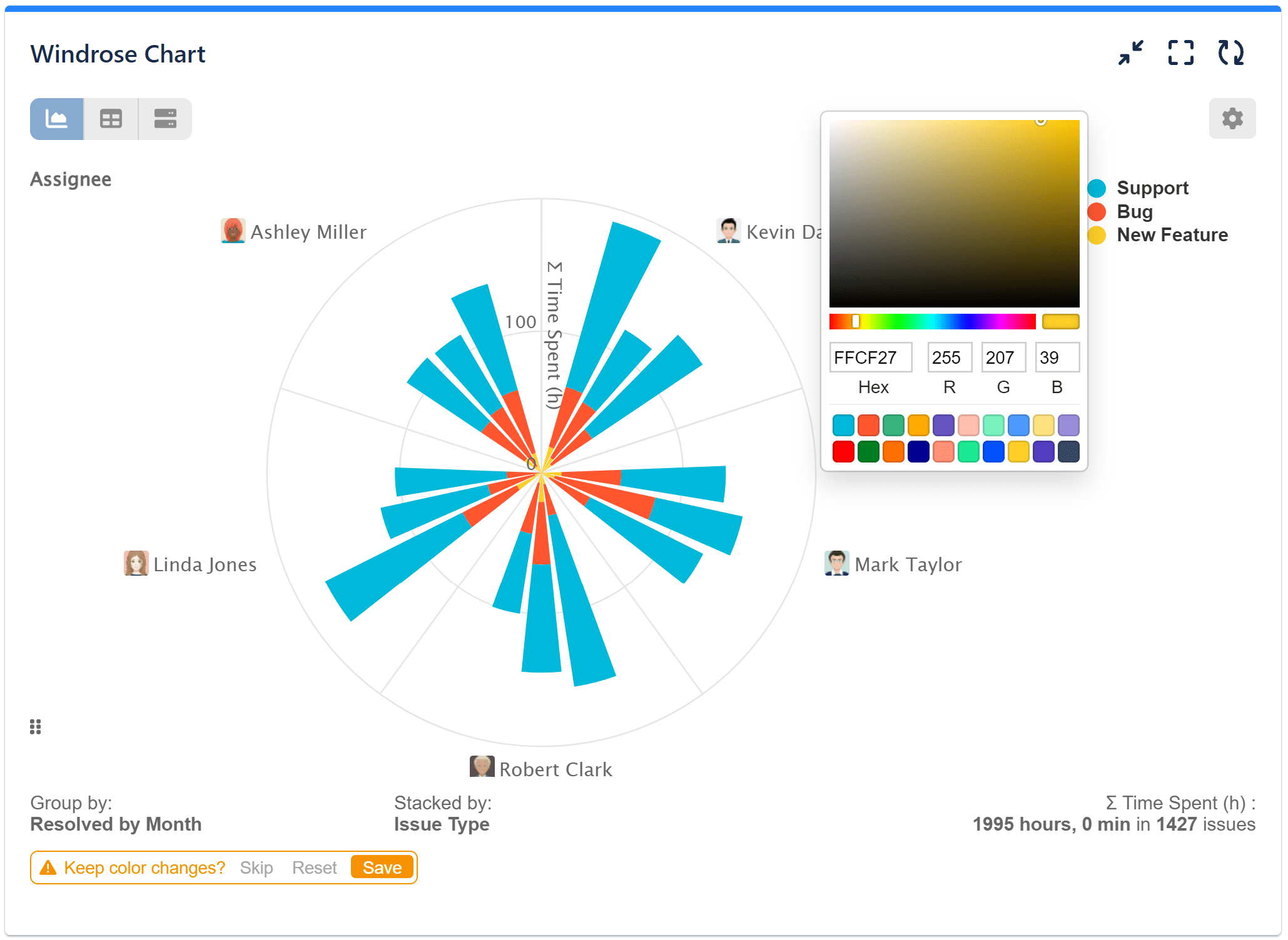
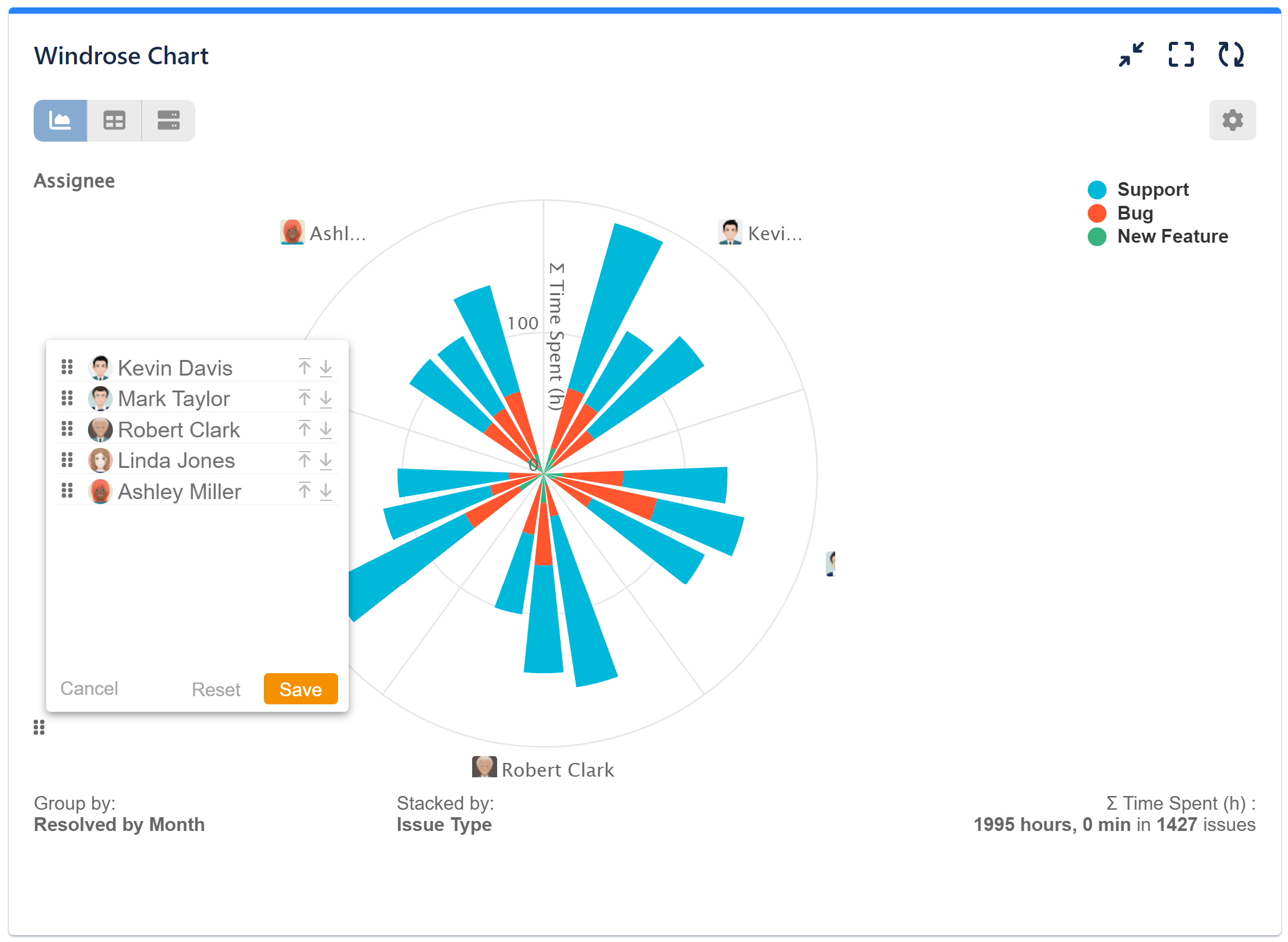
You can make the most of the ‘Circular Chart’ gadget’s rich customization options by selecting custom colors directly on your Wind rose chart and reordering the fields according to your preference. This level of customization allows you to create visually appealing and tailored charts that suit your specific Jira reporting needs.
With the ‘Circular Chart’ gadget, you have the flexibility to effortlessly switch between different chart types, enabling you to present your Jira data in the most effective manner. Discover the versatility of the Pie chart, Sunburst chart, and the Radial bar chart, all supported by the gadget. To explore even more chart types available in the Performance Objectives: Charts for Jira app, visit our Charts overview page.
Start your 30 days free trial of Performance Objectives: Charts for Jira from Atlassian Marketplace.