Table of Contents
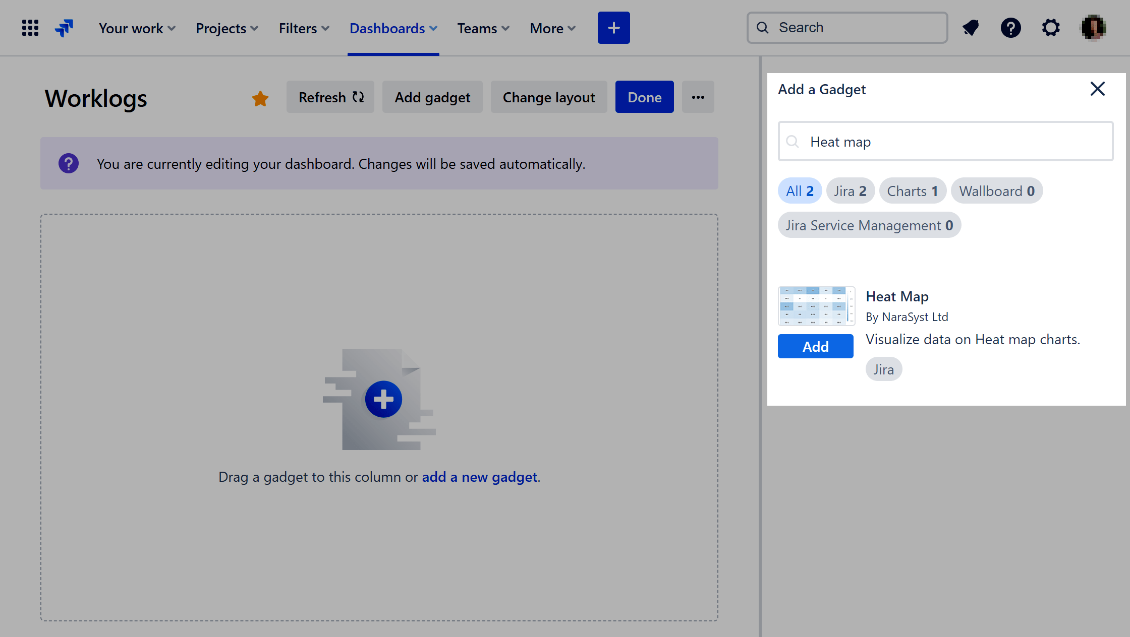
The Heat Map is one of the 10 standalone gadgets available within our app, Performance Objectives for Jira.
Discover the power of the Heat Map chart to uncover hot and cold areas within your Jira datasets. This visualization tool enhances your analysis by incorporating a “color axis” alongside traditional X and Y axis values, making it perfect for identifying correlations and patterns in your data. As a result, Jira users can effortlessly analyze complex datasets, facilitating informed decision-making processes. In this article, we’ll navigate through its location within the interface, explore the Heat Map’s best use cases, and delve into its features.
Leveraging Heat Maps in Jira for Work Log and Timesheet Tracking
Among its many possible uses, the Heat Map is perfect for tracking worklogs.
Our sample report, “Worklog Time by Worklog Author” offers a concise visual overview of how worklog time is distributed among teammates across different timeframes, including days, weeks, and months. This visualization aids teams in swiftly identifying patterns, evaluating individual and collective productivity levels, and optimizing workload distribution to enhance efficiency and collaboration.
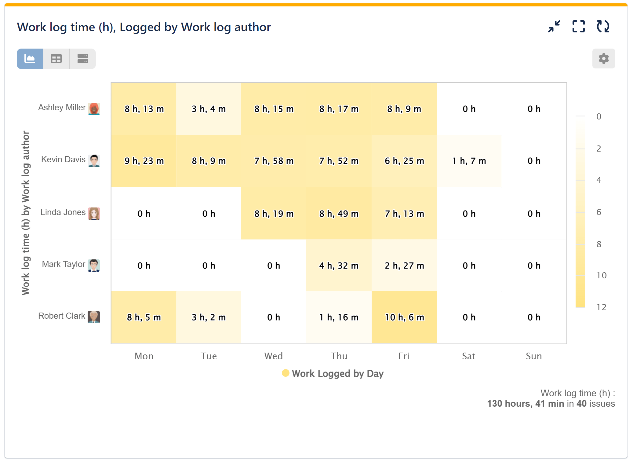
Below are the configuration steps for this report:
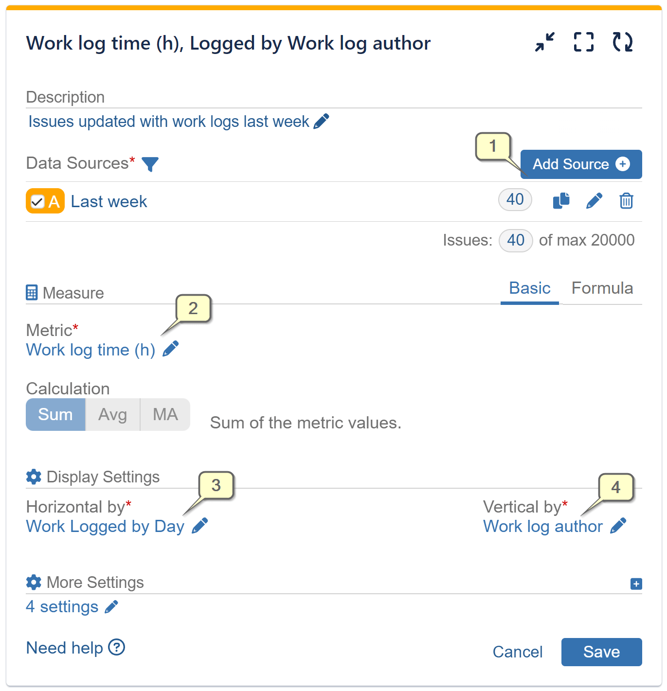
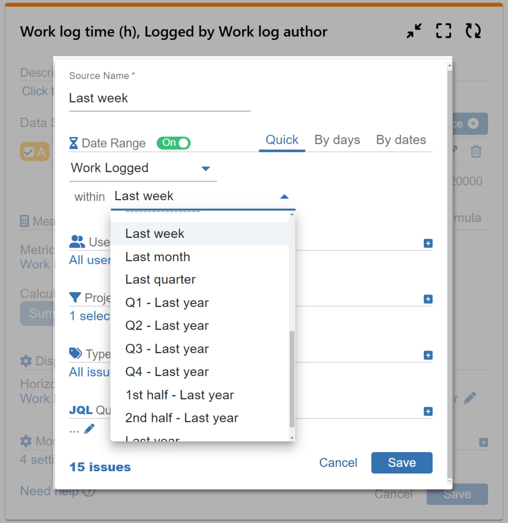
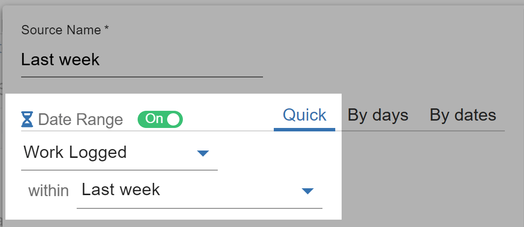
Step 1: Add a data source and filter out the issues that need to be analyzed. In our sample, we have filtered “Work Logged” issues within the Quick date range filter – Last week. Please ensure to always filter Work logged issues in the Data Source for an accurate work log report.
Step 2: Select the dynamic metric ‘Work Log Time (h)’ from the available metric options. For a comprehensive list of metrics supported by the app, please refer to our Configuration Overview.
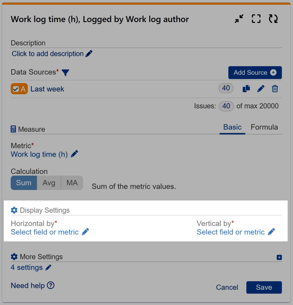
Step 3: Select the ‘Work Logged’ field and specify “by Day” for the Horizontal axis.
Step 4: Select the ‘Work log author’ field for ‘Vertical by’ from the available field options, then save the configuration.
There are various Jira reports and scenarios suitable for the Heat Map gadget, and our support team is available to assist you in configuring them. Here’s a glimpse of other reports that you can build with our Heat Map.
- Support Requests by time of day
- Story Points Resolved by Sprint by Epic Link
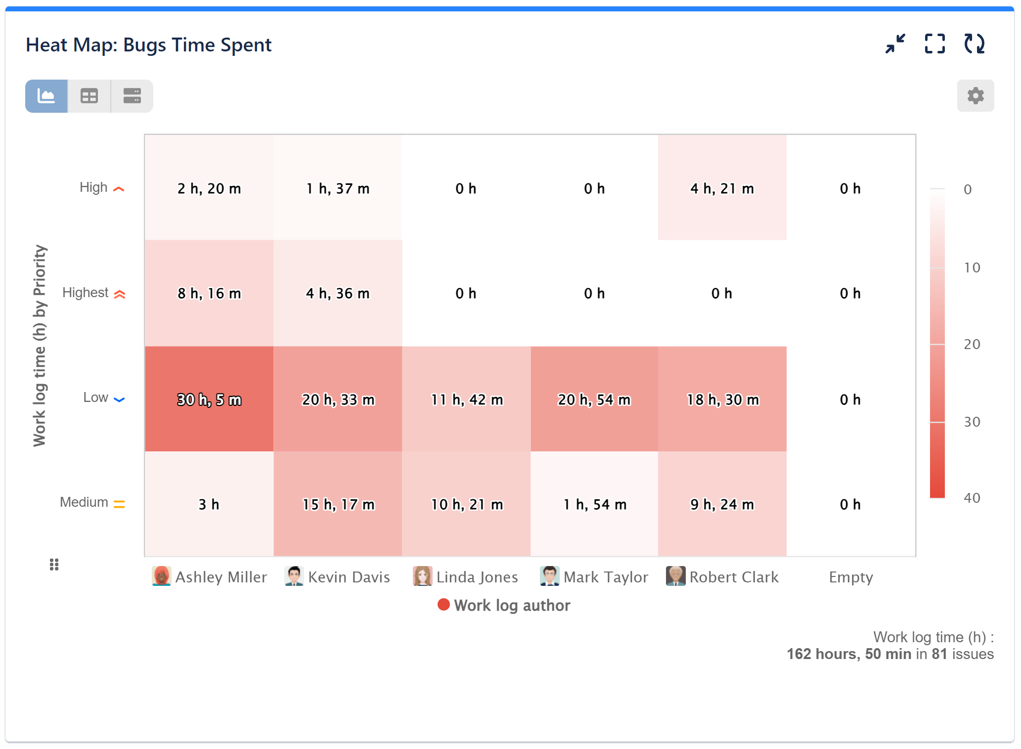
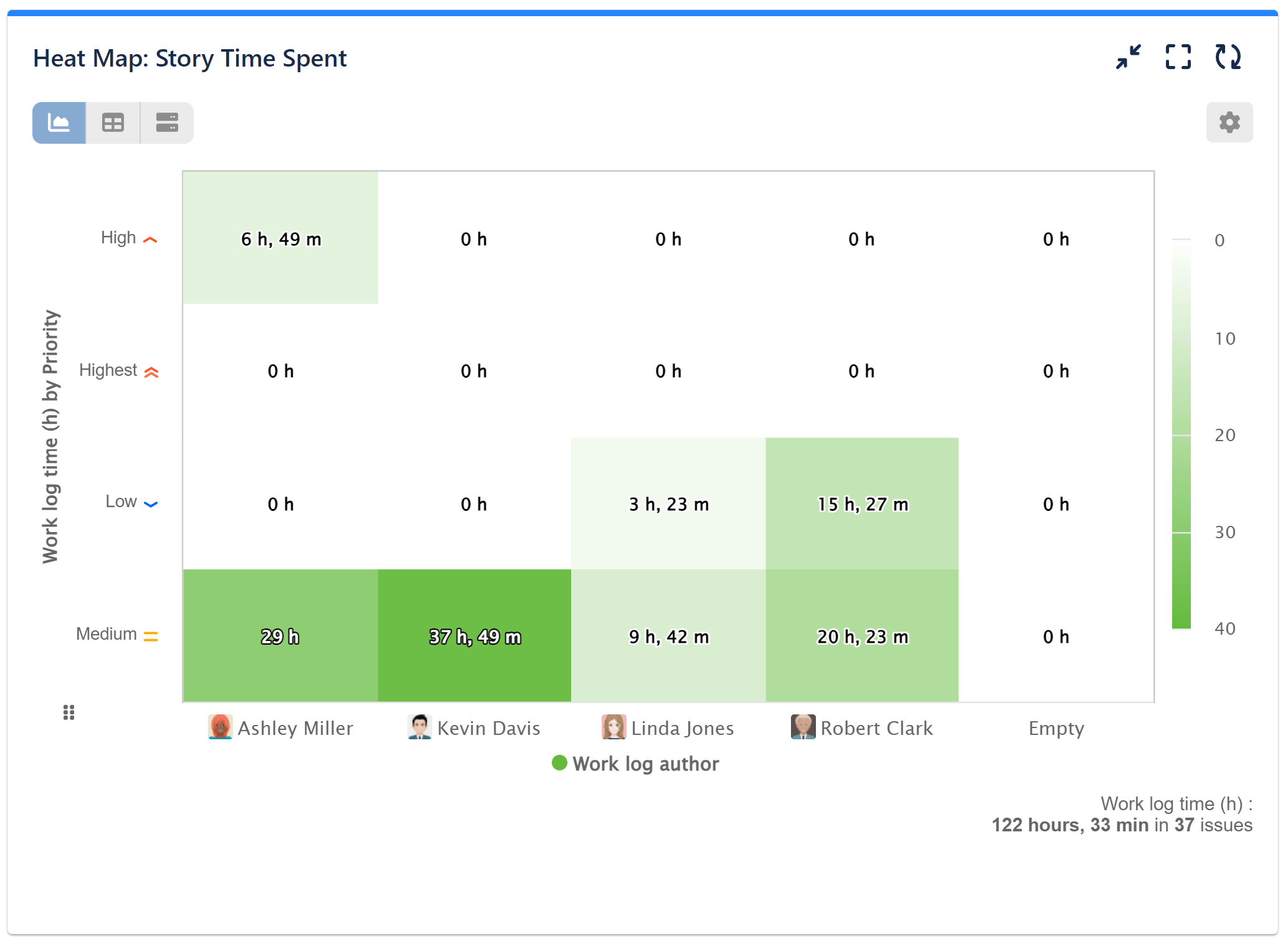
- Worklog time by Issue Type and Priority
Explore the Heat Map Gadget’s Powerful Features
Data Source Settings
Heat Map gadget allows you to seamlessly integrate multiple data sources to facilitate comprehensive analysis. In the Quick date range, you can benefit from a diverse selection of pre-defined periods such as this/last week, this/last month, quarters, the first or second half of this or last year, and more. For more granular control over date ranges, leverage the “By days” or “By dates” options. With these selections, you can specify exact start and end dates.
Measure Settings
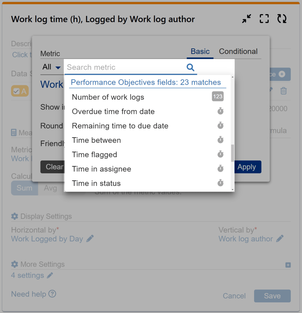
Dynamic Metrics
‘Time in status’
‘Work log time’
‘Time in assignee’
‘Cycles in assignee’
‘Time between dates’
‘Number of Issues over time in Status’
Choose the most appropriate metric to meet your reporting requirements. Select from a wide range of metrics, including Jira System, Jira Service Management (SLA), Custom, or Performance Objectives’ app dynamic metrics.
Display Settings
In the Heat Map gadget, the chart’s Y and X axes options are labeled as “Horizontal by” and “Vertical by” respectively. Select from a variety of display fields for both axes to tailor the Jira report according to your requirements.
Customization Settings
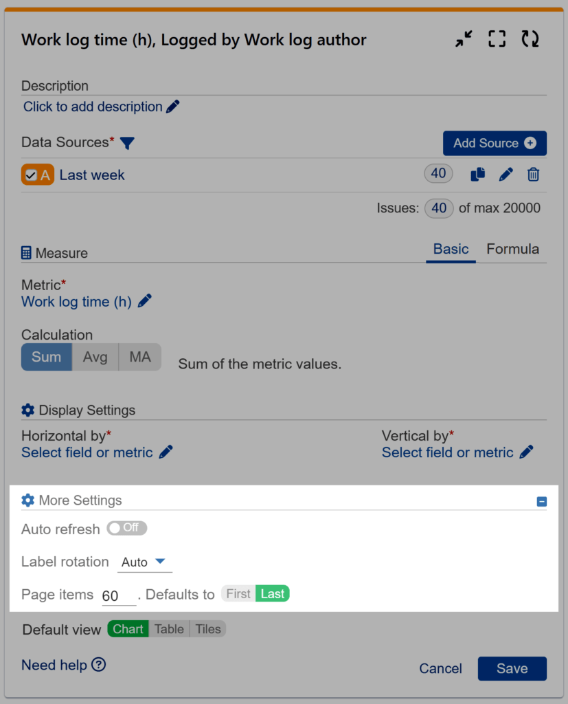
Under “More Settings,” you have the option to customize the Auto Refresh interval to ensure you’re viewing the most up-to-date data on your chart. Additionally, you can rotate the item labels to enhance readability or restrict the number of items displayed vertically.
The Heat Map offers a user-friendly interface for easy navigation and customization, enabling Jira users to adapt the chart to their needs effortlessly. You can employ the Custom colors feature in Heat Map charts. Assign colors to data segments to ensure clear interpretation and maintain consistency, as shown on the sample charts below. For multiple x-axis (vertical by) items, utilize the Custom reorder feature to arrange them according to your reporting requirements and preferences.
Start your 30 days free trial of Performance Objectives: Charts for Jira from Atlassian Marketplace.
