Performance Objectives: Charts for Jira app provides a wide range of chart types through its gadgets, allowing you to effectively visualize your Jira data and generate comprehensive reports on your Jira dashboard. These chart types include Pie, Donut, Line, Area, Bar, Heat Map, Tree Map, Bubble, Scatter, Sunburst, Wind rose charts, and Venn Diagram.
Table of Contents
Sample Visualizations Utilizing Various Chart Types for Jira Dashboard
Discover the gallery of sample visualizations created using the 12 diverse chart types available in Performance Objectives: Charts for Jira app. Attractive visualizations possess the ability to engage attention and that can be further elevated by the advanced functionalities of the app, resulting in understandable and actionable charts for Jira.


Choose the Right Chart Type For Your Jira Report
Below you will discover various Jira report examples showcasing the diverse chart types available in the Performance Objectives: Charts for Jira app, along with the specific data sets they are most suitable for.
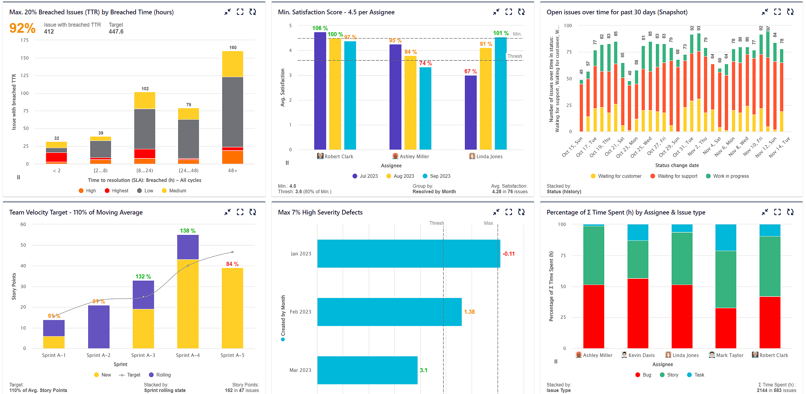
- ‘The Performance Objectives’ and ‘Multi Metric Combined Chart‘ dashboard gadgets support Bar charts, also referred to as Column charts. These chart types are widely used for comparative analysis and displaying data over a specific time period. Bar and column charts are particularly suitable for visualizing key performance indicators (KPIs), enabling effortless comparison and analysis across different categories or time intervals, including scenarios involving negative values. Examples of KPIs that can be effectively visualized with bar charts include Cycle Time KPI and % of High Severity Defects.
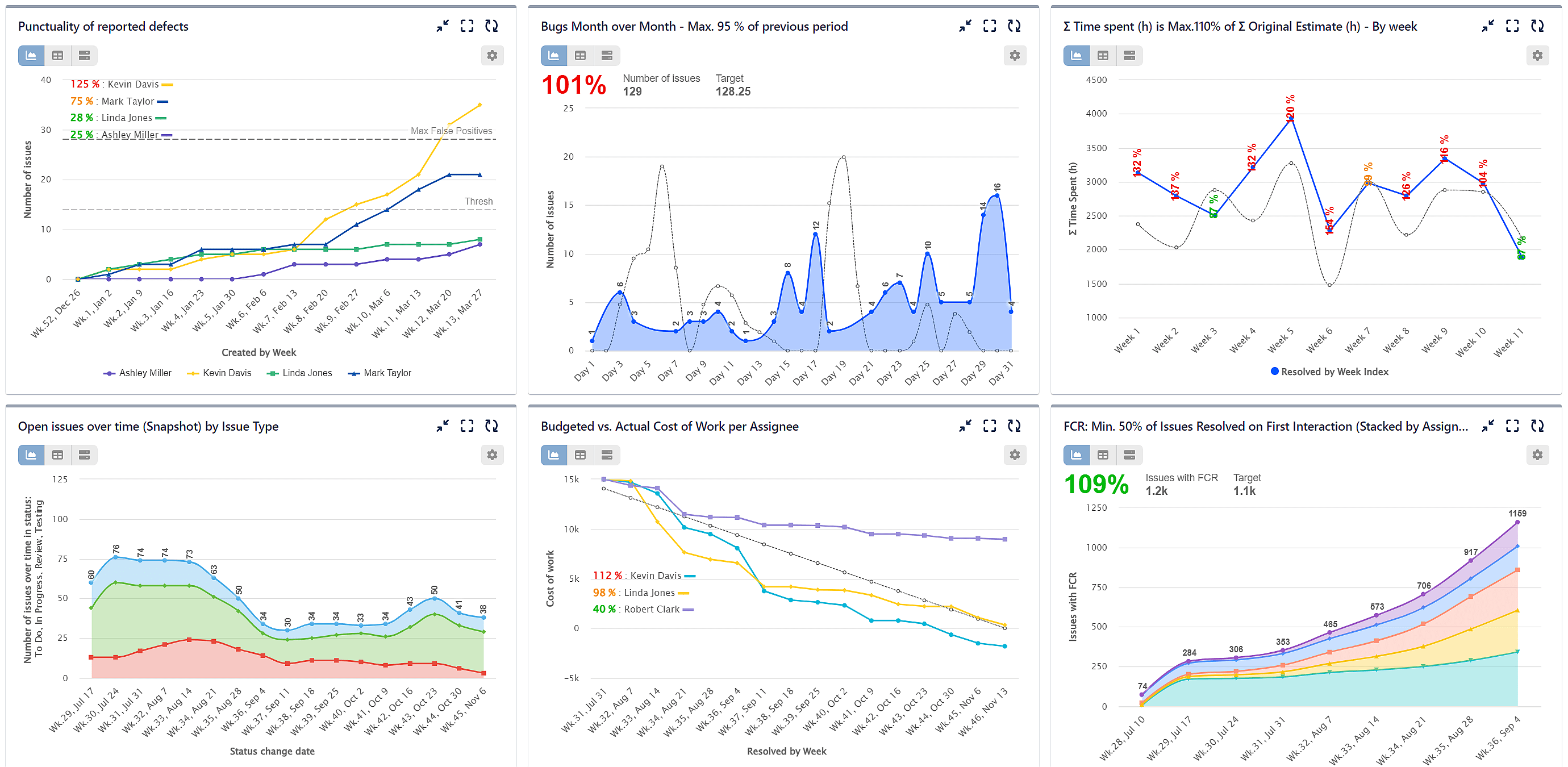
- Line charts, on the other hand, can be found in the ‘Performance Trend’, ‘Multi Metric Trend Chart’, ‘Multi Metric Combined Chart’, and ‘Change History’ gadgets. These charts are ideal for visualizing continuous data and showcasing the relationship between variables. Line charts excel at illustrating data progression, making them suitable for tracking performance over a period or displaying temporal patterns. Examples of KPI reports that can be represented using line charts include First Contact Resolution and Created vs Resolved.
- Area charts can be effectively utilized to compare data from two different datasets over time, enabling period-to-period comparisons. This type of chart is available in the ‘Performance Trend’ dashboard gadget. By representing each dataset as a separate area, the chart visually highlights the relative contributions and changes of each dataset. This allows for a clear understanding of how the two datasets compare and evolve over the specified time period. Here you may find an example PoP Improvement KPI report.
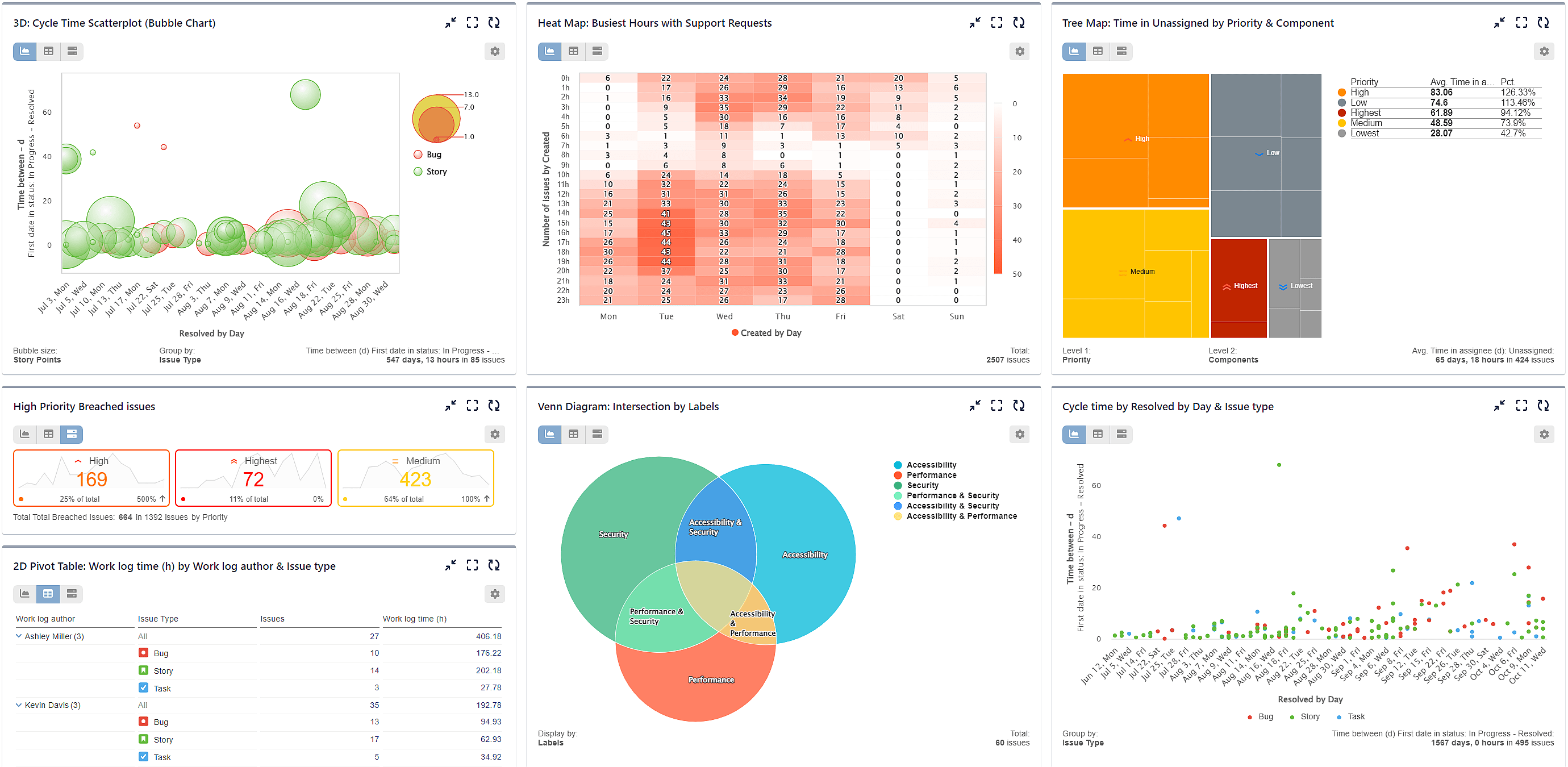
- Heat Map is available through the ‘Heat Map’ dashboard gadget, which allows you to visually represent data using color gradients. By assigning colors to varying levels of intensity or frequency, heat maps provide an intuitive way to identify patterns, outliers, and trends in data sets. For instance, utilizing the Support Requests report by time of day can provide valuable insights into the busiest hours of your service, facilitating informed decision-making and resource allocation.
- The ‘Tree Map’ dashboard gadget supports tree map charts, which are particularly useful for effectively communicating the hierarchical relationships within a dataset, enabling viewers to comprehend the structure and proportions of various categories. Additionally, tree map charts offer an intuitive means of comparing the relative sizes and proportions of different categories or subcategories within a dataset, all while efficiently displaying large amounts of data in a compact form, optimizing space utilization. Finally, with interactive features like drill-down capabilities, tree map charts empower users to explore and navigate through the hierarchical structure, enhancing their data exploration experience.
- Venn Diagram is available in the ‘Venn Diagram’ dashboard gadget. Those diagrams are best utilized for visually illustrating the relationships and intersections between different sets or groups of data. They provide a clear and intuitive representation of the overlap and common elements among multiple categories, allowing for easy comparison and analysis.
- Scatter and Bubble charts are available in the ‘Scatter & Bubble Charts’ dashboard gadget. Scatter charts are primarily used to plot the relationship between two variables. They allow for the examination of the correlation or lack thereof between the variables in an attractive visual way. Bubble charts, on the other hand, enhance the capabilities of scatter charts by introducing a third dimension. In addition to the x-axis and y-axis, bubble charts utilize the size of the bubble to represent a third metric.
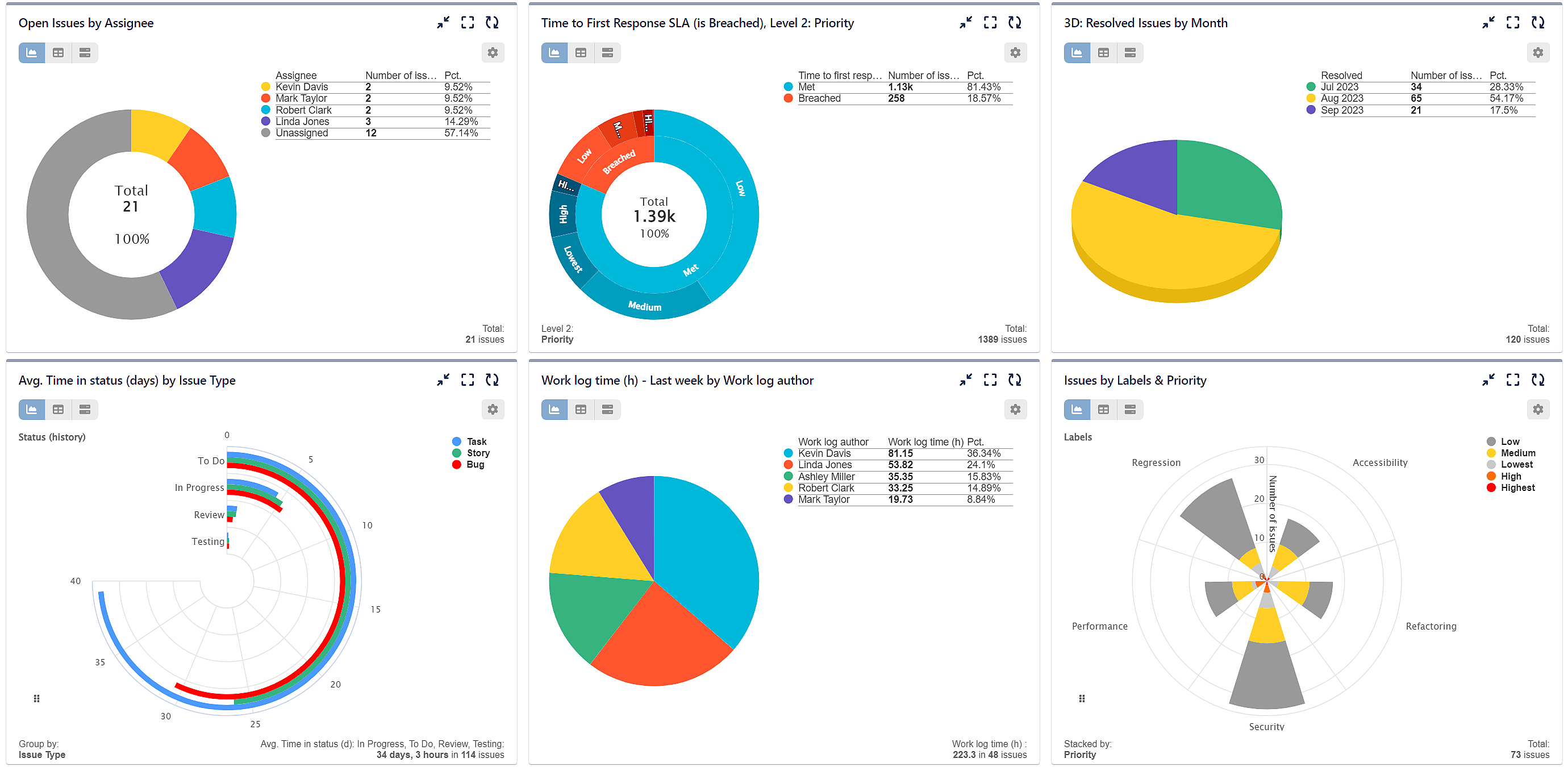
- The ‘Circular Chart’ dashboard gadget offers a versatile set of chart types, including Sunburst, Pie chart, Radial bar, Wind rose, and Donut charts. Each chart type serves a specific purpose and, when combined in one gadget, provides a comprehensive toolkit for visualizing data in a circular format.
Performance Objectives: Charts For Jira Advances Features
While Performance Objectives: Charts for Jira boasts a wide selection of chart types, its true value extends beyond that. The app provides advanced functionalities on top of the built-in Jira report features, enhancing the reporting capabilities and offering an extensive array of customization options. These include features such as:
- Data grouping
- JQL Data segmentation
- Goal setting and tracking
- SLA reporting
- Formula metrics
- Multiple metrics
- Metric distribution
- Essential Jira data metrics, such as: Time Tracking, Time in Status, Average & Moving Average among others
- Rich date granularity options
For detailed information on these features, please refer to our User Guide.
Start your 30 days free trial of Performance Objectives: Charts for Jira from Atlassian Marketplace.